
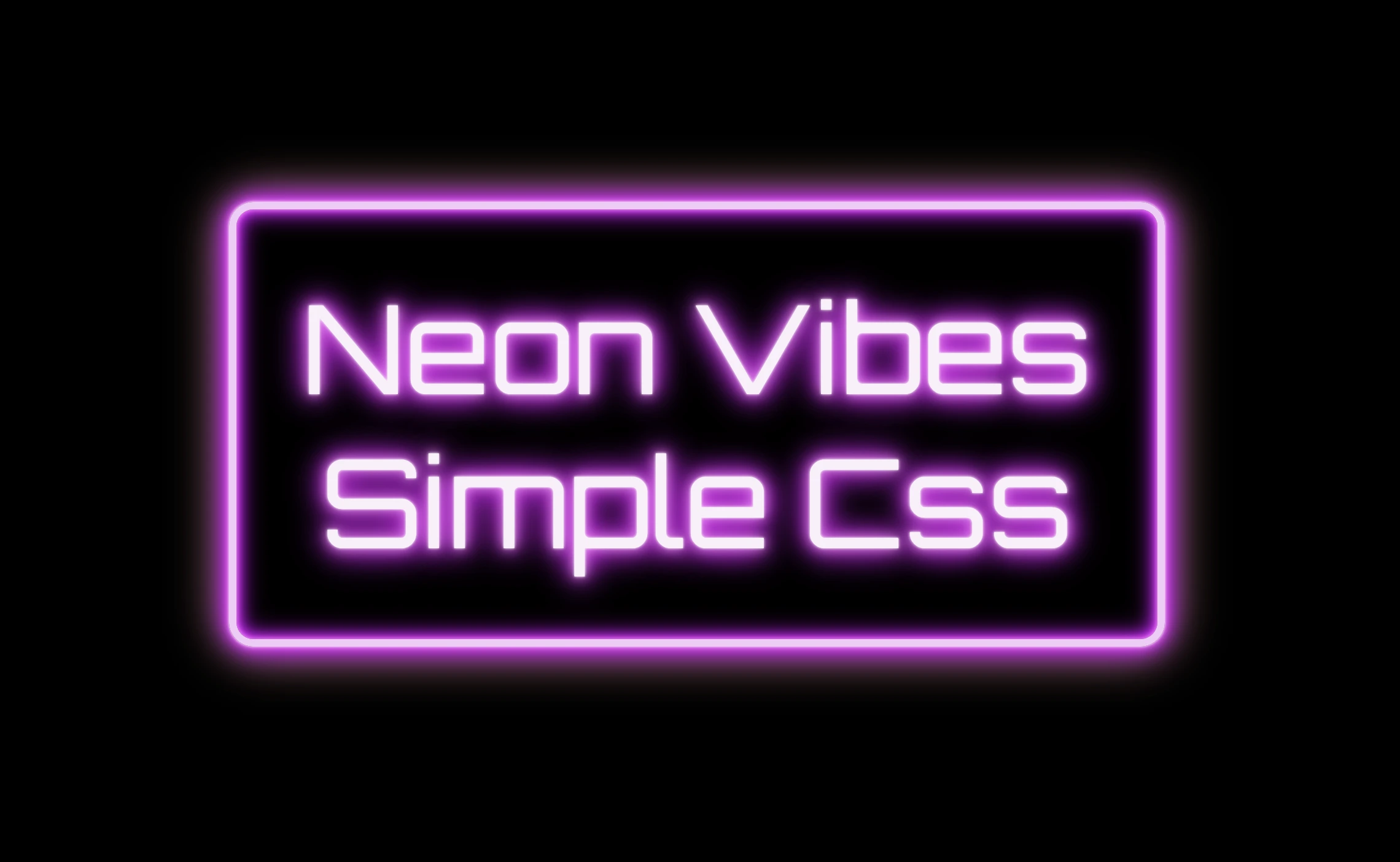
The neon effect in web design brings that bold, electric vibe that grabs attention right away. ⚡🌈 Inspired by real-life neon signs, which I’m sure you have seen outside bars, arcades, or glowing up city streets — it mixes retro charm with a modern twist. It adds personality and mood, turning plain text or shapes into glowing, eye-catching pieces. That soft glow, the depth, those bright color fades — they take a simple design and make it feel alive, like if you have just travelled back in the future. 🌟 And the best part? You can pull it off with just CSS. No images, no JavaScript. 🥳
Setting the stage: Basic HTML structure
To begin creating this effect, we’ll start with a basic HTML structure and add custom CSS later. Think of the HTML <div> we are using, as the frame for a neon sign, and the text as the glowing message inside it.
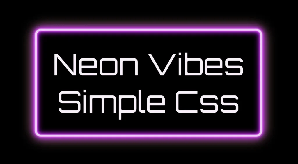
<div class="neon-effect">Neon Vibes Simple Css</div>From there, we move on to CSS. We import a Google font named “Orbitron”, a futuristic style text, that fits perfectly for our neon effect.
Then we lay the foundation: we structure the page by setting the body to fill the entire viewport and using display: flex to center our neon box both vertically and horizontally. Finally, we add a solid black background — it doesn’t look like much yet, but it sets the perfect stage for the neon glow we’ll add soon, creating strong contrast just like a real sign glowing in the dark.
@import url('https://fonts.googleapis.com/css?family=Orbitron');

body {
  max-width: 100%;
  height: 100vh;

  display: flex;
  align-items: center;
  justify-content: center;

  background-color: #000;
}Building the neon sign base
The .neon-effect class is used to create the main structure of the glowing sign. It defines a rectangular box with a width of 700px and a height of 300px, along with a soft, rounded border in light violet (#f4cbf8).
The box uses display: flex to perfectly center the text both vertically and horizontally. The font is set to Orbitron, giving the text a bold, futuristic style, and its size is large (80px) to make it stand out.
.neon-effect {
  /* Frame */
  width: 700px;
  height: 300px;
  border: 6px solid #f4cbf8; /* light violet */

  border-radius: 20px;
  display: flex;
  align-items: center;
  justify-content: center;

  /* Fonts */
  font-family: 'Orbitron', Arial;
  font-size: 80px;
  text-align: center;
  color: #faf0fb; /* light pink */
}
The text color is a very light pink (#faf0fb), which will work beautifully once we add glowing shadow effects around it. For now, this creates a clean and centered base — the canvas for our neon sign.
You may also like 🎬
Glowing borders: Neon frame with box-shadow
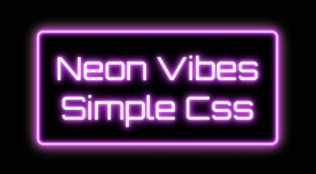
To create the glowing neon frame around the box, we use layered box-shadow effects. The outer shadows softly expand in multiple directions, starting with white and transitioning through vivid shades of pink, magenta, and purple. This gives the impression of light softly spreading from the edges.
We also include a subtle touch of yellow-gold hue, blending into the glow. This not only adds visual warmth but also gives a nostalgic nod to vintage neon signs, bringing up the charm of the old days while keeping the overall look fresh and vibrant.
.neon-effect {
  ...
  box-shadow:
    /* outer glow */
    0 0 2px #fff, /* white */
    0 0 6px #ff99ff, /* light pink */
    0 0 12px #ff33ff, /* magenta */
    0 0 20px #cc00ff, /* violet */
    0 0 28px #9900cc, /* deep purple */
    0 0 36px #660066, /* dark purple */
    0 0 40px #ffe187, /* light yellow - soft gold */
    /* inner glow */
    inset 0 0 4px #ff99ff, /* light pink */
    inset 0 0 8px #ff33ff, /* magenta */
    inset 0 0 14px #cc00ff, /* violet */
    inset 0 0 18px #9900cc, /* deep purple */
    inset 0 0 24px #660066; /* dark purple */
}Equally important is the second group, which uses the inset keyword and adds an inner glow that shines inside the box. These inset shadows create depth and give the illusion that the light is not only around the sign, but also glowing from within. The combination of outer and inset shadows is essential for achieving a rich, realistic neon effect.
Illuminated Text: Neon Glow with Text-Shadow
To create the glowing effect around the text, we use the same method, multiple layers of text-shadow. Each shadow in your code adds a soft light in a different shade: from white and light pink to vibrant magenta, deep purple.
.neon-effect {
  ...
  text-shadow:
    0 0 2px #fff, /* white */
    0 0 10px #ff99ff, /* light pink */
    0 0 20px #ff33ff, /* magenta */
    0 0 26px #cc00ff, /* violet */
    0 0 24px #9900cc, /* deep purple */
    0 0 32px #660066; /* dark purple *
}
These layered shadows build a rich glow around each letter, giving it a strong, radiant presence against the dark background. The variation in color and blur size creates depth, making the text appear as if it’s lit from within, just like real neon tubing.
Neon effects in web design are a powerful way to grab attention. ✨ They combine vivid colors, glowing shadows, and sharp contrast to mimic the iconic look of neon signs. Whether you’re aiming for a modern tech vibe or a nostalgic retro feel, neon brings style and energy. Using CSS alone, we can recreate this classic visual with precision and creativity — no electricity needed! 💡😎
