Hello there! 😃 In CSS, we have a really helpful property called backdrop-filter. It’s like a special filter that applies grayish shades to the backgrounds. A useful tool when we want to focus on a part of the webpage without changing the actual element itself. Mm… 🤔 that is a little bit tricky! Isn’t it? Let’s grab a cup of coffee ☕ and move forward! We will clarify everything in this post about using a grayscale backdrop filter. 👩💻
How the backdrop filter works
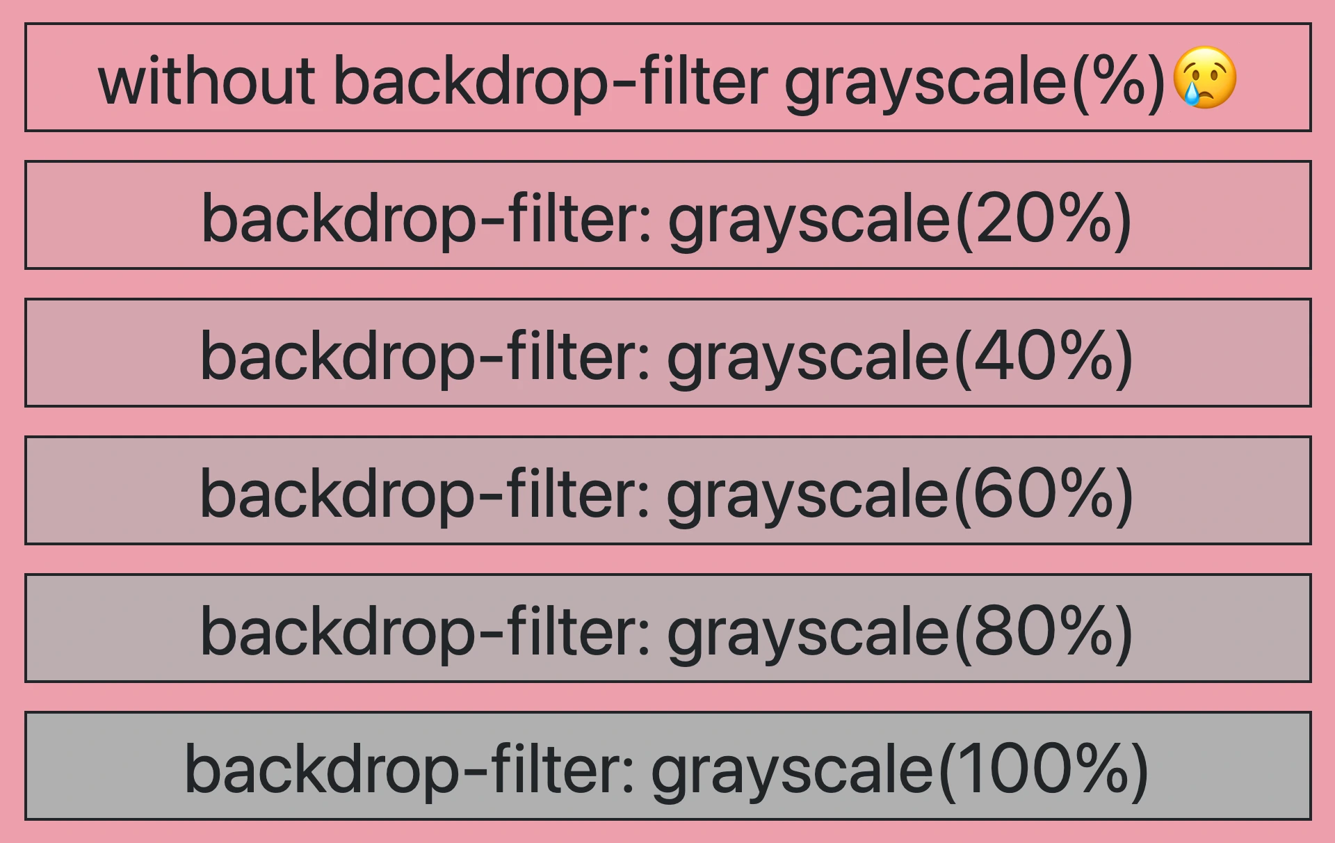
So, how does this property really work? We will begin by setting the backdrop-filter property to grayscale(percentage), where the percentage determines the intensity of the grayscale effect, ranging from 0% to 100%. A value of 100% turns the color into a complete grayscale color, while a value of 0% will keep the element’s original color shades without any grayscale effect.
This CSS property is not quite noticeable on black or white backgrounds because it adds shades of gray, and black is already the darkest shade while white is the lightest one. In simpler words, black and white will not get converted to grayscale because it already belongs to the darkest side of grayscale.
For the filter to work properly, as a first step, we need to set the background-color property of the parent element. Afterward, we add the backdrop filter to the child elements we want to apply the grayscale effect. The backdrop filter will only affect the child element’s background color but not its content, text, images, etc.
As a result, the parent element maintains its original background color, while the child element’s background is desaturated, creating a monochromatic, grayscale effect.
Create a grayscale backdrop filter effect
This HTML and CSS code above creates a <section> element (father) with a <p> element (child) inside. The section has a background color in a shade of pinkish peach, defined by the hex color code #f99bab. Initially, the paragraph inherits the same background color.
<section>
  <p>...</p>
</section/* PARENT ELEMENT */
section {
background-color: #f99bab; // a shade of pinkish peach
}
/* CHILD ELEMENT */
p {
backdrop-filter: grayscale(50%);
}We continue with the <p> element styled by a backdrop-filter with a grayscale value of 50%. This effect visually desaturates the paragraph’s background (the paragraph inherits its background from its parent, the section). This means that the colors where the backdrop filter is applied (the area behind the element) will be desaturated to 50%. As a result, a grayscale effect will be applied where the colors are halfway between their original color and grayscale while leaving the content unaffected.
In simple terms, by setting this code, we create a parent element with a shade of pinkish peach-colored background, and its child element has a somewhat muted, desaturated appearance while at the same time retaining some of the original pink color.


You may also like 🎬
A grayscale-themed table
Below, I have included a table that visually presents some possible variations of the grayscale backdrop filter effect. 😃

🌼 Hope you found my post interesting and helpful. Thanks for being here! 🌼


