
Welcome to a world where ⚫ black and ⚪ white aren’t just colors. In this post, 😃 we’ll explore the exciting world of creating black and white CSS stripes. It is a really cool effect to level up your text by adding stripes, making it even more fascinating and appealing.
We will be learning about this effect by using an example to make it crystal clear. Let’s check it out! 👩💻
Create basic HTML and CSS structure
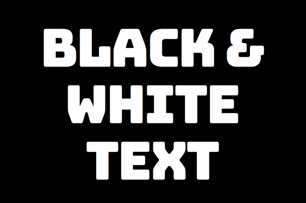
We will begin with our HTML and CSS structure. Our HTML code includes a <div> element that has a class named .stripes-effect for identification and styling purposes. Following that, we add some CSS rules to apply specific styles to our HTML element with this class.
<body>
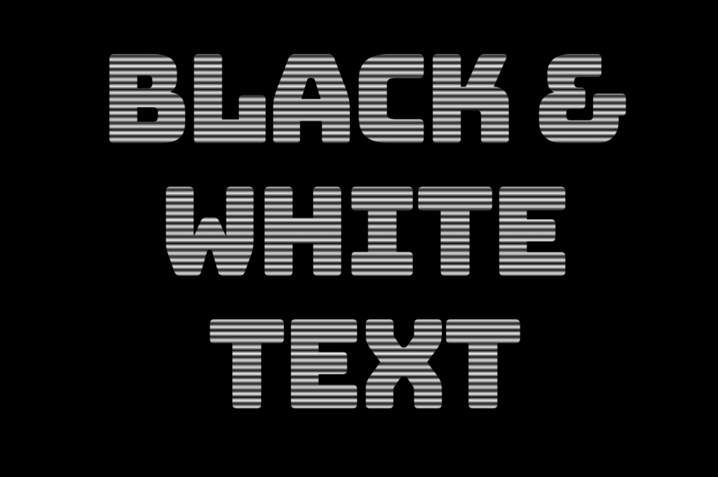
<div class="stripes-effect">black & white text with shadow</div>
</bodybody {
background-color: black;
}
.stripes-effect {
font-family: 'Bungee', sans-serif;
text-align: center;
color: white;
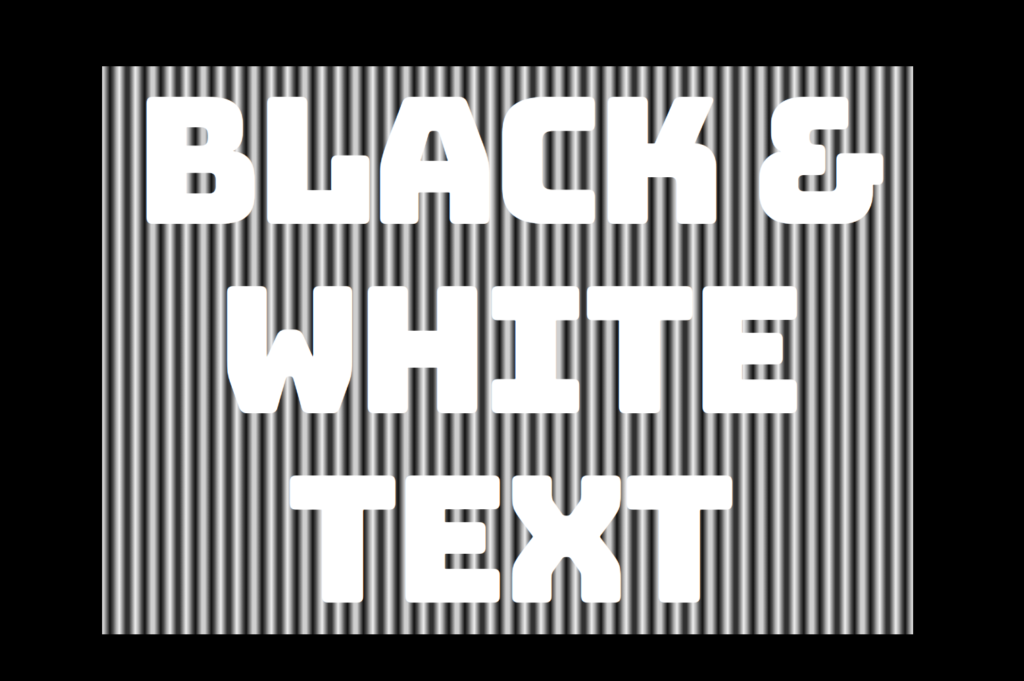
}By doing so, our heading is ready for applying our CSS stripes effect and should now look like this

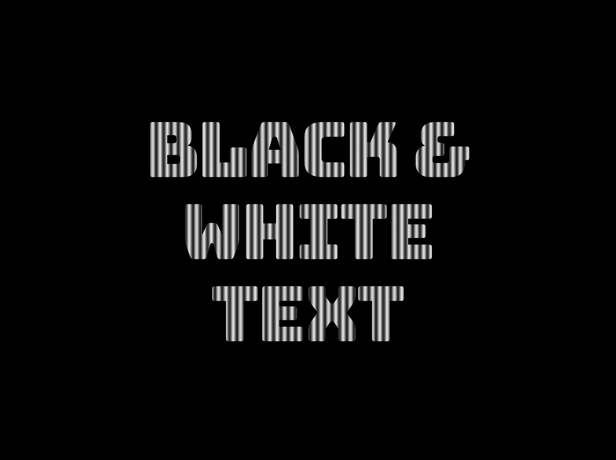
Adding black and white vertical stripes
Now that we have added our basic structure, we’ll create our stripe effect gradually, step by step, until it’s perfected. Let’s add the following styling
.stripes-effect {
  ...
  background-image: linear-gradient(to right, white, black, ...);
  /* clips the background pattern */
  background-clip: text;
  /* makes text invisible */
  color: transparent;
}In our already existing .stripes-effect class, we have the following rules:
background-image: linear-gradient(to right, white, black, ...) ➡ We begin by setting this CSS property that creates a background pattern using a gradient of alternating black and white stripes from left to right. The default direction is from top to bottom.
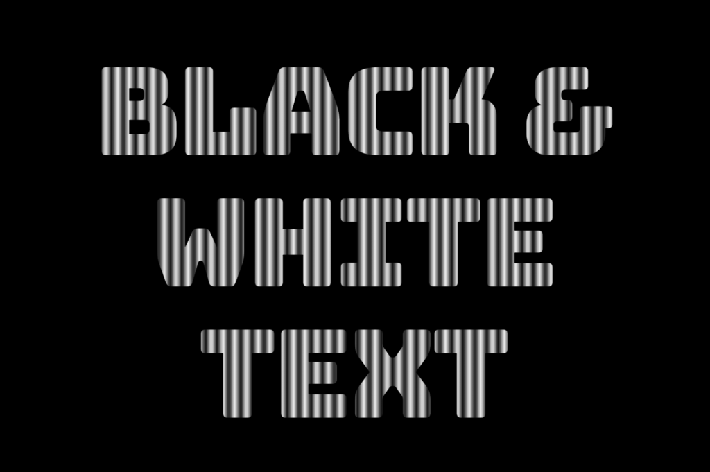
Don’t worry if our black-and-white text is hard to read; 🕯 😂 it is a temporary phase just to serve our purpose for now. We will move forward and see! So let’s proceed immediately! ⏳
background-clip: text ➡ By adding this property, it clips the background pattern to the shape of the text, making the text appear as if it’s filled with black and white stripes. If we just add this property and leave our CSS settings without any other change, our effect will not show properly.
If we want this to see our effect it is necessary to proceed with the following step (color: transparent ⬇).
color: transparent ➡ It’s time to make the text transparent, enabling the background pattern we created in the previous step to be visible!
You may also like 🎬

Black and white CSS stripes variations
The Zebra effect is not limited to vertical stripes for your texts; you can explore more options and create any effect you want. Below, you will find some variations to give you the inspiration you need.
Horizontal striped text
.stripes-effect {
  ...
  background-image: linear-gradient(white, black, ...);
}
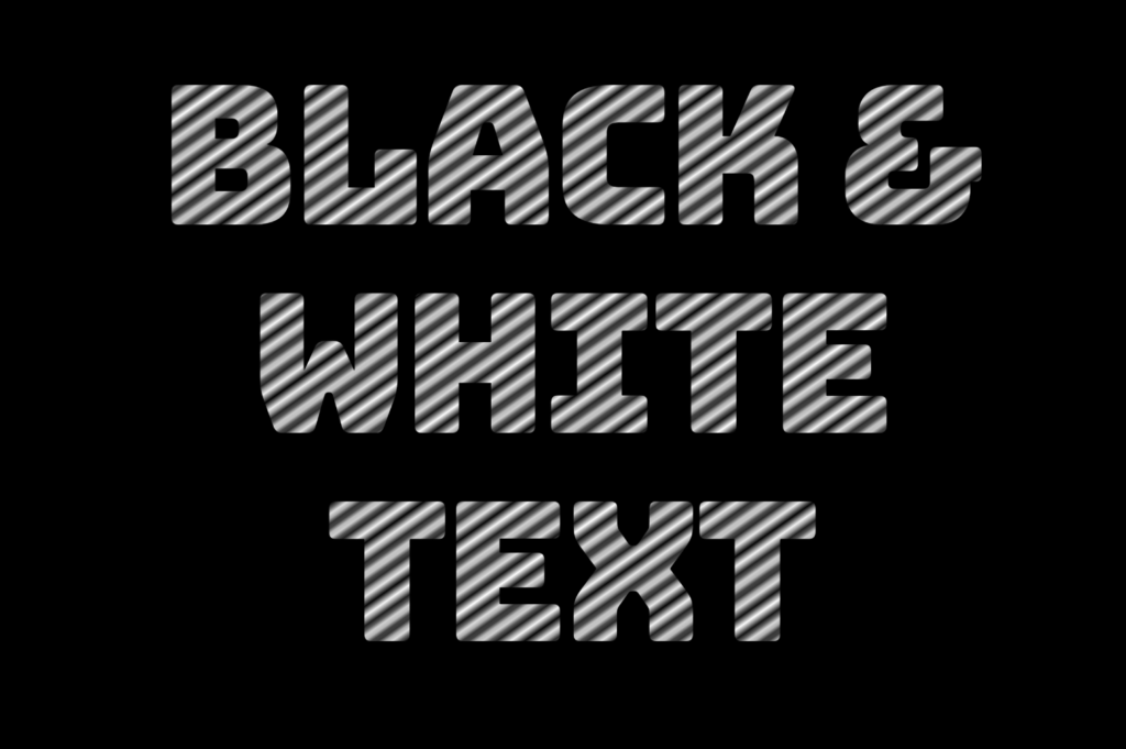
Diagonal striped text
.stripes-effect {
  ...
  background-image: linear-gradient(to bottom right white, black, ...);
}
🌼 Hope you found my post interesting and helpful. Thanks for being here! 🌼
