
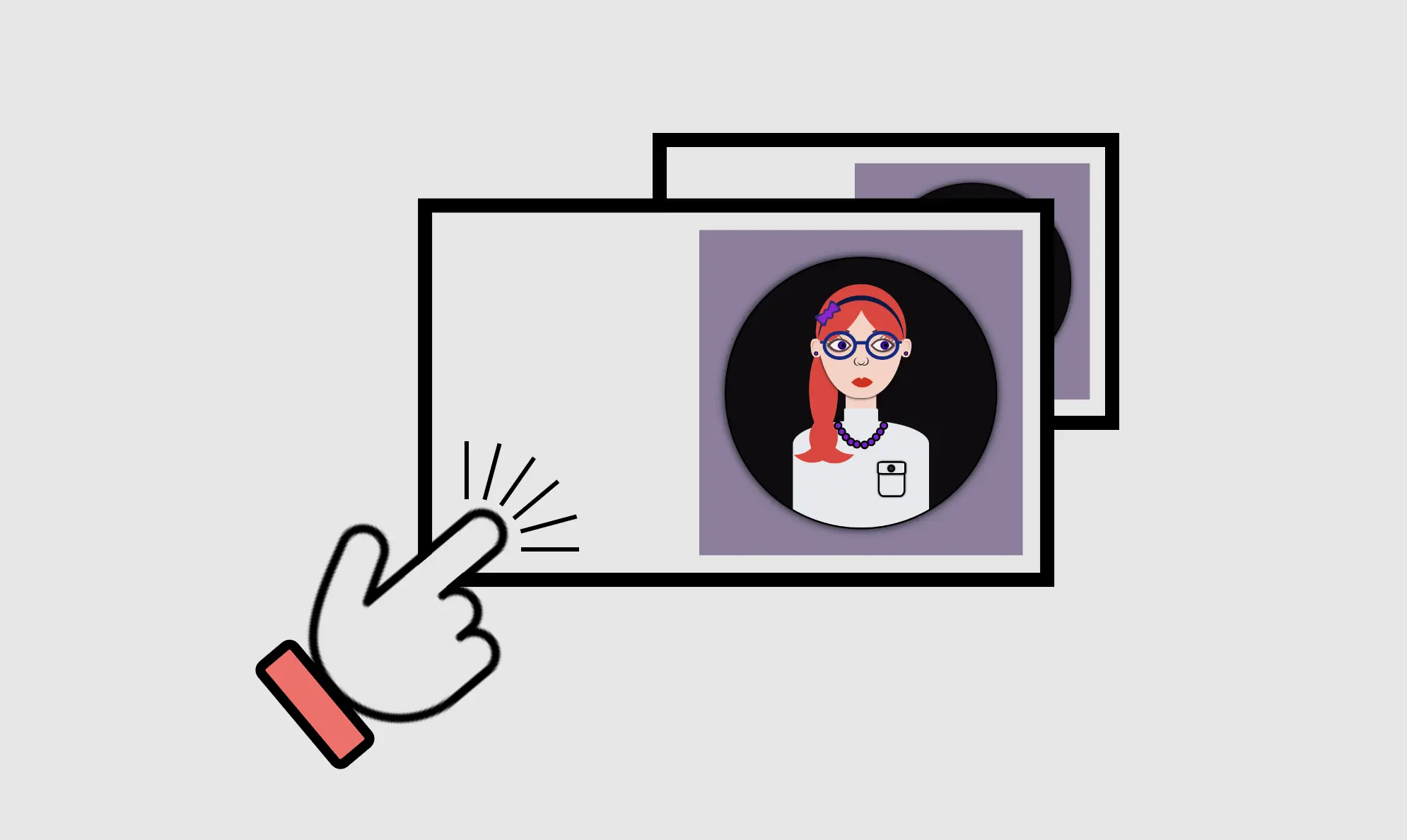
Hey there! Today, I’m gonna teach you how to use CSS transform scale on hover by using the transform: scale property. I’ve already created an avatar in order to make our animation more understandable and fun! 😄 If you’re curious about how I made the avatar, you will find the complete avatar code at the end of my post. You are encouraged to incorporate it into your animation as well 😉 The choice is yours!
Meanwhile, let’s just dive 🤿 into creating these amazing scale animations!

Meanwhile, let’s just dive into creating these amazing scale animations!
HTML structure
In order to create the scale transformations, first of all, it is necessary to make a container, which I named scale-content. This is the ‘place’ where we will do our CSS manipulations. After that, we move forward with a second container, the avatar-container. I named it that way as I intend to position the avatar inside it. As a matter of choice, 😊 you are able to add the avatar, too. Otherwise, you can continue only with the box. Once we prepare those two containers we are ready to move on.
<div class="scale-content">
  <div class="avatar-container">
    ... Here goes my avatar
  </div> <!-- end of avatar-container -->
</div> <!-- end of scale-content -->CSS basic styling
Next, we do the appropriate settings in order to center our container to the body, using the display: flex CSS property. We have also added the colors, setting body-color and container-color.
$body-color: #8e7d9e;
$container-color: #0f0b0f;

* {
  margin: 0;
  padding: 0;
  box-sizing: border-box;
}

html,
body {
  height: 100%;
}

body {
  min-width: 500px;
  display: flex;
  align-items: center;
  justify-content: center;
  background-color: $body-color;
}CSS containers structure
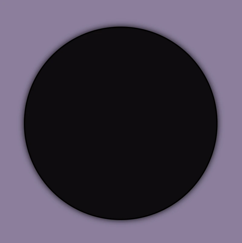
We begin with position: relative CSS property to the parent container and position: absolute to the child container in order to achieve the desired positioning of elements. Next, we specify the width and height of both containers according to our desired dimensions. We also use the CSS properties we want in order to create our avatar-container with the willing characteristics.
.scale-content {
  position: relative;
  width: 320px;
  height: 320px;
  .avatar-container {
    position: absolute;
    width: 100%;
    height: 100%;
    background-color: $container-color;
    border: 2px solid black;
    box-shadow: 0 0 10px;
    border-radius: 50%;
    overflow: hidden;
  } /* end of avatar-container */
} /* end of scale-content */Great! Now, take a break and look at the container we made using our earlier code. Feel free to go with it, or you may come up with your own! 😊
You may also like 🎬


CSS scale transformation structure
Our containers are ready!! We can continue by doing our manipulations and creating scale transformations.
We apply the transition: transform CSS property to the parent element, which enables us to achieve smooth changes in property values within a specified duration. As you can see below, I set 4s, and as a result, our transition lasts 4 seconds.
Next, we set the CSS transform: scale(X, Y) property on the child element in order to resize, increase, or decrease the size of an element in the axes. We have the capability to simultaneously resize both axes with the same or different values or selectively resize either the X-axis or the Y-axis.
💡 Below there are some examples of scale transformations as a way to understand it better 😃
transform: scale(X, Y) with the same value on both axes
- Resizes (increases) with the same value, the size of an element in both axes.
.scale-content {
  ...
  transition: transform 4s;
  &:hover {
    cursor: pointer;
    transform: scale(1.2);
  }
  .avatar-container {
    ...
  } /* end of avatar-container */
}  /* end of scale-content */
- Resizes (decreases) with the same value, the size of an element in both axes.
.scale-content {
  ...
  transition: transform 4s;
  &:hover {
    cursor: pointer;
    transform: scale(0.5);
  }
  .avatar-container {
    ...
  } /* end of avatar-container */
} /* end of scale-content */
transform: scale(X, Y) with different values on both axes
- Resizes (increase the width and decrease the height), with different values, the size of an element in both axes.
.scale-content {
  ...
  transition: transform 4s;
  &:hover {
    cursor: pointer;
    transform: scale(1.4, 0.4);
  }
  .avatar-container {
    ...
  } /* end of avatar-container */
} /* end of scale-content */
- Resizes (decrease the width and increase the height), with different values, the size of an element in both axes.
.scale-content {
  ...
  transition: transform 4s;
  &:hover {
    cursor: pointer;
    transform: scale(0.4, 1.4);
  }
  .avatar-container {
    ...
  } /* end of avatar-container */
} /* end of scale-content */
transform: scale(X) increase or decrease width
- Resizes (increases) the width of an element (X-axis).
.scale-content {
  ...
  transition: transform 4s;
  &:hover {
    cursor: pointer;
    transform: scaleX(2);
  }
  .avatar-container {
    ...
  } /* end of avatar-container */
} /* end of scale-content */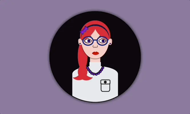
- Resizes (decreases) the width of an element (X-axis).
.scale-content {
  ...
  transition: transform 4s;
  &:hover {
    cursor: pointer;
    transform: scaleX(0.2);
  }
  .avatar-container {
    ...
  } /* end of avatar-container */
} /* end of scale-content */
transform: scale(Y) increase or decrease height
- Resizes (increases) the height of an element (Y-axis).
.scale-content {
  ...
  transition: transform 4s;
  &:hover {
    cursor: pointer;
    transform: scaleY(2);
  }
  .avatar-container {
    ...
  } /* end of avatar-container */
} /* end of scale-content */
- Resizes (decreases) the height of an element (Y-axis).
.scale-content {
  ...
  transition: transform 4s;
  &:hover {
    cursor: pointer;
    transform: scaleY(0.5);
  }
  .avatar-container {
    ...
  } /* end of avatar-container */
} /* end of scale-content */
Complete avatar code
Below, I include my HTML and CSS avatar code.
<section class="avatar-container">
  <div class="hair-back"></div>
  <div class="face">
    <div class="ear ear-left">
      <div class="earing earing-left"></div>
    </div>
    <div class="ear ear-right">
      <div class="earing earing-right"></div>
    </div>
    <div class="eyebrow eyebrown-left"></div>
    <div class="eyebrow eyebrown-right"></div>
    <div class="hair-front"></div>
    <div class="hair-long"></div>
    <div class="hairband">
      <div class="bow-big"></div>
      <div class="bow-small"></div>
    </div>
    <div class="eye eye-left">
      <div class="eyelash eyelash--left"></div>
      <div class="eyelash eyelash--left1"></div>
      <div class="eyelash eyelash--left2"></div>
      <div class="eyelash eyelash--left3"></div>
      <div class="eyelash eyelash--left4"></div>
    </div>
    <div class="eye eye-right">
      <div class="eyelash eyelash--right"></div>
      <div class="eyelash eyelash--right1"></div>
      <div class="eyelash eyelash--right2"></div>
      <div class="eyelash eyelash--right3"></div>
      <div class="eyelash eyelash--right4"></div>
    </div>
    <div class="eye-glasses eye-glasses-left"></div>
    <div class="eye-glasses eye-glasses-right"></div>
    <div class="nose"></div>
    <div class="lips"></div>
  </div>
  <div class="avatar-body">
    <div class="neck"></div>
    <div class="t-shirt">
      <div class="pocket"></div>
    </div>
    <div class="neckless">
      <div class="perl perl--perl1"></div>
      <div class="perl perl--perl2"></div>
      <div class="perl perl--perl3"></div>
      <div class="perl perl--perl4"></div>
      <div class="perl perl--perl5"></div>
      <div class="perl perl--perl6"></div>
      <div class="perl perl--perl7"></div>
      <div class="perl perl--perl8"></div>
      <div class="perl perl--perl9"></div>
      <div class="perl perl--perl10"></div>
    </div>
  </div>
</section>$body-color: #8e7d9e;
$container-color: #0f0b0f;
$skin-color: #fbd0c3;
$hair-color: #ec3535;
$eyebrow-color: #5b3a3a;
$hairband-color: #091845;
$bow-big-color: #2d2b78;
$bow-small-color: #9914d2;
$eye-base-color: #f1f1f1;
$eyeline-color: #5b3a3a;
$eyelash-color: #6d4646;
$iris-color: #000;
$eye-glasses-color: #0d2b85;
$nose-color: #383737;
$lips-color: #e41202;
$t-shirt-color: #e6e9ee;
$button-color: #2d2a2a;
$perl-color: #8314d2;
* {
margin: 0;
padding: 0;
box-sizing: border-box;
}
html,
body {
height: 100%;
}
body {
display: flex;
align-items: center;
justify-content: center;
background-color: $body-color;
}
.avatar-container {
position: relative;
width: 320px;
height: 320px;
background-color: $container-color;
border: 2px solid black;
box-shadow: 0 0 10px;
border-radius: 50%;
overflow: hidden;
.hair-back {
position: absolute;
width: 106px;
height: 110px;
border-radius: 50%;
top: 30px;
left: 50%;
transform: translate(-50%);
background-color: $hair-color;
&:before {
content: "";
position: absolute;
width: 34px;
height: 100px;
border-radius: 60%;
background-color: $hair-color;
top: 74px;
left: -8px;
}
} // end of hair-back
.face {
position: absolute;
width: 100px;
height: 110px;
border-radius: 100% / 70% 70% 140% 140%;
background-color: $skin-color;
top: 54px;
left: 50%;
transform: translate(-50%);
box-shadow: 0 0.5px 3px;
z-index: 2;
.ear {
position: absolute;
width: 12px;
height: 22px;
background-color: $skin-color;
border-radius: 40%;
top: 40px;
z-index: 6;
&.ear-left {
left: -9px;
transform: rotate(-6deg);
&:before {
content: "";
position: absolute;
width: 7px;
height: 10px;
background-color: $skin-color;
border-radius: 40%;
box-shadow: inset 1px 1px 1px darken($skin-color, 15%);
top: 3px;
left: 2px;
}
}
&.ear-right {
right: -9px;
transform: rotate(6deg);
&:before {
content: "";
position: absolute;
width: 7px;
height: 10px;
background-color: $skin-color;
border-radius: 40%;
box-shadow: inset -1px 1px 1px darken($skin-color, 15%);
top: 3px;
right: 2px;
}
}
.earing {
position: absolute;
width: 5px;
height: 5px;
background-color: $perl-color;
border: 1px solid black;
border-radius: 50%;
z-index: 7;
top: 15px;
&.earing-left {
left: 3px;
}
&.earing-right {
right: 3px;
}
} // end of earings
} // end of ears
.eyebrow {
position: absolute;
width: 34px;
height: 10px;
border: solid 3px $eyebrow-color;
border-color: $eyebrow-color transparent transparent transparent;
top: 28px;
z-index: 3;
&.eyebrown-left {
left: 7px;
border-radius: 50%/5px 10px 0 0;
}
&.eyebrown-right {
right: 7px;
border-radius: 50%/10px 5px 0 0;
}
} // end of eyebrows
.hair-front {
position: absolute;
z-index: 10;
width: 80px;
height: 36px;
border-radius:50%;
top: -7px;
left: -14px;
background-color: $hair-color;
transform: rotate(-50deg);
z-index: 4;
&:before {
content: "";
position: absolute;
z-index: 10;
width: 70px;
height: 30px;
border-radius:50%;
top: 44px;
right: -23px;
background-color: $hair-color;
transform: rotate(-85deg);
}
} // end of hair-front
.hair-long {
position: absolute;
width: 60px;
height: 60px;
border-radius: 60%;
box-shadow: 20px 12px 0 0 $hair-color;
z-index: -1;
top: 116px;
left: 10px;
transform: rotate(122deg);
&:before {
content: "";
position: absolute;
width: 60px;
height: 60px;
border-radius: 60%;
box-shadow: 20px 12px 0 0 $hair-color;
z-index: 100;
top: 58px;
left: 37px;
transform: rotate(230deg);
}
} // end of hair-long
.hairband {
position: absolute;
width: 100px;
height: 100px;
border-radius: 60%;
box-shadow: 4px 4px 0 0 $hairband-color;
z-index: 10;
top: -5px;
transform: rotate(225deg);
.bow-big {
position: absolute;
width: 10px;
height: 14px;
background-color: $bow-big-color;
border-radius: 50%;
transform: rotate(90deg);
top: 40px;
left: 96px;
z-index: 10;
&:before {
content: "";
position: absolute;
width: 0;
height: 0;
border-top: 10px solid transparent;
border-left: 20px solid $bow-big-color;
border-bottom: 10px solid transparent;
border-radius: 30%;
top: -4px;
left: -10px;
}
&:after {
content: "";
position: absolute;
width: 0;
height: 0;
border-top: 10px solid transparent;
border-right: 20px solid $bow-big-color;
border-bottom: 10px solid transparent;
border-radius: 30%;
top: -4px;
right: -10px;
}
}
.bow-small {
position: absolute;
width: 6px;
height: 10px;
background-color: $bow-small-color;
border-radius: 50%;
transform: rotate(90deg);
top: 42px;
left: 98px;
z-index: 10;
&:before {
content: "";
position: absolute;
width: 0;
height: 0;
border-top: 6px solid transparent;
border-left: 16px solid $bow-small-color;
border-bottom: 6px solid transparent;
border-radius: 30%;
top: -2px;
left: -10px;
}
&:after {
content: "";
position: absolute;
width: 0;
height: 0;
border-top: 6px solid transparent;
border-right: 16px solid $bow-small-color;
border-bottom: 6px solid transparent;
border-radius: 30%;
top: -2px;
right: -10px;
}
}
} // end of hairband
.eye {
position: absolute;
width: 20px;
height: 20px;
top: 38px;
background-color: $eye-base-color;
border: 2px solid $eyeline-color;
border-radius: 75% 0%;
transform: rotate(45deg);
&:before {
content: "";
position: absolute;
width: 10px;
height: 10px;
top: 50%;
left: 50%;
transform: translate(-30%, -70%);
background: radial-gradient(circle, purple, blue);
box-shadow: inset 0 0 3px;
border-radius: 50%;
}
&.eye-left {
left: 15px;
box-shadow: -1px 1px 2px darken($eyeline-color, 10%);
}
&.eye-right {
right: 15px;
box-shadow: 1px -1px 2px darken($eyeline-color, 10%);
}
&:after {
content: "";
position: absolute;
width: 4px;
height: 4px;
top: 50%;
left: 50%;
transform: translate(20%, -120%);
background-color: $iris-color;
border-radius: 50%;
}
.eyelash {
position: absolute;
width: 1px;
height: 5px;
background-color: $eyelash-color;
&--left,
&--left1,
&--left2,
&--left3,
&--left4 {
transform: rotate(90deg);
}
&--left {
top: -2px;
left: 2px;
}
&--left1 {
top: 2px;
left: -2px;
}
&--left2 {
top: 6px;
left: -4px;
}
&--left3 {
top: 10px;
left: -5px;
}
&--left4 {
top: 14px;
left: -5px;
}
&--right {
top: -1px;
right: 15px;
}
&--right1 {
top: -4px;
right: 11px;
}
&--right2 {
top: -7px;
right: 7px;
}
&--right3 {
top: -8px;
right: 3px;
}
&--right4 {
top: -8px;
right: -1px;
}
}
} // end of eye
.eye-glasses {
position: absolute;
width: 40px;
height: 34px;
border: 4px solid $eye-glasses-color;
top: 31px;
z-index: 5;
border-radius: 50%;
&.eye-glasses-left {
left: 5px;
&:before {
content: "";
position: absolute;
width: 14px;
height: 4px;
background-color: $eye-glasses-color;
top: 8px;
left: 35px;
}
&:after {
content: "";
position: absolute;
width: 9px;
height: 3px;
background-color: $eye-glasses-color;
top: 8px;
left: -9px;
}
}
&.eye-glasses-right {
right: 5px;
&:after {
content: "";
position: absolute;
width: 9px;
height: 3px;
background-color: $eye-glasses-color;
top: 8px;
right: -10px;
}
}
} // end of eyeglasses
.nose {
position: absolute;
width: 8px;
height: 8px;
border-radius: 50%;
box-shadow: 1px 1px 0 0 $nose-color;
top: 62px;
left: 46px;
transform: rotate(45deg);
&:before {
content: "";
position: absolute;
width: 10px;
height: 10px;
border-radius: 60%;
box-shadow: 1px 1px 0 0 $nose-color;
top: 1px;
left: -2px;
transform: rotate(75deg);
}
&:after {
content: "";
position: absolute;
width: 10px;
height: 10px;
border-radius: 50%;
box-shadow: 1px 1px 0 0 $nose-color;
top: -3px;
right: -3px;
transform: rotate(-65deg);
}
} // end of nose
.lips {
position: absolute;
width: 18px;
height: 18px;
border-radius: 90% 0;
background-color: darken($lips-color, 1%);
top: 90px;
left: 50%;
transform: rotate(45deg) translate(-60%);
&:before {
content: "";
position: absolute;
width: 0;
height: 0;
border-left: 3px solid transparent;
border-right: 3px solid transparent;
border-top: 3px solid $skin-color;
border-radius: 60%;
transform: rotate(-45deg);
top: 24%;
left: 12%;
}
} // end of lips
} // end of face
.avatar-body {
.neck {
position: absolute;
width: 36px;
height: 50px;
background-color: $skin-color;
top: 150px;
left: 50%;
transform: translate(-50%);
z-index: 1;
&:before {
content: "";
position: absolute;
width: 40px;
height: 34px;
border-radius: 2px 2px 50% 50%;
background-color: $t-shirt-color;
top: 26px;
left: -2px;
}
} // end of neck
.t-shirt {
position: absolute;
width: 160px;
height: 140px;
background-color: $t-shirt-color;
border-radius: 100% / 40% 40% 20% 20%;
top: 190px;
left: 50%;
transform: translate(-50%);
.pocket {
position: absolute;
width: 32px;
height: 40px;
background-color: $t-shirt-color;
box-shadow: 0 0 2px;
border: 2px solid black;
border-radius: 20%;
top: 50px;
left: 100px;
&:before {
content: "";
position: absolute;
width: 30px;
height: 12px;
background-color: $t-shirt-color;
box-shadow: 0 0 2px;
border: 2px solid black;
border-radius: 20%;
top: -4px;
left: -3px;
}
&:after {
content: "";
position: absolute;
width: 5px;
height: 5px;
background-color: $button-color;
box-shadow: 0 0 2px;
border: 2px solid black;
border-radius: 50%;
top: 0px;
left: 9px;
}
} // end of pocket
} // end of t-shirt
.neckless {
position: absolute;
width: 50px;
height: 50px;
border-radius: 50%;
box-shadow: 2px 2px 0 transparent;
top: 167px;
left: 50%;
transform: translate(-50%) rotate(45deg);
z-index: 10;
.perl {
position: absolute;
width: 10px;
height: 10px;
border-radius: 50%;
border: 2px solid black;
background-color: $perl-color;
&--perl1 {
top: 4px;
left: 42px;
}
&--perl2 {
top: 42px;
left: 4px;
}
&--perl3 {
top: 12px;
left: 44px;
}
&--perl4 {
top: 44px;
left: 12px;
}
&--perl5 {
top: 20px;
left: 45px;
}
&--perl6 {
top: 45px;
left: 20px;
}
&--perl7 {
top: 28px;
left: 45px;
}
&--perl8 {
top: 45px;
left: 28px;
}
&--perl9 {
top: 36px;
left: 42px;
}
&--perl10 {
top: 42px;
left: 35px;
}
} // end of perl
} // end of neckless
} // end of body
} // end of avatar-container
🌼 Hope you found my post interesting and helpful. Thanks for being here! 🌼
