
Hey there! 😃 Exploring CSS linear gradient techniques is a fantastic approach to fashion vibrant, colorful mixtures. Gradients give us the flexibility to choose any desired direction, defined by their starting and ending points. Mixing a minimum of two colors is fundamental, yet the potential for blending expands further, enabling us to achieve seamless transitions or pronounced shifts based on our design requirements.
Today let’s dive into the exciting world of CSS linear gradient techniques. 🌈✨ Picture a smooth transition of colors in a straight line, adding a sleek and dynamic touch to your web design. With linear gradients, you can smoothly transition between colors. You have the power to guide the eye seamlessly from one color to another. Whether it’s a subtle shift or a striking contrast, mastering linear gradients empowers you to enhance the visual appeal of your web projects.
Ready to discover 🔍 the art and versatility behind linear gradients? Let’s get started! 💻
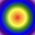
Definition of a radial gradient
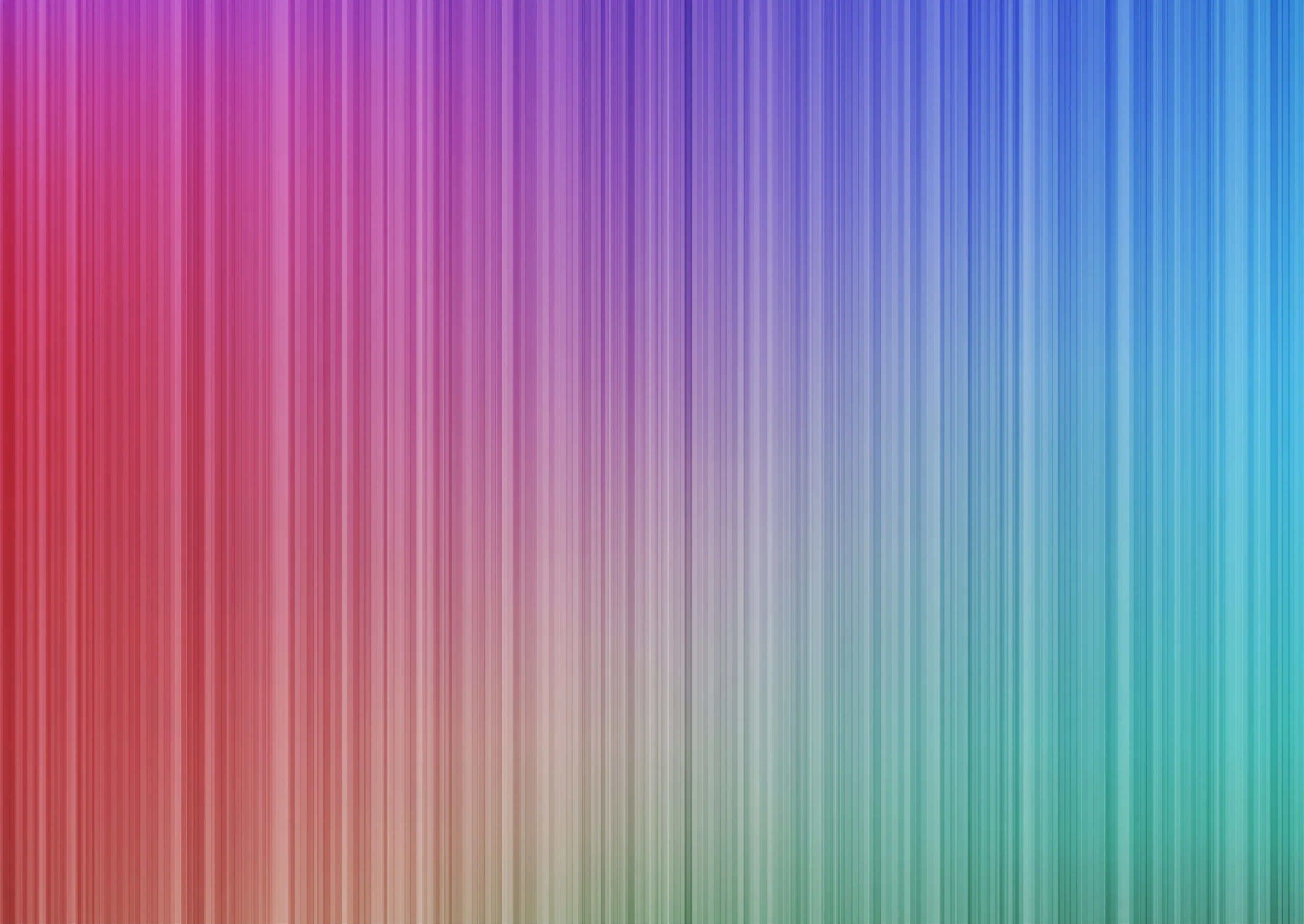
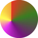
A linear gradient is a visual effect that allows us to smoothly shift between colors in a straight line inside any shape we want. It’s like blending multiple colors together in a straight line pattern, allowing us to create colorful and visually appealing backgrounds or effects for elements on our website.
A linear gradient is a visual effect that allows us to smoothly shift between colors in a straight line inside any shape we want
The default CSS linear gradient
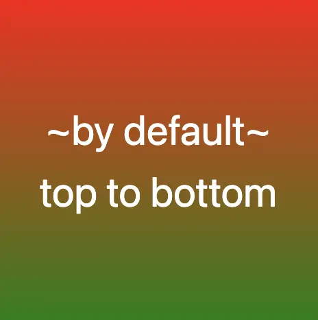
We will begin our exploration with the default linear gradient, characterized by its top-to-bottom direction. The following code snippet and image provide a clear representation.
.linear-default {
  background-image: linear-gradient(red, green);
}

/* we are free to use "deg" too */
.linear-default {
  background-image: linear-gradient(180deg, red, green);
}
From side to side
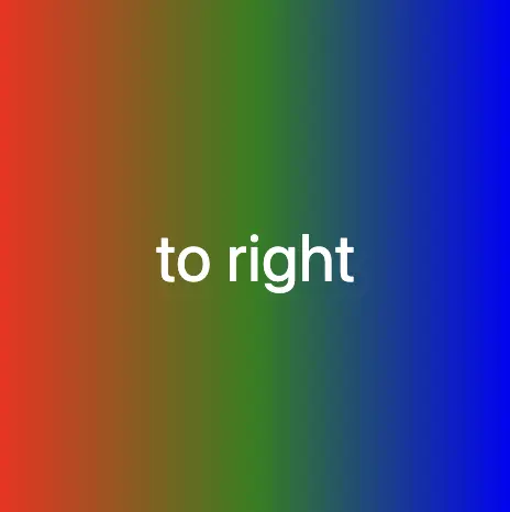
We can adjust the direction of our gradients whenever we need to. To help you understand this better, take a look at the example below, where we changed the default direction to to right.
We are also free to choose any direction we want to top , to right , to bottom (the default direction), to left.
.linear-to-top {
  background-image: linear-gradient(to right, red, green, blue);
}
From corner to corner
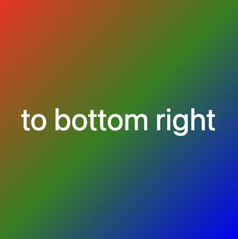
At any point, we also have the flexibility to alter the orientation of our gradients along the diagonal path. To illustrate this concept, consider the following example with the to bottom right direction.
Here colors would spread from the top-left corner to the bottom-right corner. We can combine any corner with its adjacent sides, to top left, to top right, to bottom left, and to bottom right.
.linear-to-corner {
  background-image: linear-gradient(to bottom right, red, green, blue);
}
You may also like 🎬

CSS Linear gradient using percentages %
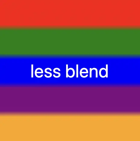
With less blend
If we want to create a linear gradient with less blending (colors have more distinct limits this way) and maintain the same space for each color, we can use equal specific stops in the gradient by adding % percentages.
.linear-less-blend {
  background-image: linear-gradient(
    red 0%, red 18%,
    green 22%, green 38%,
    blue 42%, blue 58%,
    purple 62%, purple 78%,
    orange 82%, orange 100%
  );
}🕵️♂️ In this example, I’ve divided the space into 5 segments, but I left a 4% blend among each space in order to create a smooth but small transition.
The percentages between the color stops determine how smooth the transition between colors is.
- Red (0% – 18%): defines a red color stop that starts at 0% and ends at 18% of the gradient.
- Between 18% and 22%, there is no specific color stop defined. This gap represents a transition zone where the gradient transitions smoothly from red to green.
- Green 22%, green 38%): defines a green color stop that starts at 22% and ends at 38% of the gradient.
- Between 38% and 42%, there is no specific color stop defined. This gap represents a transition zone where the gradient transitions smoothly from green to blue.
- Blue (42% – 58%): defines a blue color stop that starts at 42% and ends at 58% of the gradient.
- Between 58% and 62%, there is no specific color stop defined. This gap represents a transition zone where the gradient transitions smoothly from blue to purple.
- Purple (62% – 78%): defines a purple color stop that starts at 62% and ends at 78% of the gradient.
- Between 78% and 82%, there is no specific color stop defined. This gap represents a transition zone where the gradient transitions smoothly from purple to orange.
- Orange (82% – 100%): defines an orange color stop that starts at 82% and ends at 100% of the gradient.
Without blend
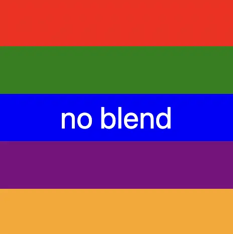
Finally, it is really useful to know that we are able to create non-smooth transitions. In the following example, we will see a gradient with distinct color stops at specific percentage intervals, resulting in a distinct color transition from red to orange. Each color stop abruptly changes to the next color at the defined percentage points.
.linear-no-blend {
  background-image: linear-gradient(
    red 0%, red 20%,
    green 20%, green 40%,
    blue 40%, blue 60%,
    purple 60%, purple 80%,
    orange 80%, orange 100%
  );
}🕵️♂️ In this example, I’ve divided the space into 5 equal segments without blending among each other. So, we create multiple color stops without transitions.
- Red (0% – 20%): defines a red color stop that starts at 0% and ends at 20% of the gradient.
- Green (20% – 40%): defines a green color stop that starts at 20% and ends at 40% of the gradient.
- Blue (40% – 60%): defines a blue color stop that starts at 40% and ends at 60% of the gradient.
- Purple (60% – 80%): defines a purple color stop that starts at 60% and ends at 80% of the gradient.
- Orange (80% – 100%): defines an orange color stop that starts at 80% and ends at 100%
🌼 Hope you found my post interesting and helpful. Thanks for being here! 🌼
