
Hello there! 😃 In this post, we’ll explore the unique CSS box sizing property, which is a part of the box model. We’ll explore how this property affects the size of an element on a webpage and take a closer look at the details of the content-box and border-box CSS properties.
So, let’s move forward and delve into 🕵️♀️ the powerful box-sizing CSS property!
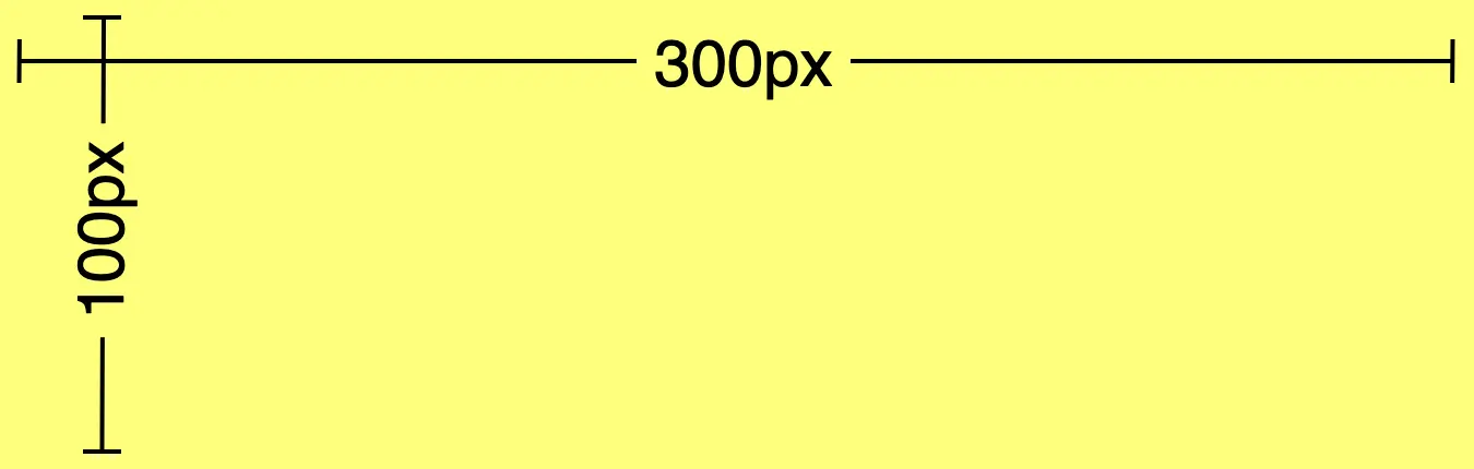
First of all, we have to create a simple box with specific dimensions for its width and height. Also, assigning a color for our box would be essential, hence, we also need to set a background-color. I like the idea of giving our box a vibrant and cheerful yellow 🟨 as it is super appealing! 😃
.box {
  width: 300px;
  height: 100px;
  background-color: yellow;
}
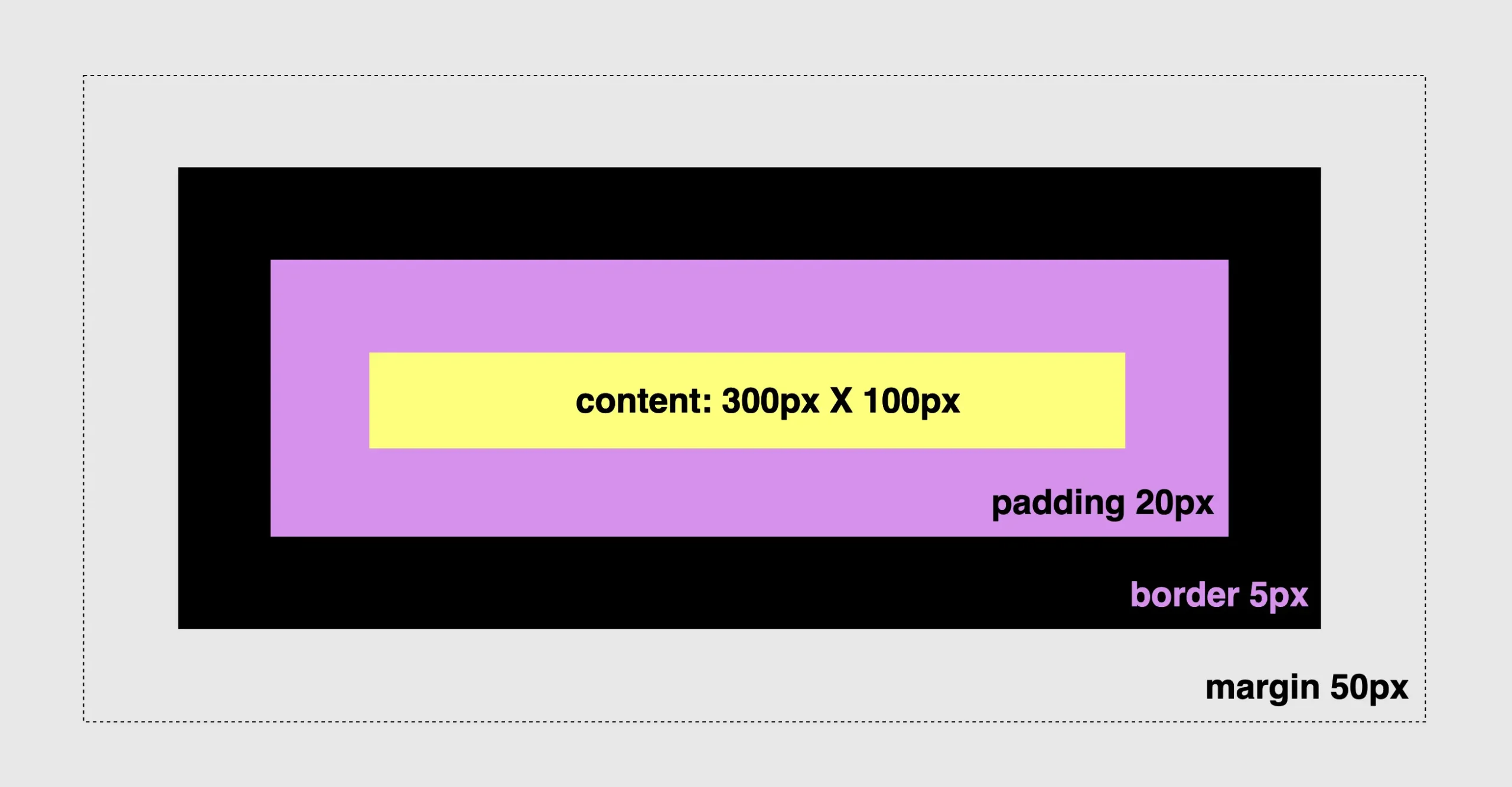
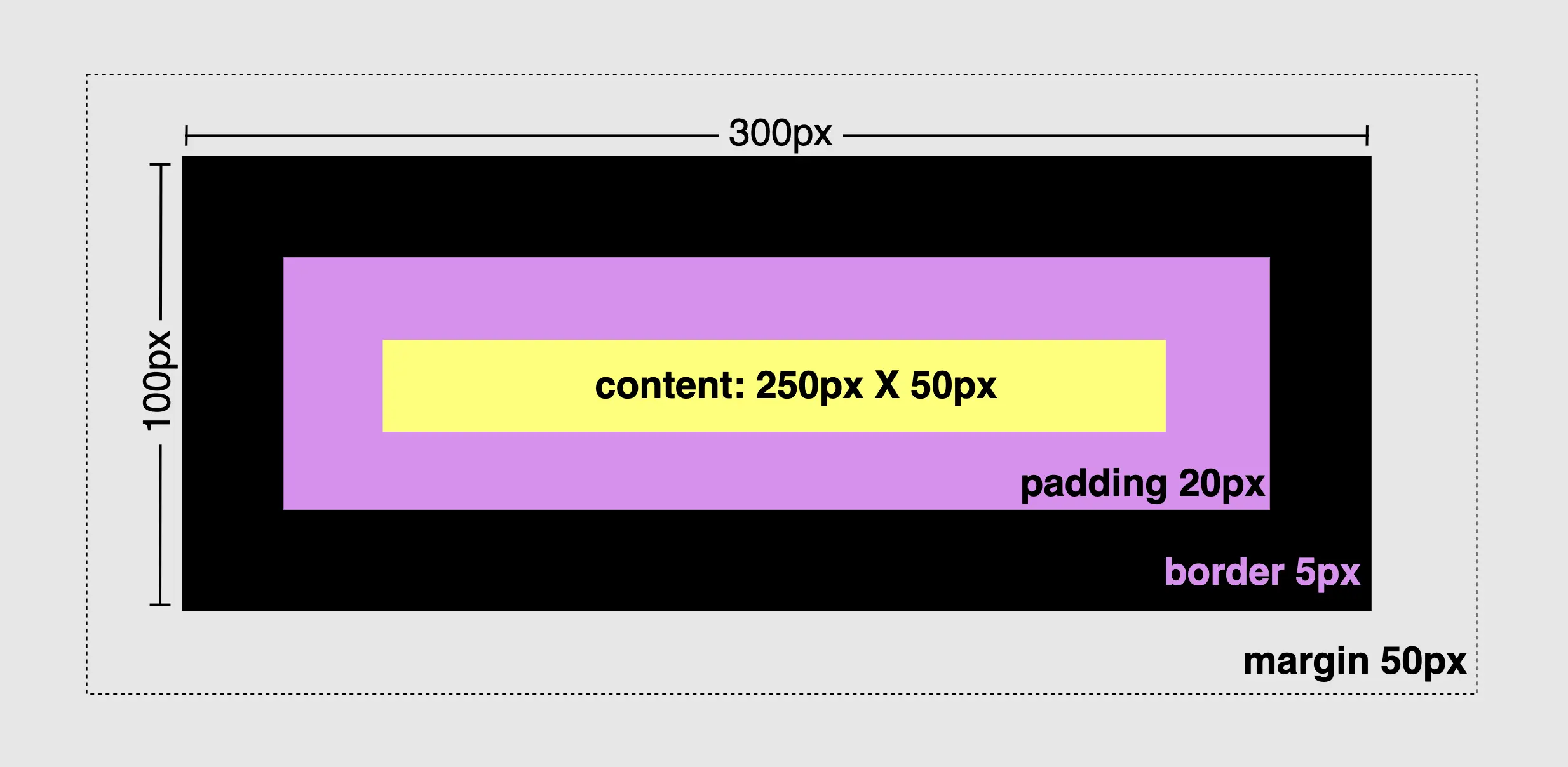
Since our box is now prepared, 🥁 we can proceed further by adding padding, border and margin and observe the changes in the dimensions surrounding our box.
Paddings & margins are both transparent. Paddings use the same background as the one used by the main content, while margins inherit their background from the parent element to which they belong.
🔖 For today, and only in order to make our example more explicit and easily understandable, we have chosen to apply a purple 🟪 color to the padding. In the image below we can see what is rendered to our screen based on the code snippet.
.box {
  ...
  padding: 20px; /* to all 4 sides */
  border: 5px solid black; /* to all 4 sides */
  margin: 50px; /* to all 4 sides */
}
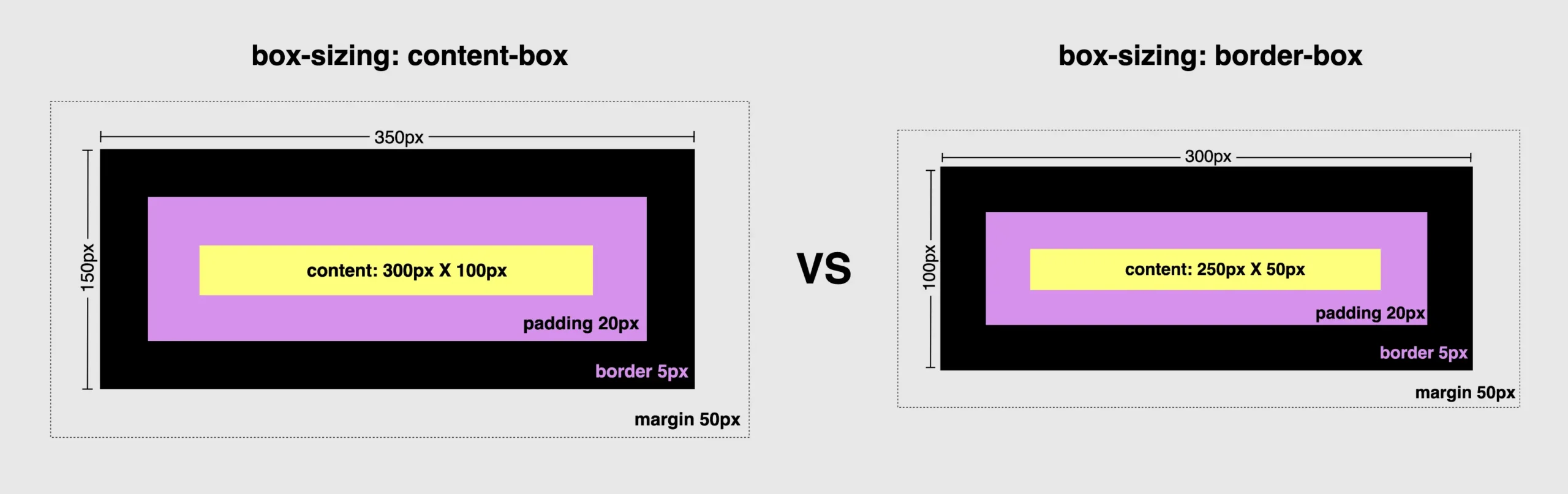
Understanding CSS content-box
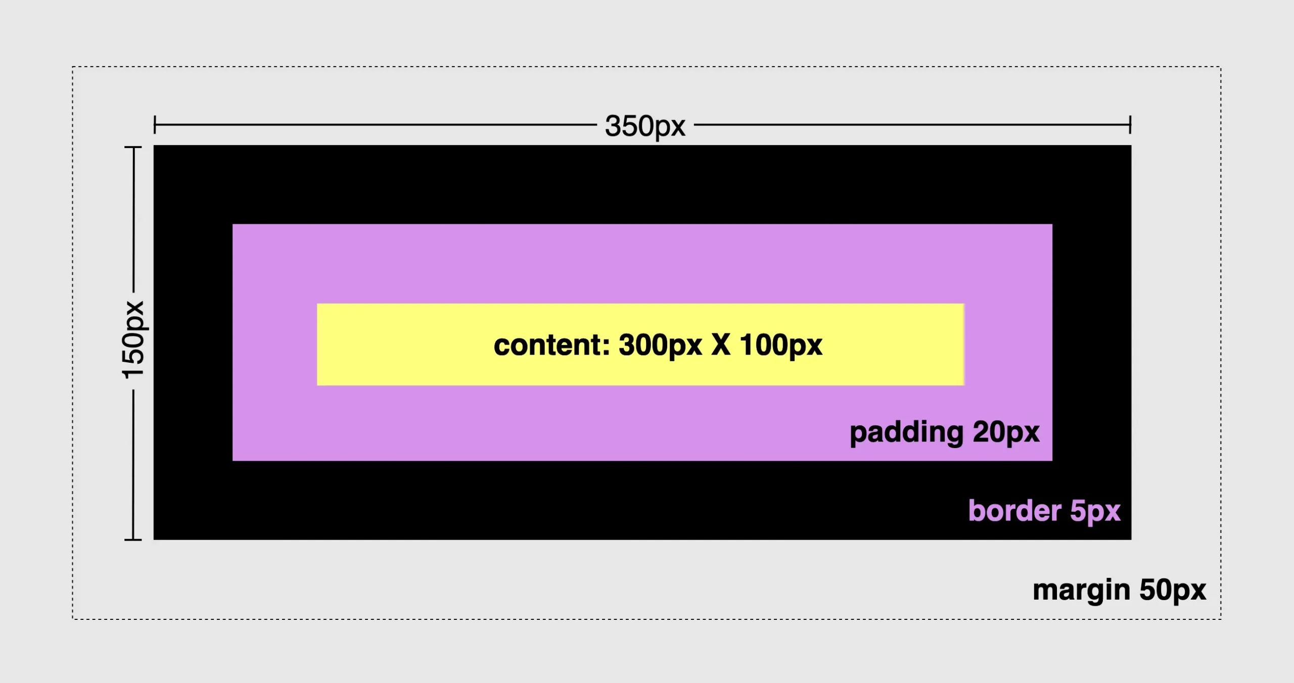
First and foremost, we need to know that all elements have, by default, box-sizing: content-box. That means when we add border and padding to an element, it automatically grows bigger and occupies more place.
(The provided code snippet serves as an illustration of the configuration. It should be emphasized that this snippet is specifically designed for the purpose of this example, and represents the default setting, as we previously mentioned).
The box-sizing property does not have any effect on margins as they are already positioned outside of the element’s space and are not considered part of it.
You may also like 🎬


Calculate dimensions 🕵️♀️
width: ➡ 300px (box’s width) + 40px (20px padding-left + 20px padding-right)+ 10px (5px border-left + 5px border-right) = 350px;
heigth: ➡ 100px (box’s height) + 40px (20px padding-top + 20px padding-bottom)+ 10px (5px border-top + 5px border-bottom) = 150px;
.box {
  ...
  box-sizing: border-box;
}
Mastering CSS border-box
To modify the default configuration and include the borders and paddings of an element within its initial size, it is necessary to apply the CSS property box-sizing: border-box. This property ensures that the specified width and height of the element is now adjustable and the content box can reduce its dimensions in order to include/accommodate paddings and borders.
Calculate dimensions 🕵️♀️
width: ➡ 250px (box’s width) + 40px (20px padding-left + 20px padding-right)+ 10px (5px border-left + 5px border-right) = 300px;
heigth: ➡ 50px (box’s height) + 40px (20px padding-top + 20px padding-bottom)+ 10px (5px border-top + 5px border-bottom) = 100px;
.box {
  ...
  box-sizing: border-box;
}
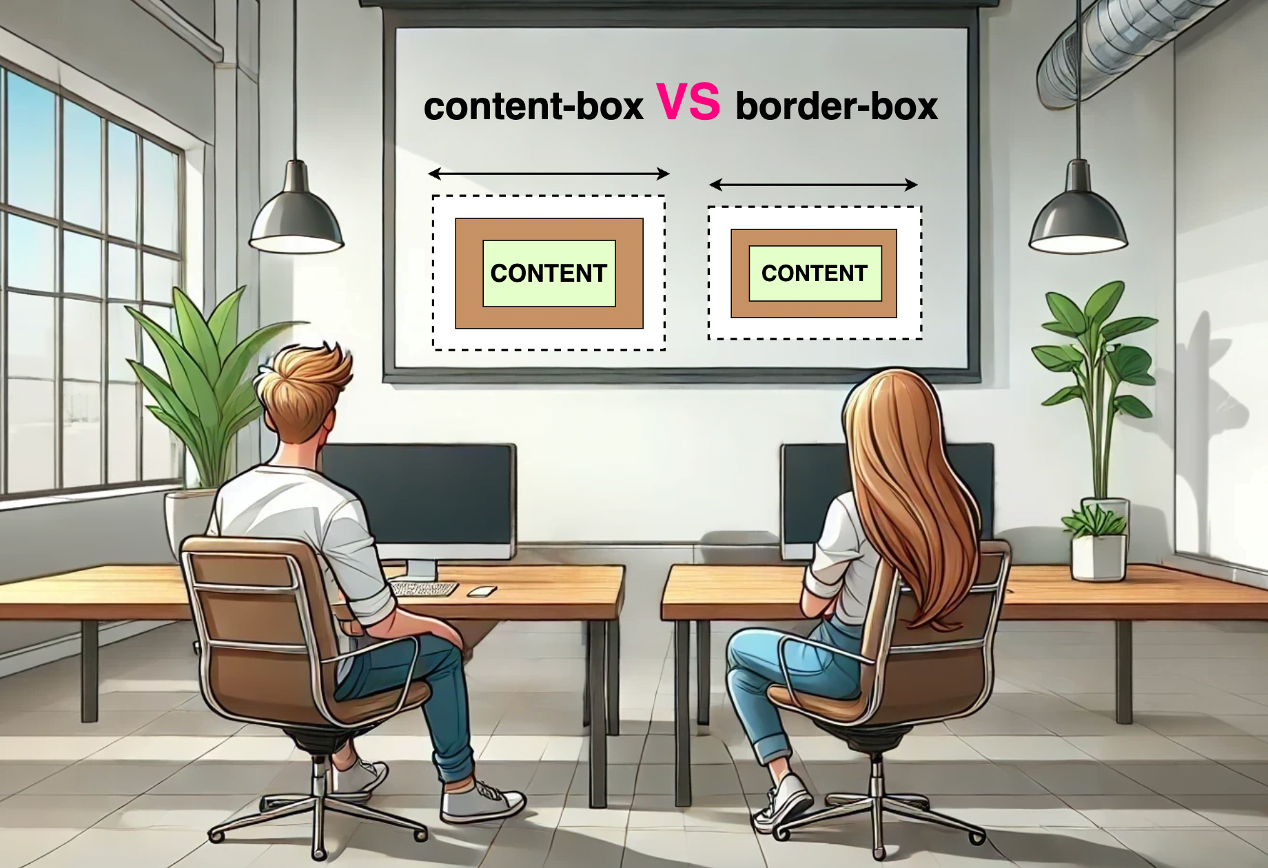
Comparing: content-box VS border-box
To summarize in a nutshell, 😌 content-box calculates the width and height based only on the content while border-box includes the paddings and borders in the calculation.
Let’s examine both images side by side to simplify the contrast of their different sizes.
Tech tips
* {
  box-sizing: border-box;
}🔖 We usually choose the border-box method due to its simplicity in achieving consistent layouts. We include the corresponding code in our CSS files by setting the asterisk (*) from the CSS selectors. By doing so, we apply it to all HTML elements, hence, we no longer need to include it repeatedly in each HTML 👌 element.
🌼 Hope you found my post interesting and helpful. Thanks for being here! 🌼
