
Greetings! 😃 Utilizing CSS radial gradient techniques is a remarkable approach for vibrant, colorful combinations. Gradients give us the liberty to choose any desired direction, defined by a clear starting and ending point. Using a minimum of two colors is essential, but we are free to blend even more based on our needs. This lets us achieve progressions or variations based on our specific requirements.
In today’s post, we will analyze the captivating world of CSS radial gradient techniques. 🌈✨ Imagine colors coming out from a central point, spreading outwards in a circular fashion—an effect 🌀 that can truly elevate your design.
Radial gradients offer a versatile approach to blending colors, creating central points or smooth transitions. By mastering radial gradients, you unlock the potential to infuse depth and excitement into your web design.
Excited to learn more about this captivating technique? Let’s dive 🤿 right in! 💻
Definition of a radial gradient
A radial gradient is a visual effect in which colors blend outward from a central point, creating a smooth transition from one color to another in a circular or elliptical pattern. Circular ones spread colors outward from the center, evenly, making a symmetrical look. Elliptical ones also start from the center but stretch the colors toward the edges, creating an oval appearance.
A radial gradient is a visual effect in which colors blend outward from a central point, creating a smooth transition from one color to another in a circular or elliptical pattern
The default CSS radial gradient
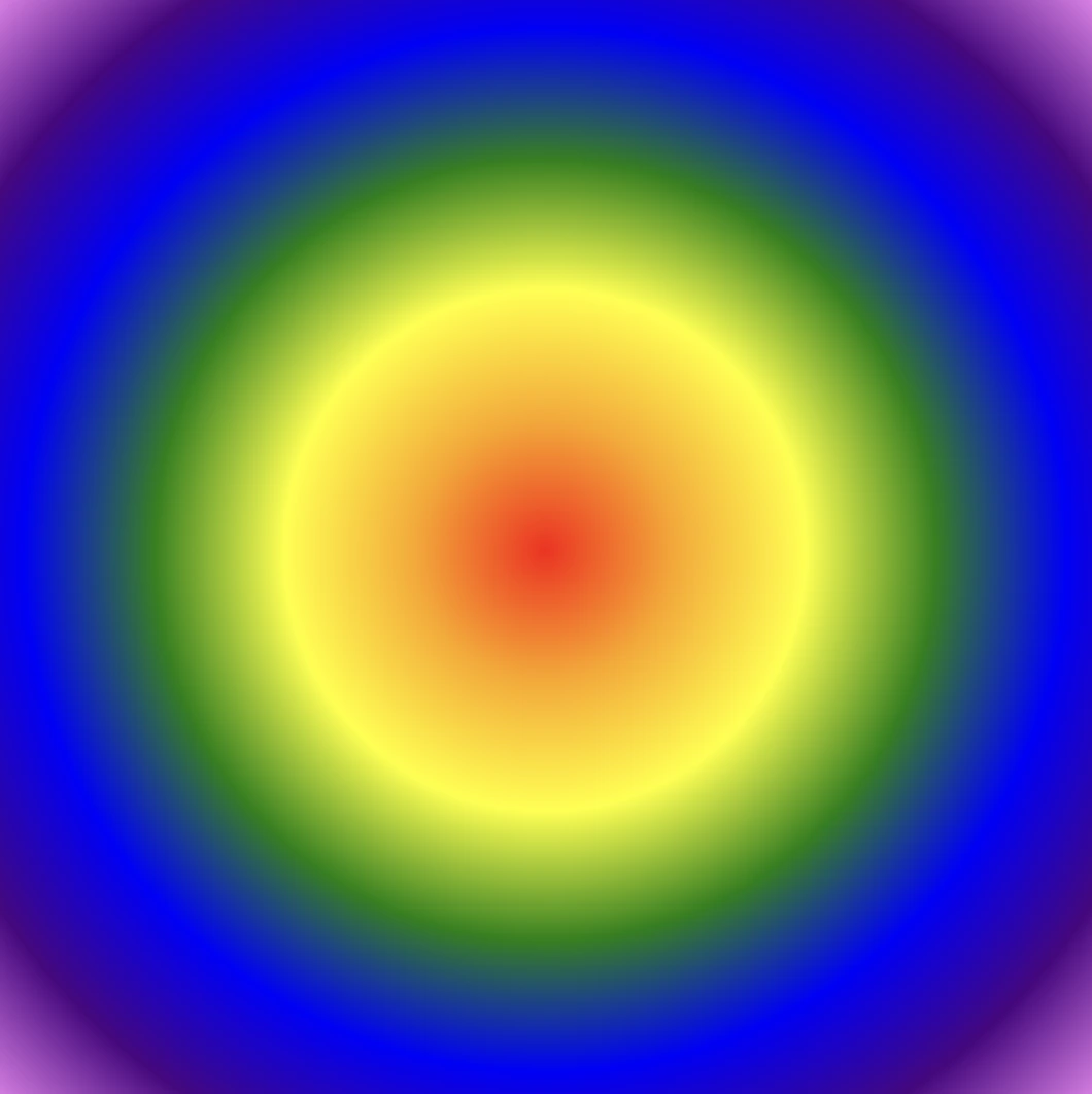
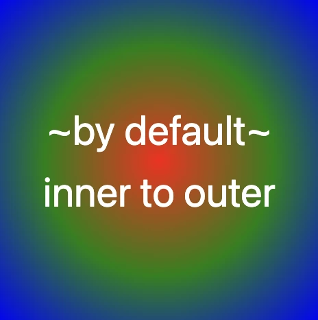
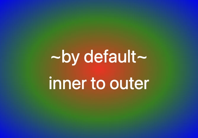
We’ll start by exploring the default orientation for the radial gradient which starts in the center of our elements and spreads outward. To better understand, look at the following piece of code and the pictures that go with it.
The first picture shows a circle, while the second one depicts an ellipse.
.radial-default {
  background-image: radial-gradient(red, green, blue);
}

/* circle default */
.box-square {
  width: 240px;
  height: 240px;
}

/* elliptical default */
.box-rectangle {
  width: 340px;
  height: 240px;
}
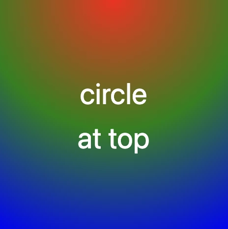
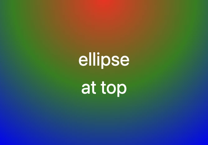
Center at sides
We can change the center of our element by setting circle at left , circle at top , circle at bottom and circle at right. To understand this better we’ve prepared an example. As before, the left picture relates to the circle, whereas the second one refers to the ellipse.
.radial-at-side {
  background-image: radial-gradient(circle at top, red, green, blue);
}

/* circle default */
.box-square {
  width: 240px;
  height: 240px;
}

/* elliptical default */
.box-rectangle {
  width: 340px;
  height: 240px;
}
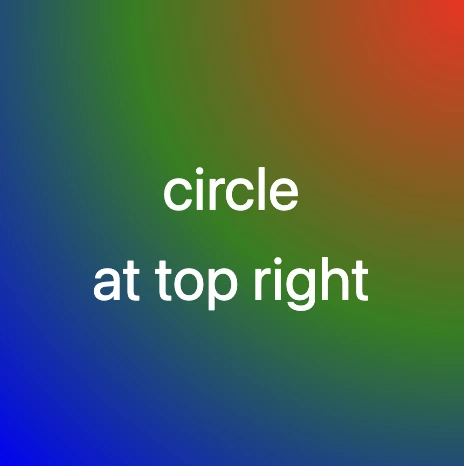
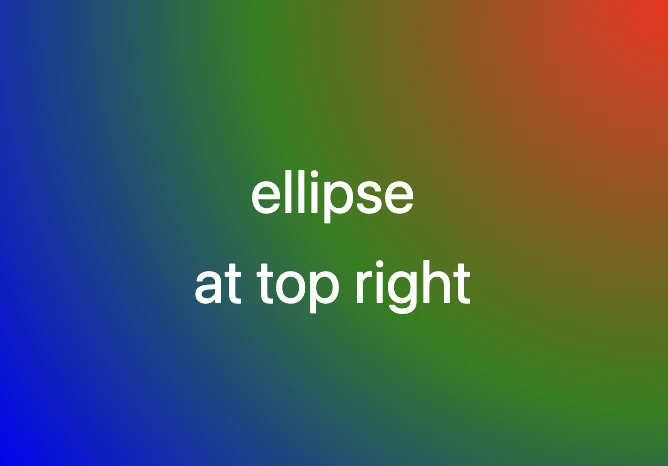
Center at corners
Also, the diagonal direction of our circle can change if we combine any corner with its adjacent sides.
.radial-at-corner {
  background-image: radial-gradient(circle at top right, red, green, blue);
}

/* circle default */
.box-square {
  width: 240px;
  height: 240px;
}

/* elliptical default */
.box-rectangle {
  width: 340px;
  height: 240px;
}
You may also like 🎬

CSS Radial gradient using %
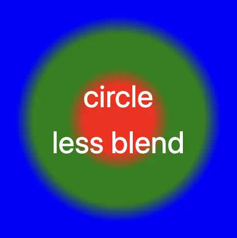
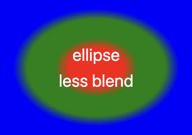
With less blend
We are also up to play with the blend we want to create. In the following example, the gradient blends between various colors in a circular pattern, it begins with red at the center, transitioning to green, then blue, purple, and finally orange at the outer edge.
.radial-less-blend {
  background-image: radial-gradient(
    red 0%, red 20%,
    green 30%, green 50%,
    blue 60%, blue 100%
  );
}

/* circle default */
.box-square {
  width: 240px;
  height: 240px;
}

/* elliptical default */
.box-rectangle {
  width: 340px;
  height: 240px;
}🕵️♂️ In this example, I’ve divided the space into 3 sections. I left a 10% blend in each space in order to create a smooth small transition. The percentages between the color stops, determine how smoothly the transition between colors happens.
- Red (0%-20%): The gradient starts at the center (0%) with the red color.
- Red to Green (20%-30%): Within this radial range, there is a subtle transition from red to green, creating a visually appealing blend.
- Green (30%-50%): the gradient takes a solid green color.
- Green to Blue (50%-60%): Between this radial distance, there’s a gentle transition from green to blue.
- Blue (60%-100%): Finally, the gradient concludes with a blue hue, providing a vibrant and visually striking finish.
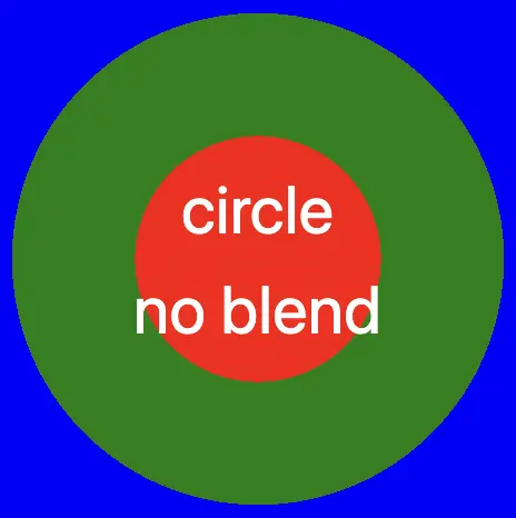
Without blend
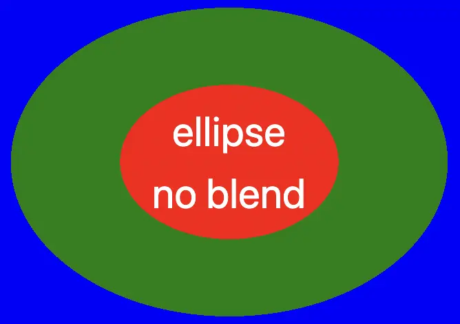
We also have the option to make non-blend gradients. As you can see below, the gradient consists of multiple color stops, transitioning from red to orange in a radial pattern, like colorful rings. Each color is assigned to specific percentage intervals, creating a visually appealing gradient effect.
.radial-no-blend {
  background-image: radial-gradient(
    red 0%, red 33%,
    green 33%, green 66%,
    blue 66%, blue 100%
  );
}

/* circle default */
.box-square {
  width: 240px;
  height: 240px;
}

/* elliptical default */
.box-rectangle {
  width: 340px;
  height: 240px;
}🕵️♂️ In this example, I’ve divided the space into 3 sections. There is no blending among them. We can see a shape like a target, 🎯 that creates clear bands of sharp colors.
- Red: Starts at 0% and ends at 33%.
- Green: Starts at 33% and ends at 66%.
- Blue: Starts at 66% and ends at 100%.
🌼 Hope you found my post interesting and helpful. Thanks for being here! 🌼
