
Imagine infusing your web typography (fonts) with the vibrant hues of a dazzling 🌈✨ rainbow! Cascading Style Sheets (CSS) empower designers and developers to bring this captivating vision to life. A colorful font like the CSS rainbow effect is more than just a spectrum of colors; it’s a creative and dynamic way to enhance your website’s visual appeal and make a lasting impression on your visitors.
Today, with this post, 😃 we’ll dive into the exciting world of creating a rainbow effect, unlocking the magic of colors and typography to elevate your web design. Enjoy! 💻
Prepare basic HTML and CSS structure
We begin with our HTML and CSS structure. We create an HTML <div> element that has a class called rainbow-effect. Then, we set some rules in CSS that are applied to our HTML element. So, let’s move forward and analyze our CSS code snippet.
<body>
  <div class="raibow-effect">rainbow effect</div>
</body>body {
background-color: #050c20; /* deep blue */
}
.rainbow-effect {
text-align: center;
color: white;
font-size: 180px;
font-weight: bold;
font-family: 'Roboto', sans-serif;
}First of all, we set the background color of our body to be a deep blue. Then, we proceed with our text. We create a center aligned, white 180px text with bold and highly legible fonts, as we specifically seek a font with excellent readability.
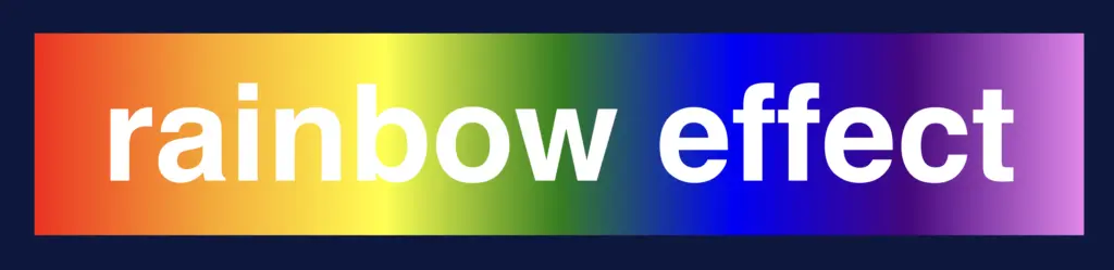
Once set, we can then proceed with our tweaks in order to infuse the text with the enchanting hues of a rainbow. The following image shows what is rendered on the screen for the time being. 😃

Apply the rainbow effect
Within the style rules of the .rainbow-effect, we find specific directives regarding our rainbow effect:
.rainbow-effect {
...
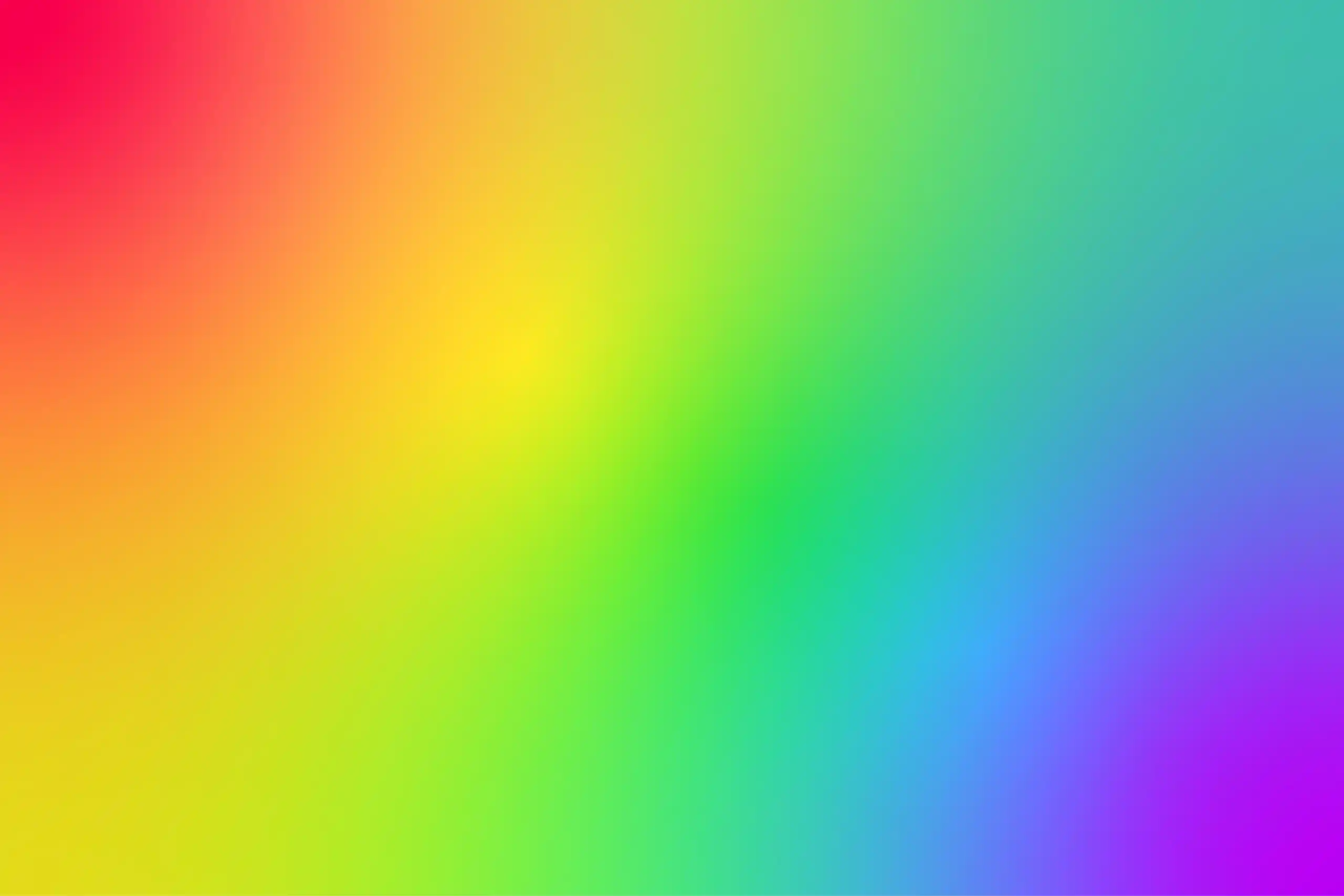
background-image: linear-gradient(
to right, red, orange, yellow, green, blue, indigo, violet
);
background-clip: text;
color: transparent;
}
background-image: linear-gradient
The first thing we need to know is that by using the background-image CSS property we are able to create a background with more than one color.
We do so by setting the linear-gradient value, and we are free to choose any color and any direction we want for our text. In our case, we use the to right direction and the gradient starts with the color red on the left and smoothly transitions through orange, yellow, green, blue, indigo, and violet as it moves from left to right. So, it gives a colorful, horizontal stripe-like background.
You are always free to choose any direction you like! 👍
You may also like 🎬

background-clip: text
We continue our work with the background-clip property which is used to define how the background should be clipped or masked. In our case, it’s set to text, which tells the browser to apply the background gradient only to the text inside our div.
What? Nothing happened yet? Why? Using this property, the colorful background is applied to the text, but the effect is not visible yet because it is necessary to proceed to our next step 🧐 ⬇ in order to achieve the final and desired results. So, let’s move on!
color: transparent
Finally, adding the color property to transparent renders the text itself invisible, allowing the colorful background to show through the text. And there it is! 🥳

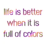
So, in summary, putting it all together, when you use this code, you’ll have a text with a colorful gradient background (rainbow colors) that appears within the text. The text itself is invisible, creating a striking and colorful text effect. 🎉
🌼 Hope you found my post interesting and helpful. Thanks for being here! 🌼
