Hi to everyone 😃 Today, we will analyze the CSS text decoration property, which is a valuable tool for improving the presentation of text on your website. It allows us to add visual enhancements such as underlines for hyperlinks, strikethroughs for completed tasks, or the removal of decoration for a clean and professional appearance.
With minor code adjustments to our CSS code, we can enhance the visual appeal of our text content. Consider integrating it to elevate the aesthetics of our website. Below, I’ve prepared a detailed guide.
Wishing you bug-free reading 👩💻, I mean coding! 💻 ✨
Text-decoration line
First of all, we define the position of the line we desire by setting text-decoration-line. Those are: underline, overline, and line-through.
text-decoration-line: overline;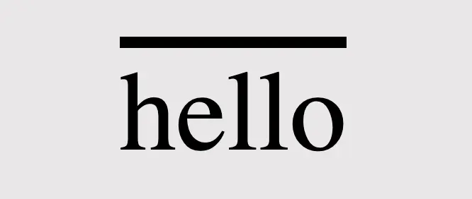
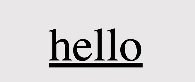
text-decoration-line: underline;/* text-decoration: line-through is also a way to write it */
text-decoration-line: through;

/* we are also able to make line combinations */
text-decoration-line: overline through underline;Text-decoration style
Next, we proceed by configuring text-decoration-style to specify the desired line style, such as solid, dashed, dotted, double, or wavy.
🔖 Each example set a different position (text-decoration-line) for the lines as an opportunity to see more combinations. 😎
text-decoration-line: through;
/* default style */
text-decoration-style: solid;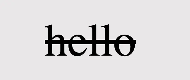
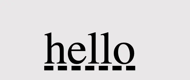
text-decoration-line: underline;
text-decoration-style: dashed;text-decoration-line: overline;
text-decoration-style: dotted;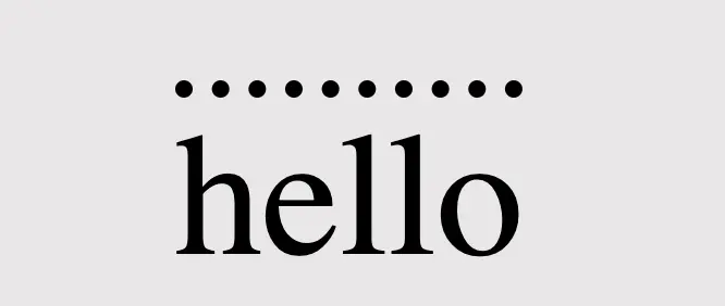
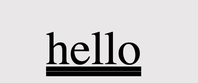
text-decoration-line: double;
text-decoration-style: double;text-decoration-line: overline;
text-decoration-style: wavy;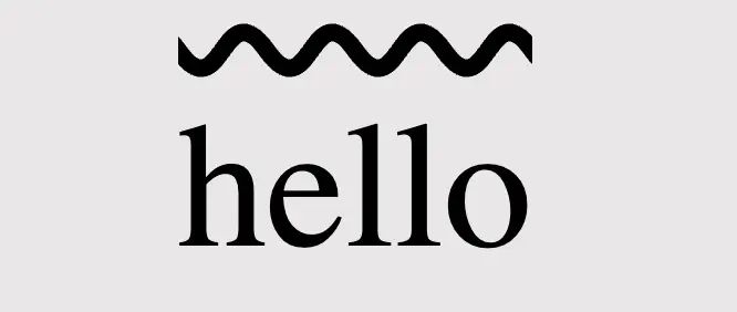
You may also like 🎬
The amazing color property
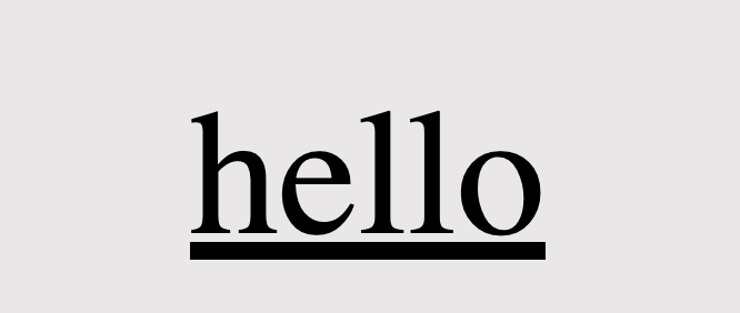
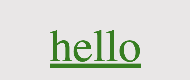
Using colors is a timeless strategy for enhancing aesthetics. Embracing the use of colors is equally effective in our case, accomplished through the addition of text-decoration-color.
/* default color value */
text-decoration-color: black;
/* or */
text-decoration-color: initial;text-decoration-color: orange;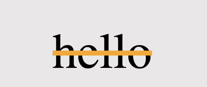
.text-color {
  color: green;
}
/* inherits text's color */
text-decoration-color: current-color;
/* or */
text-decoration-color: inherit;An analytical post about colors 🌈 is now available if you are interested in expanding your knowledge of colors.
Text-decoration thickness
Lastly, adjusting the text-decoration-thickness allows us to precisely manage the thickness and also offers us the flexibility to choose between pixels (px) or percentages (%) based on our preferences.
/* the browser pick the thickness of the text decoration line */
text-decoration-thickness: auto;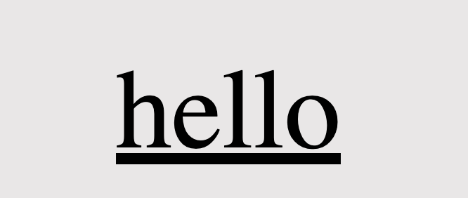
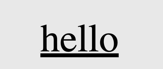
/*  means "use the default thickness for underlines as determined
 *  by the browser".
 */
text-decoration-thickness: initial; /* The percentage value is relative to the font size of the text
* to which the decoration is applied.
* Example:
* In our case the font size is set to 40 pixels,
* so the underline will be 6 pixels thick,
* which is 15% of its font size (15% of 40 pixels)
*/
text-decoration-thickness: 15%;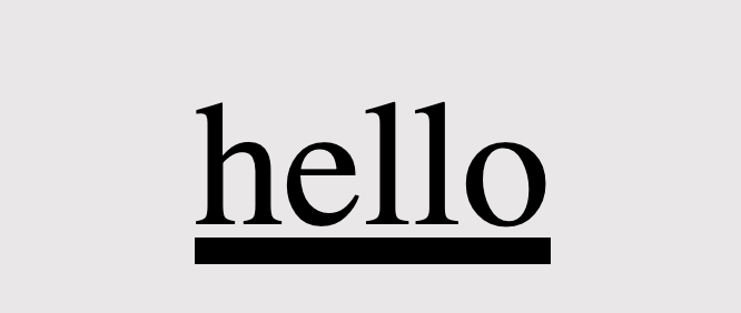
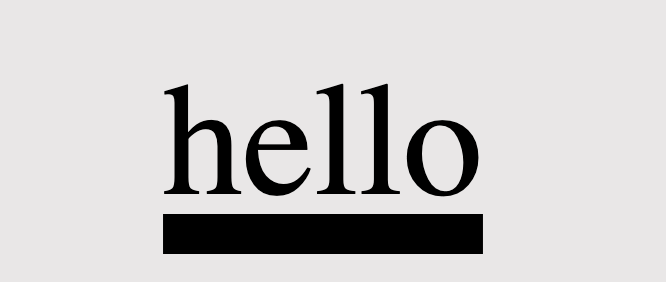
/* override the applied default thickness */
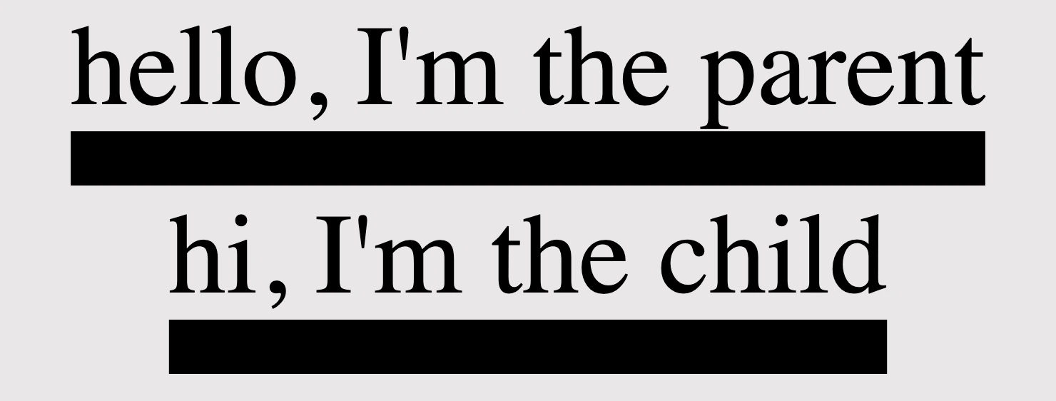
text-decoration-thickness: 10px;<div class="parent">
hello, I'm the parent
<div class="child">hi, I'm the child</div>
</div>/* Thickness for the parent element */
.parent {
text-decoration: underline;
text-decoration-style: solid;
text-decoration-thickness: 20px;
}
/* Inherits thickness from the parent */
.child {
text-decoration-thickness: inherit;
}
Be distinctive by mixing text-decoration
We can always create mixings and make our texts more strong and more stylish. Below I prepared two examples for you in order to make it clearer. 😃
Underline mixings
We combined the following HTML and CSS code snippets to create a styled text element. The HTML part consists of a <div> element with the class underline-mixings containing the text hello and a nested <span> element with the class extra-underline, also containing the text hello.
<div class="underline-mixings">
  hello
  <span class="extra-underline">hello</span>
  hello
</div>.underline-mixings {
text-decoration-line: underline;
text-decoration-style: double;
text-decoration-color: green;
}
.one {
text-decoration-line: underline;
text-decoration-style: dashed;
text-decoration-color: red;
text-decoration-thickness: 12px;
}The CSS styles are applied to these elements using their respective class selectors. The underline-mixingsins class applies an underline with a double style and green color to the text within the <div>.
On the other hand, the extra-underline class applies a red dashed underline to the text within the <span>, along with a 12-pixel thickness for the underline.
When combined, this code creates a styled text element where the text inside the <div> is underlined with a green double line, while the text inside the <span> has a red dashed underline with increased thickness. We can use it if we want to emphasize a specific part of a text.

Strike through mixings
Within the HTML code, there is a <div> element with the class strike-through-mixings, encompassing the text hello and containing a nested <span> element with the class extra-underline, which also contains the text hello.
<div class="strike-through-mixings">
  hello
  <span class="extra-underline">hello</span>
  hello
</div>.strike-through-mixings {
text-decoration-line: underline;
text-decoration-style: solid;
text-decoration-color: green;
}
.two {
text-decoration-line: line-through;
text-decoration-style: double;
text-decoration-color: red;
text-decoration-thickness: 8px;
}The CSS styles are assigned to these elements through their corresponding class selectors. The strike-through-mixings class gives the text within the <div> an underline with a solid style and a green color. Meanwhile, the extra-underline class applies a red double line-through decoration to the text inside the <span>, with an 8-pixel thickness.
When we put together this code, generates a styled text element where the text within the <div> has a green solid underline, and the text within the <span> is displayed with a red double line-through decoration of increased thickness. It is really useful if we want to erase a part of a text.

Text-decoration shorthand
The CSS text-decoration shorthand property lets you apply decorations like underline, overline, and line-through in a single statement. It simplifies things by merging multiple properties into one. Settling the shorthand makes your code shorter and easier to understand. You can set all of these properties at once, making it more efficient or you can pick some of them based on your requirements.
The CSS text-decoration shorthand property lets you apply decorations like underline, overline, and line-through in a single statement
🔖 Note that the order of these values doesn’t matter; you can change the order and still achieve the same results. However, it is essential to specify the type of the line, as setting the text-decoration-line is a necessary step for your code to work properly.
text-decoration: 10px dashed orange underline;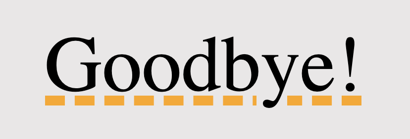
🌼 Hope you found my post interesting and helpful. Thanks for being here! 🌼


