
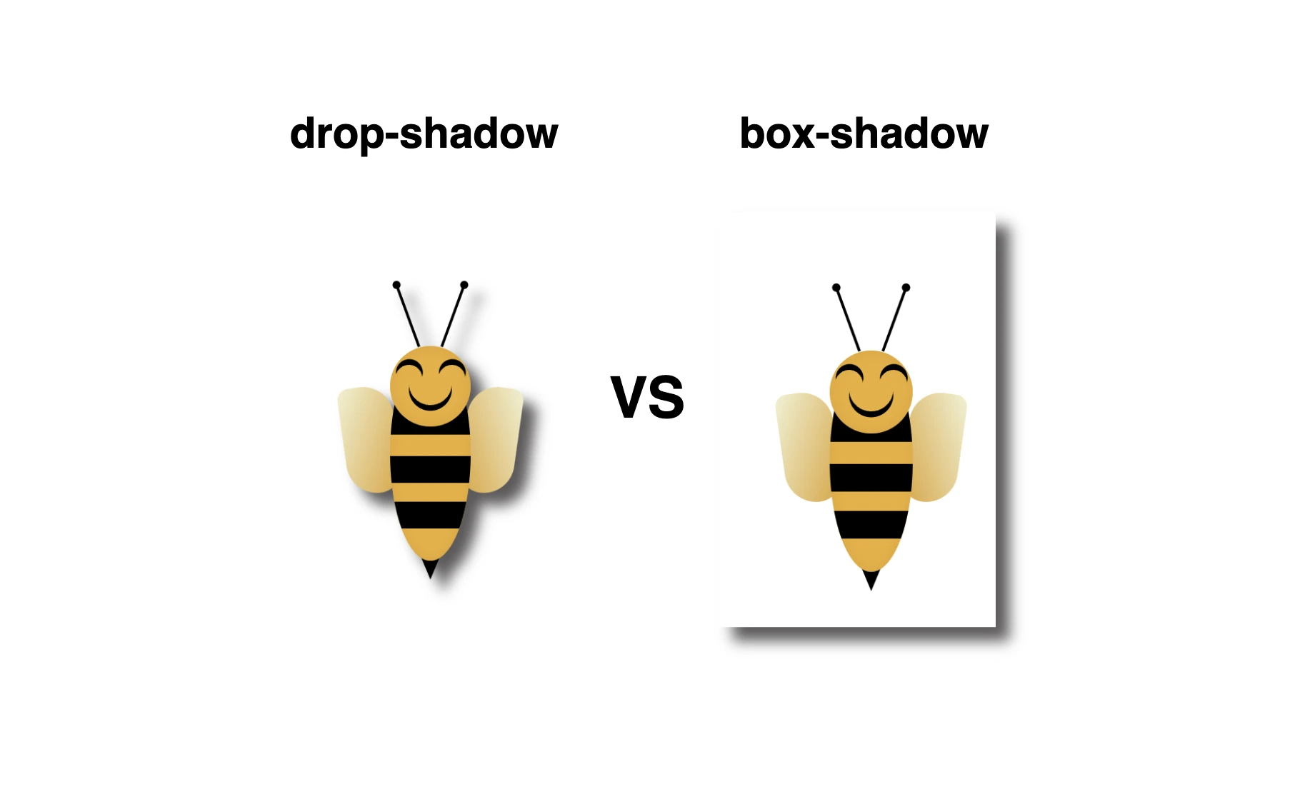
Greetings 😃 In today’s session, we’re about to explore 🔎 the fascinating world of the CSS shadow properties. Get ready to unlock 🗝 the secret between CSS drop-shadow and box-shadow properties!
I created a beautiful, playful bee 🐝 to make our example understandable and funny! You can check out my “bee code” at the end of my post and see how I created it. You are welcome to use it wherever suits you!
CSS box-shadow
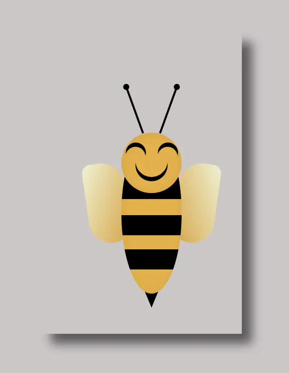
Now, let’s focus on our shadows! In the following example, we see the effect of the box-shadow property. Our shadow is applied to the two sides of our box (bee-wrapper). The code I provided creates a gray shadow with the following characteristics:
.bee-wrapper {
  ...
  /* offset-X | offset-Y | blur-radius | spread-radius | color */
  box-shadow: 10px 10px 10px 0 #5b5959;
} - offset-X: adds 10 pixels to the right of the element.
- offset-Y: adds 10 pixels below the element.
- blur-radius: A blurry shadow with a radius of 10 pixels. (You are free to use a higher blur radius for a softer, more diffuse shadow, or you might opt for a lower blur radius to create a sharper, crisper shadow).
- spread-radius: The shadow doesn’t expand or contract beyond the blur radius as I set it to zero. (I chose not to add spread, but it’s totally up to you if you want to add it. Keep in mind that the spread-radius parameter determines whether the shadow expands or reduces in size. A positive value will enlarge the shadow, whereas a negative value will shrink it).
- color: The color of the shadow is a shade of gray (
#5b5959).
CSS drop-shadow
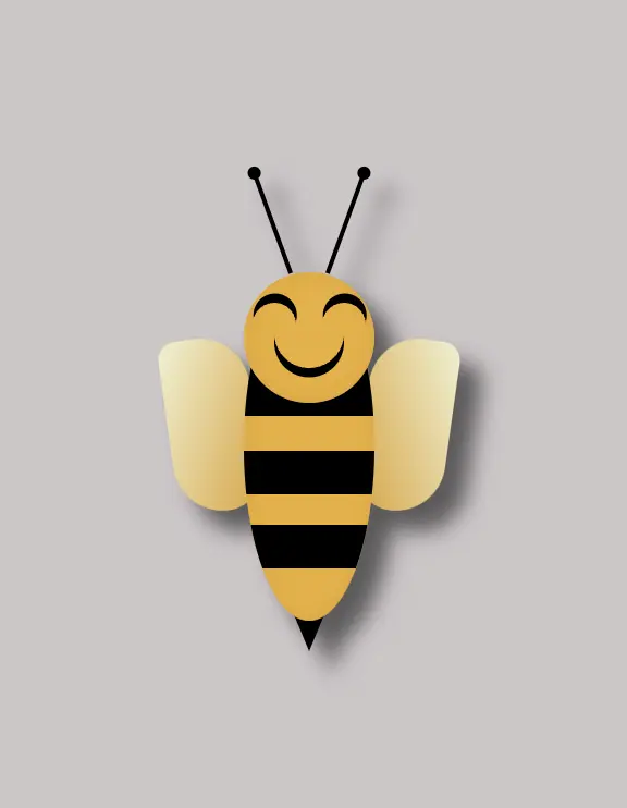
In this case, on the other hand, we can see that by setting the filter: drop-shadow() property the shadow applies smoothly to all parts of our content inside the box (bee-wrapper). Cool 🥳 ha! So, let’s see our code in more detail and how the shadow will now be rendered on the screen through our lovely bee!
.bee-wrapper {
  ...
/* offset-X | offset-Y | blur-radius | color */
filter: drop-shadow(10px 10px 5px #5b5959);
}- filter: The filter property in CSS applies various graphical effects, including blurs, color adjustments, and, in this instance, shadows, to an element.
- offset-X: This specifies the horizontal offset of the shadow from the element. It’s 10 pixels to the right, creating a shadow on the right side of the element.
- offset-Y: This specifies the vertical offset of the shadow from the element. It’s 10 pixels below the element, creating a shadow below it.
- blur-radius: A moderately blurry shadow with a radius of 5 pixels. (A higher value would create a more diffused and softer shadow, while a lower one would create a sharper shadow).
- color: The shadow’s color is a shade of gray (
#5b5959).
🔖 It is worth mentioning that spread-radius property does not appear here.
Complete bee code
Below, I include my HTML and CSS bee code.
<div class="bee-wrapper">
  <div class="face">
    <div class="antenna antenna--left"></div>
    <div class="antenna antenna--right"></div>
    <div class="bee-eye bee-eye-left"></div>
    <div class="bee-eye bee-eye-right"></div>
    <div class="bee-mouth"></div>
  </div>
  <div class="wing wing--left"></div>
  <div class="wing wing--right"></div>
  <div class="sting"></div>
  <div class="bee-body">
    <div class="stripes"></div>
  </div>
</div>:root {
--bg-color: #cdc6c7;
}
* {
margin: 0;
padding: 0;
box-sizing: border-box;
}
html,
body {
height: 100%;
}
body {
min-width: 300px;
background-color: var(--bg-color);
display: flex;
flex-direction: column;
align-items: center;
justify-content: center;
}
// BEE
.bee-wrapper {
position: relative;
width: 200px;
height: 300px;
/* BOX-SHADOW */
/* uncomment to see the box-shadow effect
* offset-x | offset-y | blur-radius | spread-radius | color
*/
// box-shadow: 10px 10px 10px 0 #5b5959;
/* DROP-SHADOW */
/* uncomment to see the drop-shadow effect
* x-offset | y-offset | blur | color
*/
// filter: drop-shadow(10px 10px 5px #5b5959);
.face {
position: absolute;
width: 60px;
height: 60px;
background-color: #ecaf2f;
box-shadow: inset 0 0 10px #dda22c;
border-radius: 50%;
z-index: 20;
top: 100px;
left: 80px;
.antenna {
position: absolute;
width: 2px;
height: 50px;
background-color: black;
&--left {
top: -48px;
left: 12px;
transform: rotate(-20deg);
&:after {
content: "";
position: absolute;
width: 6px;
height: 6px;
background-color: black;
border-radius: 50%;
top: -2px;
left: -2px;
}
}
&--right {
top: -48px;
right: 12px;
transform: rotate(20deg);
&:after {
content: "";
position: absolute;
width: 6px;
height: 6px;
background-color: black;
border-radius: 50%;
top: -2px;
right: -2px;
}
}
}
.bee-eye {
position: absolute;
width: 20px;
height: 20px;
border-radius: 50%;
box-shadow: 3px 3px 0 0 black;
transform: rotate(230deg);
&.bee-eye-left {
top: 14px;
left: 4px;
}
&.bee-eye-right {
top: 14px;
right: 4px;
}
}
.bee-mouth {
position: absolute;
width: 32px;
height: 32px;
border-radius: 60%;
box-shadow: 3px 3px 0 0 black;
top: 12px;
left: 14px;
transform: rotate(45deg);
}
}
.wing {
position: absolute;
width: 40px;
height: 80px;
&--left {
background-image: linear-gradient(to bottom right, #f0f1d2, #dda22c);
border-radius: 30px 80px 60px 80px;
transform: rotate(352deg);
top: 130px;
left: 45px;
}
&--right {
background-image: linear-gradient(to bottom left, #f0f1d2, #dda22c);
border-radius: 80px 30px 80px 60px;
transform: rotate(8deg);
top: 130px;
left: 135px;
}
}
.bee-body {
position: absolute;
width: 60px;
height: 160px;
border-radius: 50%;
background-color: #ecaf2f;
box-shadow: inset 0 0 8px #dda22c;
overflow: hidden;
top: 100px;
left: 80px;
.stripes {
position: absolute;
width: 80px;
height: 22px;
background-color: black;
border-radius: 10px;
top: 44px;
left: 50%;
transform: translate(-50%);
&:before {
content: "";
position: absolute;
width: 80px;
height: 20px;
background-color: black;
border-radius: 10px;
top: 38px
}
&:after {
content: "";
position: absolute;
width: 80px;
height: 20px;
background-color: black;
border-radius: 10px;
top: 72px;
}
}
}
.sting {
position: absolute;
width: 0;
height: 0;
border-left: 10px solid transparent;
border-right: 10px solid transparent;
border-top: 24px solid black;
top: 250px;
left: 100px;
}
}🌼 Hope you found my post interesting and helpful. Thanks for being here! 🌼
