

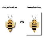
Shadows are a simple yet powerful way to add depth and dimension. In programming, the box shadow CSS property creates a sense of layering by simulating light or darkness on HTML elements. The inset box-shadow, which we will analyze in this post, creates a shadow inside the element, giving it a “pressed” or “embossed” effect that adds even more visual interest to your design.
📌 Always remember that since inset shadows are drawn inside the box, they can reduce the space inside the element.
For better clarity let’s begin by breaking down the box-shadow property as each value controls and affects a specific part of how the shadow appears.
box-shadow: /* offset-X, offset-Y, blur-radius, spread-radius, color;🔸 position
• offset-X: moves the shadow horizontally
• offset-Y: moves the shadow vertically
🔸 blur-radius
• It softens the edges of the shadow
🔸 spread-radius
• It makes the shadow bigger
🔸 color
• It defines the color and the transparency rgba() of a shadow
Setting up the layout
We begin by establishing the basic HTML and CSS structure. Our shadow will be housed within a gray ⬜ box, but for now, we need to adjust the body element so it can properly center and display our box.
<div class="box"></div>body {
background-color: #e0e0e0; /* Light Gray */
display: flex;
align-items: center;
justify-content: center;
margin: 0;
}Creating the box
Now it’s time to create a rounded box with a light gray background color to gently contrast with the body. This subtle color difference helps us clearly see the shadow effect in action.
.box {
  width: 200px;
  height: 200px;
  border-radius: 10px;
  background-color: #ece9e9; /* Very Light Gray */
}
Creating inner shadows using box-shadow
We finalize our work with the shadow effect. Let’s break down our code to make it clear:
inset -5px -5px 10px rgba(255, 255, 255, 0.8)
➤ It positions the shadow at the bottom-right, with a softly blurred, which makes the edges smooth rather than sharp. Also, the shadow is white and mostly visible.
inset 5px 5px 10px rgba(50, 50, 50, 0.2)
➤ It positions the shadow at the top-left, we have again a softly blurred effect and the shadow now is dark gray and very soft.
.box {
  ...
  box-shadow: inset -5px -5px 10px 0 rgba(255, 255, 255, 0.8),
    inset 5px 5px 10px 0 rgba(50, 50, 50, 0.2);
}
If you use spread-radius with inset shadows, it can make the shadow spread too much, making it look too big or messy. By leaving it out, the shadow stays close to the edges, keeping the effect clean and focused.
This combination gives the box a sunken or pressed-in look, like it’s been gently pushed into the background. However, depending on how you view it, it may also appear as though the box is popping out, giving it a slight 3D effect. This subtle duality is a hallmark of neumorphism design. 🆙
You may also like 🎬

Working with different shades of gray adds a touch of elegance and also elevates your work. Additionally, it keeps the design clean and modern. 🚀 ✨ So, what’s your take? Do you agree with me, or do you see it in a whole different way? 😄
🌼 Hope you found my post interesting and helpful. Thanks for being here! 🌼
