

In this post, we will explore how to center elements in CSS using various methods and make our lives, as developers, much easier. Are you ready to dive deeper? Take your snorkel 🤿 and follow me!
As in life, so in programming, placing items in a way that will be helpful or more beautiful, is one of the most important things you can achieve. There are plenty of ways to place or position (in programming terms) items, although it still remains quite a challenge.
We will start by adding our basic HTML & CSS structure:
<body>
  <div class="parent">
    <div class="child"></div>
  </div>
</body>.parent {
width: 200px;
height: 100px;
background-color: purple;
}
.child {
width: 200px;
height: 100px;
background-color: pink;
}Now, we can move forward. 😕 Don’t worry — everything is going to be okay! We‘ll go step by step together and continue working only on CSS.
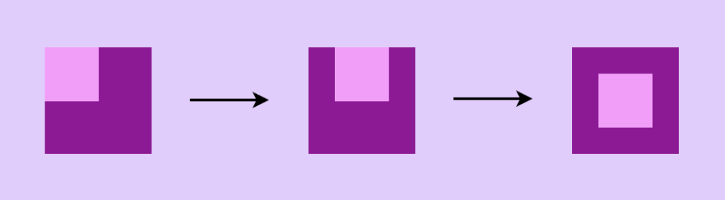
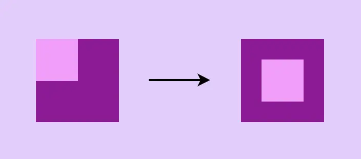
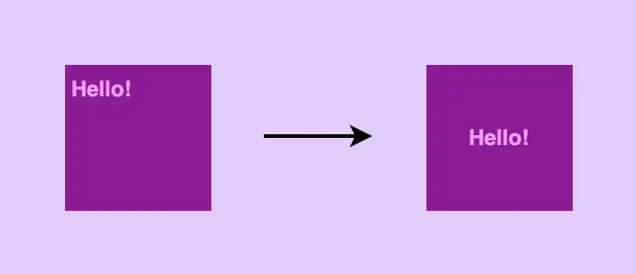
Below are two images. The left one shows what was rendered through our code above, and the right one shows what we want to achieve.
Let’s get started! 💪

Center in CSS using flexbox
First, a few words about flexbox. 😇 Flexbox is a modern layout model, in simpler words, a way to easily position our HTML elements in rows or columns. It provides multiple ways, through CSS, to organize our layout and at the same time be flexible and responsive on different devices.
Basic steps for centering HTML elements using flexbox
The basic property for flexbox is the display property. Using display: flex is not gonna give us something but it is necessary if we want to work with the other flexbox properties.
To center HTML elements we have to use align-items & justify-content properties. align-items: center centers child elements vertically & justify-content: center centers child-elements horizontally.
All these three properties combined give us the desired outcome, as seen in the code snippet below:
.parent {
  ...
  display: flex;
  align-items: center;/* centers vertically */
  justify-content: center;/* centers horizontally */
}
Center in CSS using Grid
There is a small prologue for the grid here. 😇 The grid is a layout system. There is a basic difference between flexbox and grid. Flexbox is one-dimensional (best suited for small-scale layouts) while grid is two-dimensional (best suited for large-scale layouts).
In simple words, with flexbox we work in rows or columns while with grid, we work on both at the same time. Grid layout makes it easier to create complex, responsive designs that adapt to different screen sizes and orientations.
Flexbox & grid
can work together
and complement
each other
Using grid-template-areas
As in flexbox, the basic property for the grid is the display property. Using display: grid is not gonna give us something but it is necessary if we want to work with the other properties. By setting the display property of an element to a grid, the element becomes a container for grid elements, which can be positioned using the grid layout.
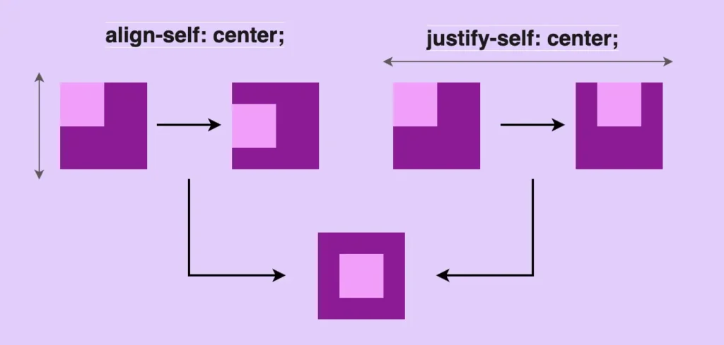
To center HTML elements we have to use align-self & justify-self properties. align-self: center centers child-elements vertically and justify-self: center centers child-elements horizontally.
All these three properties combined give us the desired outcome, as seen in the code snippet below:
.parent {
  ...
  display: grid;
}

.child {
  ...
  align-self: center; /* centers vertically */
  justify-self: center; /* centers horizontally */
}
Using grid-auto-flow and justify-content
Another way to center HTML elements through a grid is with place-items property. place-items: center centers child elements vertically & horizontally at the same time.
.parent {
  ...
  display: grid;
  place-items: center; /* centers vertically & horizontally at the same time */
}
You may also like 🎬


Center in CSS using Positioning
At this point, a few words about positioning property would be helpful, I suppose. 😇 CSS position property defines the position of an HTML element in a document. There are five types of positioning:
- static
- relative
- absolute
- fixed
- and sticky
In this post, we will use position: relative & position: absolute . By default the position property of HTML elements is static. That means that our flow (direction of HTML elements) follows HTML order and goes from top to bottom. If we want to change this flow we have to change the position property.
Position: relative works exactly as position static but allows you to change the position of an HTML element. In simple words, you can now move your HTML element, for example, 20px left.
.examRel {
  position: relative;
  left: 20px;
}Position: absolute takes the document out of its flow and places an element relative to the closest parent element.
.examAbs {
  position: absolute;
  top: 40px;
}🤔 So if we have two HTML elements and we want to put one (which we used to call child-element) inside the other (which we used to call parent-element) all we have to do is put position relative to the parent and position absolute to the child.
.examParent {
  position: relative; /* parent element */
}

.examChild {
  position: absolute; /* child element */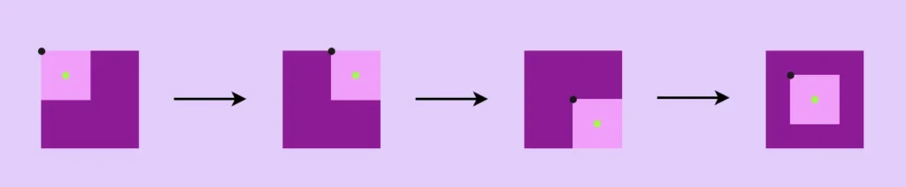
}Using transform and translate
First of all, we set position: relative to our parent element. Secondly, we set position: absolute to our child element. Then we set left: 50% and top: 50% to move the child-element from the parent, using as a reference the child’s top-left edge (see black dot).
To finalize our centering, we use transform: translate(-50%, -50%) to align the middle of the child element (green dot) to the middle of the parent element.
.parent {
  position: relative;
}

.child {
  position: absolute;
  left: 50%;
  top: 50%;
  transform: translate(-50%, -50%);
}
Using transform and translateY
First of all, we set position: relative to our parent element. Secondly, we set position: absolute to our child element. Then we text-align: center to center our child element horizontally.
Afterward, we need to set top: 50% and transform: translateY(-50%) to center our child element vertically.
.parent {
  position: relative;
}

.child {
  position: absolute;
  text-align: center;
  top: 50%;
  transform: translateY(-50%);
}
Using margin: auto
First of all, we set position: relative to our parent element. Secondly, we set position: absolute to our child element. Then we set left: 0 top: 0 right: 0 bottom: 0 . By doing so, the child element will fill all available space of the parent container.
Finally, we use margin: auto. Using the margin property lets the browser calculate the appropriate margin for the child element and divide the space evenly. It centers our element horizontally & vertically at the same time.
.parent {
  ...
  position: relative;
}

.child {
  ...
  position: absolute;
  left: 0;
  top: 0;
  right: 0;
  bottom: 0;
  margin: auto; /* centers vertically & horizontally at the same time */
}
📢 Warning: you need to set a fixed width to the HTML element you are trying to center (in our case the child element). Otherwise, it won’t work!
Do’s for CSS centering
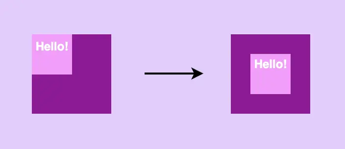
If instead of a box, you have to center a div or even a whole paragraph you can use all these methods described above! To do so, remember NOT to add width and height to the child and just let the child get its dimensions based on the included text. This way when centering the child it will be the same as centering the text, check the image below:
If you decide, though, to add bigger dimensions, bigger than your text, I mean, you need to be careful. By doing so you might end up centering the child element but not its content, the text.
Dont’s for CSS centering
🥵 DO NOT center elements using huge paddings. It may seem easy at first but it is considered to be extremely risky and error-prone. Especially now that we have to deal with all these different screen sizes. You will be forced to change paddings again and again with media queries. (@media only screen and(screen’s width) { }).
🌼 Hope you found my post interesting and helpful. Thanks for being here! 🌼
