
Hello everyone! 😃 Today, we will learn how to create a cool CSS reflection effect. Through step-by-step instructions, we will understand how to manipulate linear-gradient and opacity CSS properties to create a stunning mirror-like effect. Below, I’ll include’ll give you all the information you need. Let’s get started.
HTML structure
Our HTML structure starts with an empty div element, with the class .reflection where our effect will take place.
<div class="reflection"></div>CSS foundation
Let’s continue with the CSS basic structure. We will start by setting the background-color to orange.
body {
  background-color: orange;
}
Creating the element
In the following step, we will define the element. I opt for a color black rectangle with 300 pixels width and 200 pixels height.We will also be adding the flex method to the body to center our element.
body {
  ...
  display: flex;
  align-items: center;
  justify-content: center;
}

.reflection {
  width: 300px;
  height: 200px;
  background-color: black;
}This is what is rendered on the screen for now. A perfectly centered black rectangle!

Adding the CSS structure for the reflection effect
A CSS reflection effect can be accomplished using pseudoelements like before and after.First, we need to add position: relative in our .reflection class to get prepared for our pseudoelement’s positioning.
.reflection {
  ...
  position: relative;
}Then we are ready to create our reflection utilizing the before pseudoelement.
.reflection:before {
  position: absolute;
  content: "";
  width: 100%;
  height: 100%;
  background: linear-gradient(
    to bottom,
    rgba(0, 0, 0, 5),
    rgba(0, 0, 0, 0) 80%
  );
}We initiate by setting the the position as absolute. Setting the content to an empty string (“”) and then its width and height to 100%, will make our pseudoelement appear and inherit its parent’s dimensions (width 300px and height 200px).
Next, we add a background: linear-gradient that goes downwards, by specifying its direction, from top to bottom. This way, we create black gradients that are more intense at the top and gradually fade toward the bottom to achieve our desired effect.
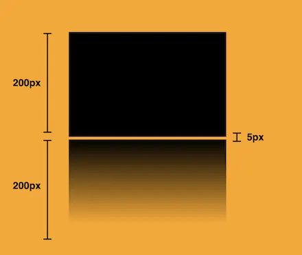
So far, we have created the CSS reflection effect below our original rectangle. However, we need to take one more step for our effect to be visible. We add the top CSS property and set it to 205 pixels. This will move our reflection 5 pixels down from the origin rectangle.
.reflection:before {
  ...
  top: 205px;
  opacity: 0.5;
}
Additionally, we set the opacity to achieve a smoother and more natural-looking effect. You might be thinking that the same result could be accomplished by adjusting the linear-gradient property and you are right. It’s just that using the opacity this way requires much less effort and produces similar results.
.reflection:before {
  ...
  opacity: 0.5;
}
Voila! Here is our amazing reflection! 🥳

You may also like 🎬


Exploring different reflection colors
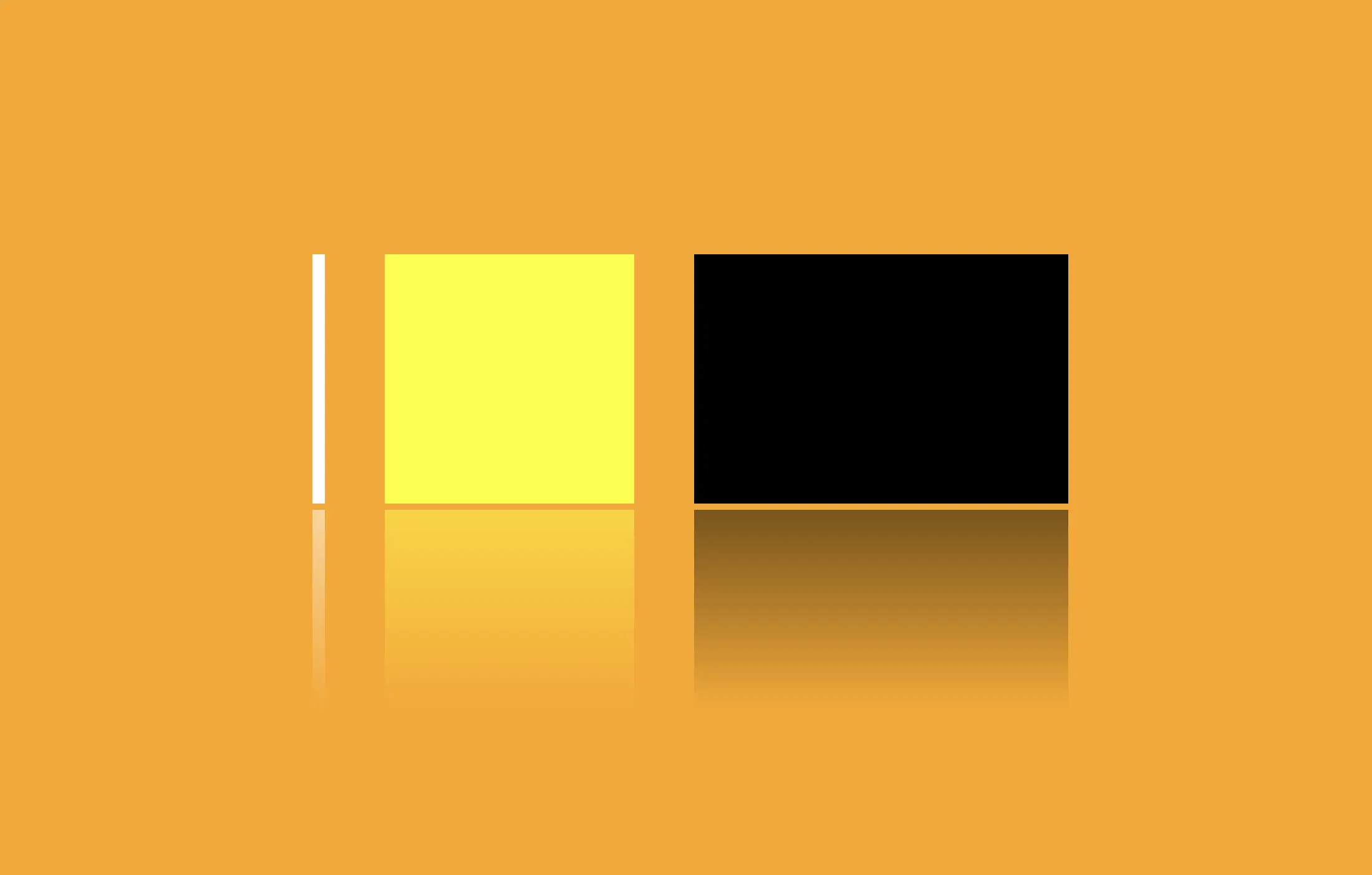
🔖 Feel free to use any color you prefer, but it’s important to create a linear-gradient that gives the perspective shades. Here are examples of white and yellow reflections. I am keeping the orange background to facilitate easier comparison.
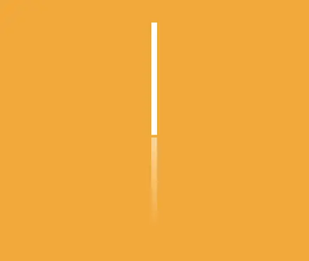
White reflection
.reflection {
  width: 10px;
  height: 200px;
  background-color: white;
}

.reflection:before {
  content: "";
  position: absolute;
  width: 100%;
  height: 100%;
  top: 205px;
  background: linear-gradient(to bottom,
  rgba(255, 255, 255, 5),
  rgba(255, 255, 255, 0) 80%);
  opacity: 0.5;
}
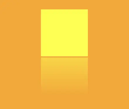
Yellow reflection
.reflection {
  width: 200px;
  height: 200px;
  background-color: yellow;
}

.reflection:before {
  content: "";
  position: absolute;
  width: 100%;
  height: 100%;
  top: 205px;
  background: linear-gradient(to bottom,
  rgba(255, 255, 0, 5),
  rgba(255, 255, 0, 0) 80%);
  opacity: 0.5;
}
Choosing the perfect colors with their appropriate shades can truly transform your work. Be bold in your choices and let your creativity shine. Remember, there are endless possibilities and your creativity knows no bounds. 🎉 ✨
🌼 Hope you found my post interesting and helpful. Thanks for being here! 🌼
