
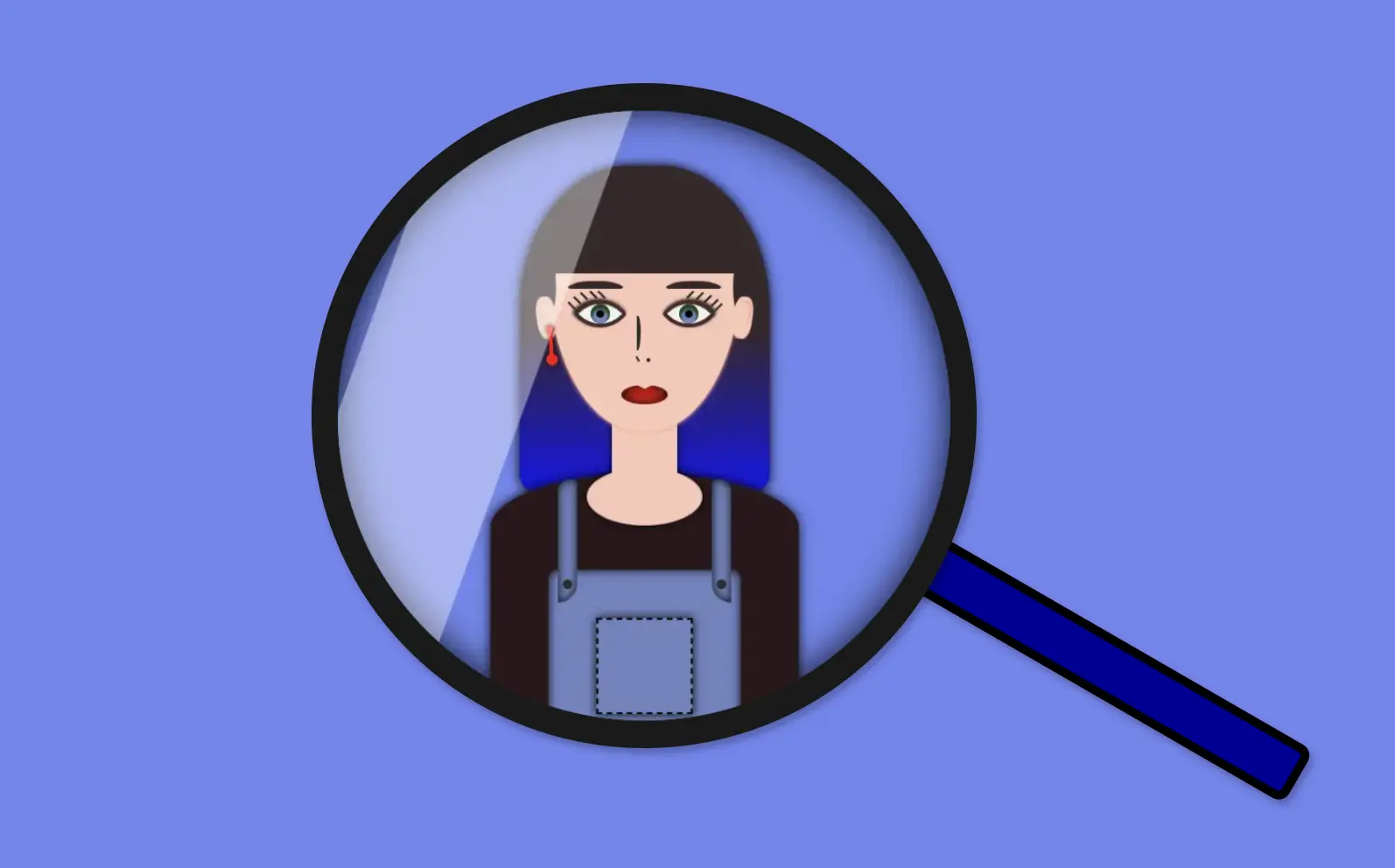
Welcome to this post! Today, I will share with you how to create a fascinating CSS shine effect animation. To make it more interesting and attractive, I have already prepared an avatar (using only HTML and CSS) and added the animation to it. If you’re curious about how I made the avatar, you can find the complete avatar code at the end of this post. Please feel free to enclose it in your animation if you wish. Remember, the most important thing is to have fun and let your creativity shine. 😉 ✨
For the moment, let’s focus on making this astonishing animation!
HTML structure
To begin, we need to create the base for our project by adding the HTML structure. We’ll start by creating our avatar-container , which will serve for our manipulations. I will carefully guide you through the following steps to achieve the desired results. Once we have a good structure in place, we can build upon it our CSS shine effect.
<div class="avatar-container">
 ... Here goes my avatar
</div> <!-- end of avatar-container -->CSS basic structure
Moving forward, let’s focus on organizing our project’s visual appeal by adding the CSS structure. Our first step will be to center the avatar-container on the screen, therefore, we can take advantage of the display: flex property of the body element. This will help us align it along the horizontal and vertical axes, creating a perfectly centered layout. With this basic structure in place, we can then proceed to add styles and create everything we have in mind. 😊
$body-color: #6e87ef;

* {
  margin: 0;
  padding: 0;
  box-sizing: border-box;
}

html,
body {
  height: 100%;
}

body {
  width: 100%;
  display: flex;
  align-items: center;
  justify-content: center;
  background: $body-color;
}CSS avatar container
In order to place the avatar inside the container, it is essential to set it position: relative. Then we can place the components we want to include for our avatar, just by adding position: absolute to them.
.avatar-container {
  position: relative;
  min-width: 320px;
  height: 320px;
  background-color: transparent;
  box-shadow: inset 0 0 20px;
  border-radius: 50%;
} /* end of avatar-container */
CSS Shine Effect
All the necessary preparations have been completed. Let’s now move forward and make the shine 🥳 effect.
Create the shine
- Firstly, we use
:beforepseudo-element which allows styling specific parts of an element without adding extra content to HTML. It behaves as a child of the chosen CSS element. In our case,avatar-containertakes extra data only by using:beforeCSS property. - Next, we set
width: 30%andheight: 100%as this is a proper space in our example. - We also set
background-color: rgba(255, 255, 255, 0.4)as it is the most suitable for the CSS shine effect. - We continue with
z-indexwhich overlaps the stack order of an HTML element. In simple words, it manages which HTML element should appear on top of others. The higher the stack order, the higher the element will be placed at the top of the stacking order. A really useful CSS property that is responsible for layering. To achieve the desired effect over my avatar, I have specified az-index: 4as my avatar has multiple layers. Without multiple layers applied to it (in simple words without the avatar),z-indexCSS property is not necessary. It’s good practice when we use z-index to count close numbers. We can set positive and negative integer values.
.avatar-container {
position: relative;
width: 320px;
height: 320px;
background-color: transparent;
box-shadow: inset 0 0 20px;
border-radius: 50%;
overflow: hidden;
&:before {
position: absolute;
content: "";
width: 30%;
height: 100%;
background-color: rgba(255, 255, 255, 0.4);
transform: skewX(-20deg);
left: -120px;
z-index: 3;
} /* end of before */
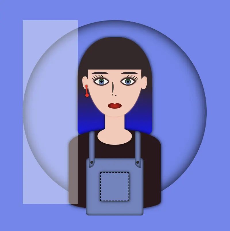
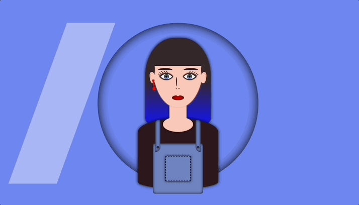
} /* end of avatar-container */The image below displays a preview of the code mentioned above.
Transform the CSS shine effect
- Afterward is necessary to add
overflow: hiddentoavatar-container, as we want to hide the content that flows over our container’s bounds.
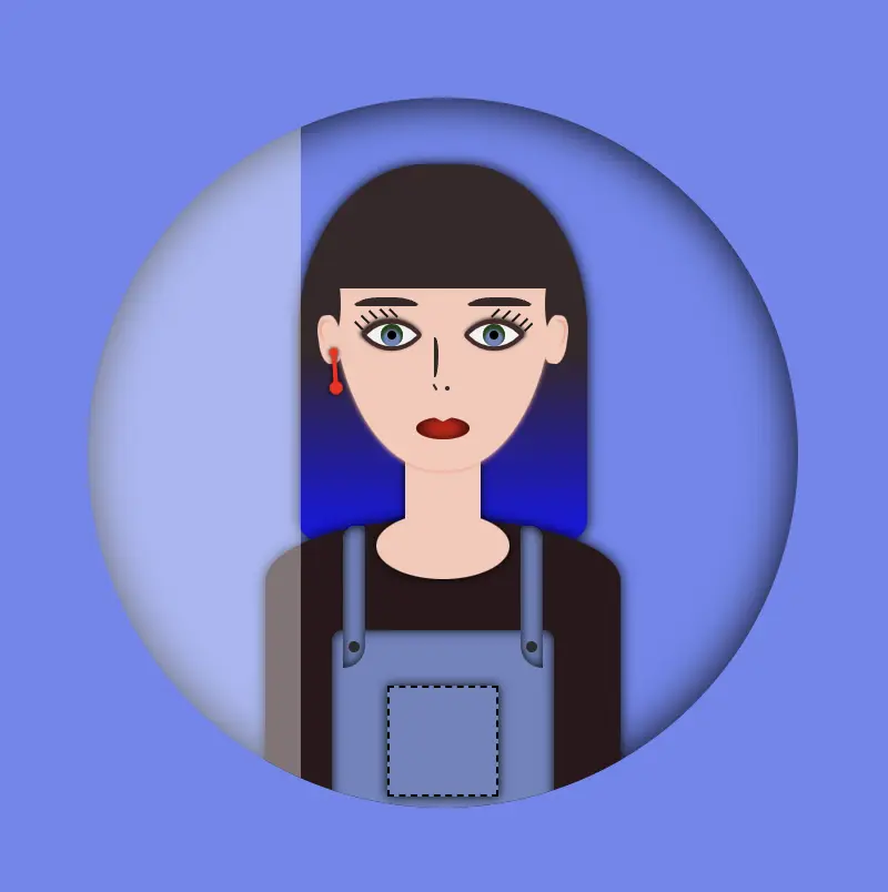
- We continue with
transform: skewas a way to add inclination to our shine.
- Finally
left: -120pxkeeps our effect in the appropriate place, -120px left out of theavatar-container, in order to be invisible. As we previously used,overflow: hiddenanything outside of theavatar-containeris not visible, that’s why in this pick, below, we can’t see our effect. It’s still there though! 😄
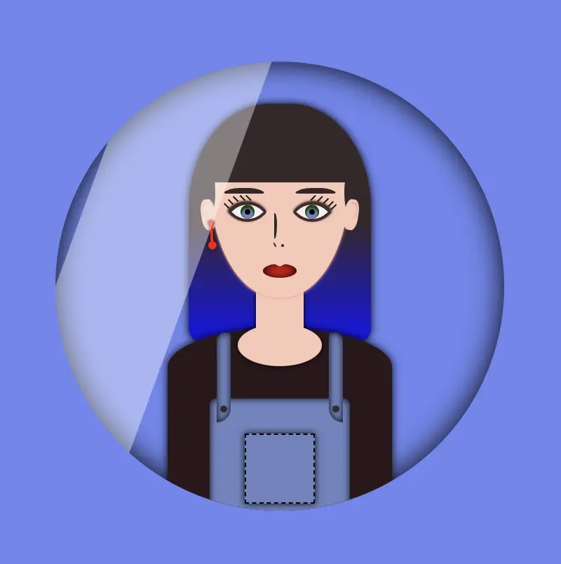
HINT
💡 Well, maybe at this point it might be a good idea to temporarily disable the CSS property overflow: hidden and observe the current position of the effect. By doing so, one can see if the effect is working as intended and make any necessary adjustments. The effect is now positioned -120 pixels to the left, as this is the starting point from where the effect will begin to move.
You may also like 🎬
Create an animation for the CSS shine effect
- To finalize my work, firstly, I’m adding the animation CSS property
animation: <animation-name> <animation-duration> <animation-iteration-count>which is responsible for the way our animation behaves. - Secondly, I add CSS
@keyframeswhich is used to control the style of the animation at different points in time. In this post, we want our shine to move rightwards, starting from -120px left to 350px left and then turning back to -120px left again. - By combining these 2 properties we end up having the desired animation result, that is, moving our shine every 5 seconds, forever (infinite), from -120px to 350px and back.
🚫 It is required to connect these two properties. We do so by giving a name to the @keyframes and putting the same name on the animation property. In our case, this name is “shine”.
.avatar-container {
  ...
  &:before {
    ...
    animation: shine 5s infinite;
  } /* end of before */
} /* end of avatar-container */


/* My animation */
@keyframes shine {
  0% {
    left: -120px;
  }
  50% {
    left: 350px;
  }
  0% {
    left: -120px;
  }
}💡 If you want to see the whole move of the CSS shine effect you can once again disable the CSS property overflow: hidden to avatar-container and observe the effect. Isn’t it great? 😄
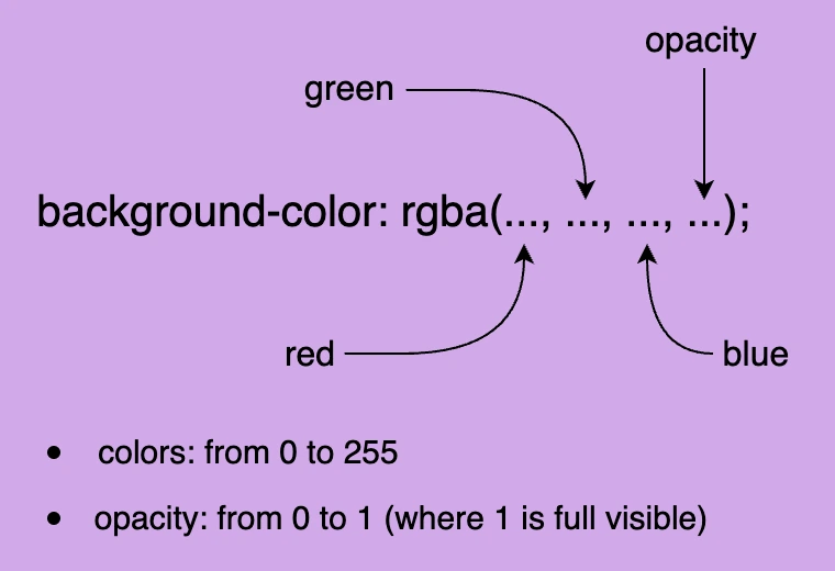
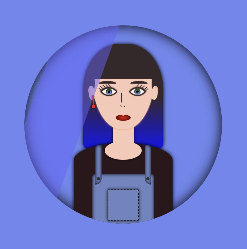
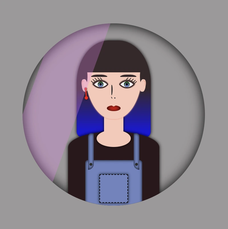
🔖 Please be informed that you have the flexibility to modify the background-color: rgba(..., ..., ..., ...) CSS property at any point to adjust both the color and opacity of your shine effect. In this context, I have chosen to generate a grey shine, as this shade is widely recognized and utilized.
Below, I add some examples with different shades. You are free to try them, or you can experiment and create some from scratch! 🛠
Yellow shade -> background-color:rgba(255, 255, 0, 0.2)
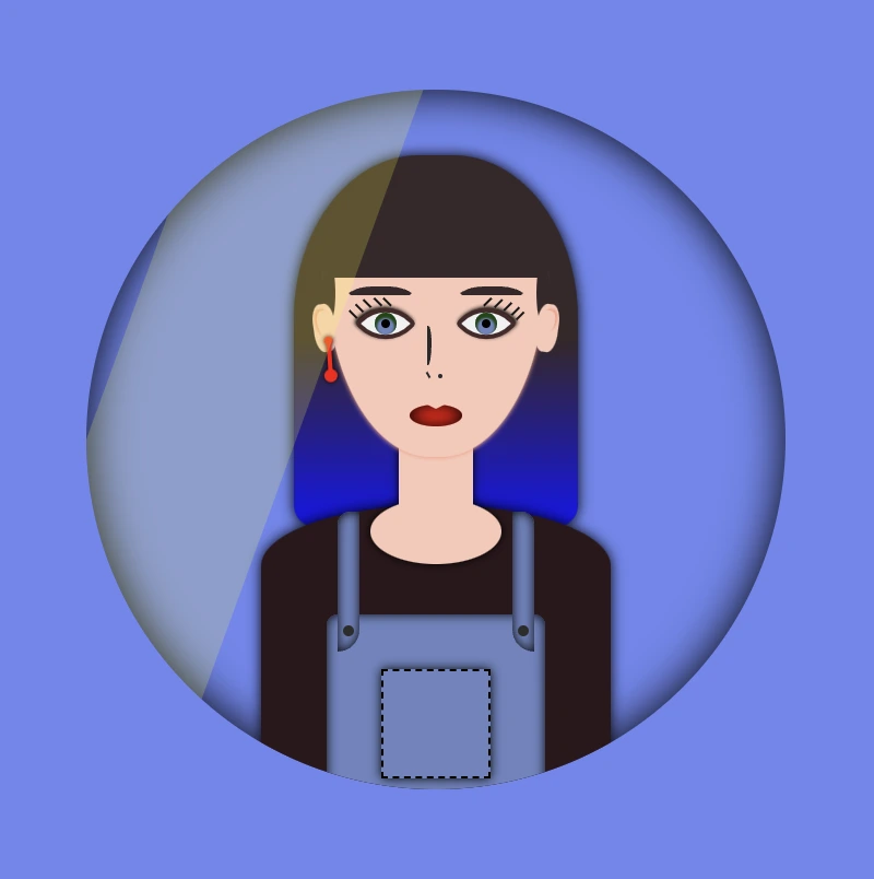
🧨 Blue shade -> background-color:rgba(100, 100, 250, 0.5) always remember to make contrasts. Avoid using the same color for backgrounds and shades.
You can also try to change both the container’s and shades’ background-color.
Pink shade -> background-color:rgba(238, 130, 238, 0.3)
Container’s color -> background-color: #c4c0c0 (grey)
Complete avatar code
Below, I include my HTML and CSS avatar code.
<div class="avatar-container">
  <div class="hair-long"></div>
  <div class="face">
    <div class="ear ear--left">
      <div class="earing earing--left"></div>
    </div>
    <div class="ear ear--right"></div>
    <div class="hair-front"></div>
    <div class="eyebrow eyebrow--left"></div>
    <div class="eyebrow eyebrow--right"></div>
    <div class="eye eye--left">
      <div class="eyelash eyelash--left"></div>
      <div class="eyelash eyelash--left1"></div>
      <div class="eyelash eyelash--left2"></div>
      <div class="eyelash eyelash--left3"></div>
      <div class="eyelash eyelash--left4"></div>
    </div> <!-- end of left eye -->
    <div class="eye eye--right">
      <div class="eyelash eyelash--right"></div>
      <div class="eyelash eyelash--right1"></div>
      <div class="eyelash eyelash--right2"></div>
      <div class="eyelash eyelash--right3"></div>
      <div class="eyelash eyelash--right4"></div>
    </div> <!-- end of right eye -->
    <div class="nose"></div>
    <div class="lips"></div>
  </div> <!-- end of face -->
  <div class="body-avatar">
    <div class="neck"></div>
    <div class="t-shirt"></div>
    <div class="dungarees">
      <div class="pocket"></div>
      <div class="strap strap--left">
        <div class="button button--left"></div>
      </div>
      <div class="strap strap--right">
        <div class="button button--right"></div>
      </div>
    </div> <!-- end of dungarees -->
  </div> <!-- end of body -->
</div> <!-- end of avatar-container -->$body-color: #6e87ef;
$skin-color: #fac8b9;
$hair-color: #36272a;
$hair-ombre-color: linear-gradient(#36272a 50%, #1616ee);
$eyebrow-color: #36272a;
$eye-color: #6d84c0;
$eye-base-color: #f1f1f1;
$eyeline-color: #472a2a;
$eyelash-color: #171616;
$iris-color: #000;
$earing-color: red;
$nose-color: #2b2a2a;
$lips-color: #f50000;
$t-shirt-color: #2c171b;
$dungarees-color: #6d84c0;
$strap-color: #6d84c0;
$button-color: #2d2c2c;
* {
margin: 0;
padding: 0;
box-sizing: border-box;
}
html,
body {
height: 100vh;
}
body {
width: 100%;
display: flex;
align-items: center;
justify-content: center;
background: $body-color;
}
.avatar-container {
position: relative;
min-width: 320px;
height: 320px;
background-color: transparent;
box-shadow: inset 0 0 20px;
border-radius: 50%;
overflow: hidden;
.hair-long {
position: absolute;
width: 130px;
height: 170px;
border-radius: 44% 44% 10px 10px;
top: 30px;
left: 50%;
transform: translate(-50%);
background: $hair-ombre-color;
filter: drop-shadow(0 0 3px);
}
.face {
position: absolute;
width: 100px;
height: 110px;
border-radius: 100% / 50% 50% 160% 160%;
background-color: $skin-color;
top: 58px;
left: 50%;
transform: translate(-50%);
z-index: 2;
box-shadow: 0 0.5px 2px darken($skin-color, 10%);
.ear {
position: absolute;
width: 10px;
height: 22px;
background-color: $skin-color;
border-radius: 40%;
top: 40px;
z-index: 3;
&--left {
left: -6px;
transform: rotate(-8deg);
&:before {
content: "";
position: absolute;
width: 6px;
height: 12px;
background-color: $skin-color;
border-radius: 40% 40% 50% 50%;
box-shadow: -1px -1px 1px darken($skin-color, 10%);
top: 3px;
left: 2px;
}
}
&--right {
right: -6px;
transform: rotate(8deg);
&:before {
content: "";
position: absolute;
width: 6px;
height: 10px;
background-color: $skin-color;
border-radius: 40% 40% 50% 50%;
box-shadow: 1px -1px 1px darken($skin-color, 10%);
top: 3px;
right: 2px;
}
}
.earing {
position: absolute;
width: 4px;
height: 4px;
background-color: $earing-color;
filter: drop-shadow(0 0 1px);
border-radius: 50%;
transform: rotate(4deg);
&:before {
content: "";
position: absolute;
width: 2px;
height: 16px;
background-color: $earing-color;
}
&:after {
content: "";
position: absolute;
width: 6px;
height: 6px;
background-color: $earing-color;
border-radius: 50%;
}
&--left {
top: 15px;
left: 4px;
&:before {
top: 3px;
right: 1px;
}
&:after {
top: 15px;
left: -1px;
}
}
} // end of earing
} // end of ear
.hair-front {
position: absolute;
width: 104px;
height: 30px;
top: -2px;
left: -2px;
border-radius: 5px;
background-color: $hair-color;
&:before {
content: "";
position: absolute;
width: 28px;
height: 6px;
background-color: $hair-color;
border-radius: 50%;
top: 34px;
left: -11px;
transform: rotate(-90deg);
}
&:after {
content: "";
position: absolute;
width: 28px;
height: 6px;
background-color: $hair-color;
border-radius: 50%;
top: 34px;
right: -11px;
transform: rotate(-90deg);
}
} // end of hair-front
.eye {
position: absolute;
width: 20px;
height: 20px;
top: 39px;
background-color: $eye-base-color;
border: 2px solid $eyeline-color;
border-radius: 85% 10%;
transform: rotate(45deg);
&:before {
content: "";
position: absolute;
width: 10px;
height: 10px;
top: 50%;
left: 50%;
transform: translate(-50%, -50%);
background-color: $eye-color;
border-radius: 50%;
box-shadow: inset 1px 1px 1px 1px #17460d;
}
&--left {
left: 17px;
box-shadow: -1px 0 2px darken($eyeline-color, 50%);
}
&--right {
right: 17px;
box-shadow: 0 -1px 2px darken($eyeline-color, 50%);
}
&:after {
content: "";
position: absolute;
width: 4px;
height: 4px;
top: 50%;
left: 50%;
transform: translate(-50%, -50%);
background-color: $iris-color;
border-radius: 50%;
}
.eyelash {
position: absolute;
width: 1px;
height: 5px;
background-color: $eyelash-color;
&--left,
&--left1,
&--left2,
&--left3,
&--left4 {
transform: rotate(90deg);
}
&--left {
top: -2px;
left: 1px
}
&--left1 {
top: 1px;
left: -2px
}
&--left2 {
top: 5px;
left: -5px
}
&--left3 {
top: 9px;
left: -6px
}
&--left4 {
top: 13px;
left: -6px
}
&--right {
top: -2px;
right: 14px;
}
&--right1 {
top: -5px;
right: 10px;
}
&--right2 {
top: -7px;
right: 6px;
}
&--right3 {
top: -8px;
right: 2px;
}
&--right4 {
top: -8px;
right: -1px;
}
} // end of eyelash
} // end of eye
.eyebrow {
position: absolute;
width: 35px;
height: 7px;
border: solid 4px $hair-color;
border-color: $hair-color transparent transparent transparent;
border-radius: 50%/10px 10px 0 0;
top: 32px;
&--left {
left: 7px;
}
&--right {
right: 7px;
}
} // end of eyebrows
.nose {
position: absolute;
width: 2px;
height: 18px;
border: 2px solid $nose-color;
border-left: 0px;
border-top-right-radius: 80% 40%;
border-bottom-right-radius: 80% 60%;
top: 50px;
left: 46px;
&:before {
position: absolute;
content: "";
width: 1px;
height: 3px;
background-color: $nose-color;
top: 19px;
transform: rotate(-30deg);
}
&:after {
position: absolute;
content: "";
width: 2px;
height: 2px;
border-radius: 50%;
background-color: $nose-color;
top: 20px;
left: 5px;
}
} // end of nose
.lips {
position: absolute;
width: 24px;
height: 10px;
border-radius: 50%;
background-color: $lips-color;
top: 86px;
left: 50%;
transform: translate(-50%);
box-shadow: inset 0 0 7px;
&:after {
content: "";
position: absolute;
width: 0;
height: 0;
border-left: 6px solid transparent;
border-right: 6px solid transparent;
border-top: 3px solid $skin-color;
border-radius: 60%;
top: -1px;
left: 6px;
}
} // end of lips
} // end of face
.body-avatar {
.neck {
position: absolute;
width: 34px;
height: 50px;
background-color: $skin-color;
filter: drop-shadow(0 0 2px);
top: 152px;
left: 50%;
transform: translate(-50%);
z-index: 1;
&:before {
content: "";
position: absolute;
width: 60px;
height: 30px;
background-color: $skin-color;
border-radius: 50%;
top: 35px;
left: 50%;
transform: translate(-50%);
}
}
.t-shirt {
position: absolute;
width: 160px;
height: 140px;
background-color: $t-shirt-color;
border-radius: 100% / 40% 40% 20% 20%;
top: 190px;
left: 50%;
transform: translate(-50%);
filter: drop-shadow(0 0 3px);
} // end of t-shirt
.dungarees {
position: absolute;
width: 100px;
height: 100px;
background-color: $dungarees-color;
border-radius: 5%;
box-shadow: inset 0 0 5px;
top: 240px;
left: 50%;
transform: translate(-50%);
.pocket {
position: absolute;
width: 50px;
height: 50px;
background-color: $dungarees-color;
border: 1px dashed black;
box-shadow: 0 0 5px;
top: 25px;
left: 50%;
transform: translate(-50%);
}
.strap {
position: absolute;
width: 10px;
height: 64px;
background-color: $strap-color;
box-shadow: inset 0 0 5px;
top: -47px;
.button {
position: absolute;
width: 5px;
height: 5px;
background-color: $button-color;
border-radius: 50%;
top: 52px;
&--left {
left: 50%;
transform: translate(-50%);
}
&--right {
left: 50%;
transform: translate(-50%);
}
} // end of button
&--left {
left: 5px;
border-radius: 6px 0 10px 0;
}
&--right {
right: 5px;
border-radius: 0 6px 0 10px;
}
} // end of strap
} // end of dungarees
} // end of body-avatar
} // end of avatar-container🌼 Hope you found my post interesting and helpful. Thanks for being here! 🌼
