
Hey there! 😃 In today’s technology-driven world, it’s super important to learn how to create an awesome transparent button. A well-designed button not only adds to the product’s aesthetic appeal but also enhances the user experience. Therefore, it’s essential to create buttons that are both visually appealing and functionally efficient.
Let’s work together to design the perfect button that stands out and makes your app more user-friendly.
HTML basic structure
First, we prepare our HTML code snippet. We need to create a parent element with the class .wrapper that acts as the base of the button. Next, we add a child element within the parent element that will serve as the clickable part of the button. This child element has the class .custom-button . Doing so will help us create an interactive button that users can click on, to perform an action. How amazing is this! 😎
<div class="wrapper">
  <button class="custom-button"></button>
</div>CSS foundation
Let’s continue by using our CSS magic and making our button look cool! For this post, I am writing CSS using Sass syntax. If you would like to convert it to vanilla CSS and don’t already know how, I’d suggest you use an online Sass —CSS converter.
Create the base for the transparent button
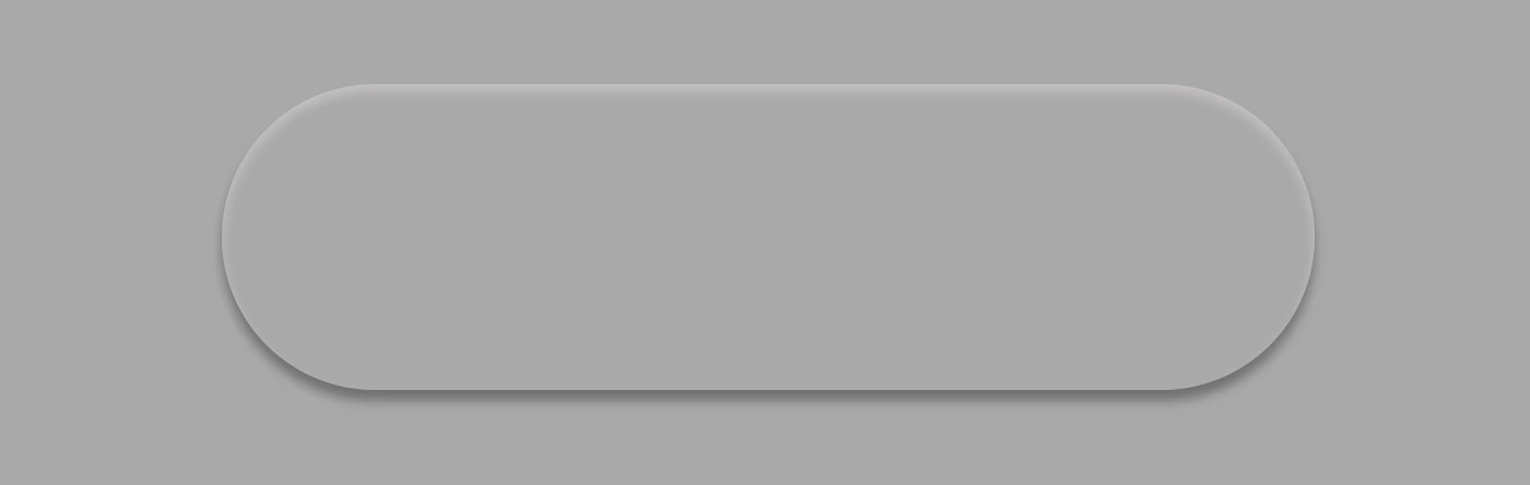
First of all, we set the background-color of the body to dark grey and also add some extra positioning properties in order for our button to be centered. We will be using the same color for our button, by applying the background: transparent CSS property, along with some width and height of our choice in the .wrapper class.
We are also applying a border-radius of 80 pixels and a box-shadow with carefully selected shades of grey. It is important to select the appropriate shades to ensure the desired outcome. 😉
For our example, we are placing the clickable part of the button in the center of the base. For that reason, we are using the flex method.
body {
  background-color: darkgrey;
  height: 100vh;

  display: flex;
  align-items: center;
  justify-content: center;
}

.wrapper {
  width: 500px;
  height: 140px;
  background: transparent;
  border-radius: 80px;
  box-shadow: inset 0px 3px 5px #c6c2c2,
    0px 5px 5px #727070;

  display: flex;
  align-items: center;
  justify-content: center;
} Take a look at the image below to see what’s currently rendered on screen.
Create the clickable part of the transparent button
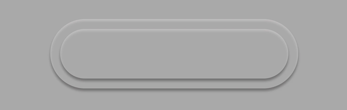
We proceed with the clickable area of our button. After applying some basic dimensions, we need to make sure the background is set to transparent as we did before, with the base part of the button. After that, we adjust the border-radius and box-shadow to inherit, so that these attributes would be identical to the base. To remove any natively applied border styling we use border: none.
.custom-button {
  width: 460px;
  height: 100px;
  background: transparent;
  border-radius: inherit;
  box-shadow: inherit;
  border: none;
}Below, you see what’s on the screen now, with the clickable (top) part of our button added.
Add the button text
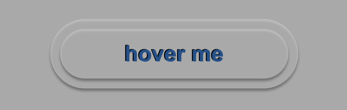
To begin, we use the flex method to center the button’s text appropriately. Then we add the text using the :before CSS pseudoselector, adding “hover me” as the content. I used a bold, 45-pixel blue text with a black shadow effect. For enhanced readability, I opted for the Arial font-family as it is really legible. 🆒 ✨
.custom-button {
  ...
  font-family: 'Arial';
  font-size: 45px;
  color: #12528e; /* a shade of blue */
  font-weight: bold;
  display: flex;
  align-items: center;
  justify-content: center;
  &:before {
    position: absolute;
    content: "hover me";
    text-shadow: -2px -1px black;
  }
}In the following image, we can see what’s displayed on the screen now.
You may also like 🎬


Apply the hover effect of the transparent button
Now, is the appropriate time to implement the hover effect. We can achieve this by adding the :hover CSS pseudo-class with the cursor set to pointer. After that, we will use :before again to modify the text content to display “click me”.
.custom-button {
  ...
  &:hover {
    cursor: pointer;
    &:before {
      content: "click me";
    }
  }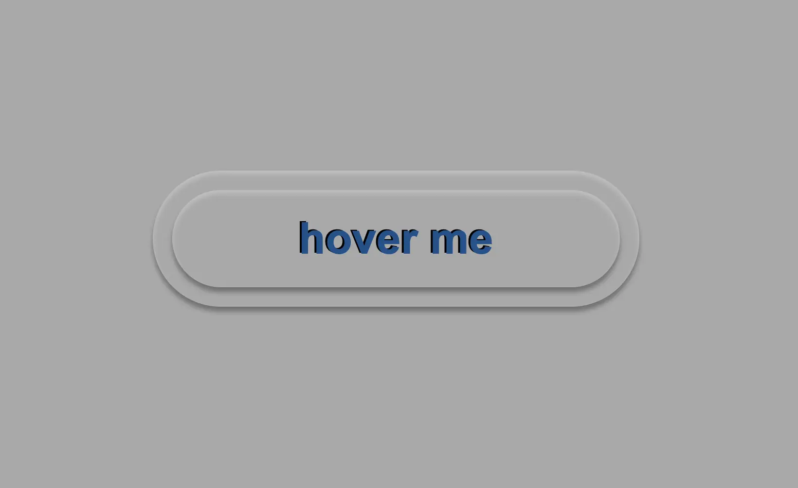
}Below, we can observe 🔎 the hover effect in action. Moving the cursor over the button, immediately transforms from arrow ⬆ into pointer 👆(hand), and the text content changes. The hover effect is a widely used design technique that adds interactivity and visual interest to a webpage.

Apply the active effect of the transparent button
Now, we can add the :active state to the button to finish our work. Once we click on the button, the active state will be triggered. To make it look more realistic and impressive, we adjust the box-shadow CSS property.
Additionally, we will modify the text content using the :before CSS property and change it to be inspiring and display the text “Good Job!” in indigo color with white text-shadow.
.custom-button {
  ...
  &:active {
    box-shadow: 0px -1px 3px #969393,  /* top side */
      inset 0px 5px 3px #b7b5b5, /* inset top side */
      inset 1px 0px 3px #969393, /* inset left side */
      inset -1px 0px 3px #969393, /* inset right side */
      inset 0px -4px 3px #969393; /* inset bottom side */
    &:before {
      content: "Good Job!";
      color: indigo;
      text-shadow: -2px -1px white;
    }
  }
}At this moment, you can witness 🧐 the active effect in action. Take a moment to observe and analyze how the effect is taking place and what impact it has. This will help you gain a better understanding of the process and its outcomes, which can be useful for future reference and decision-making. 😇 So, good luck with your work!

Complete code solution
Below is the full code referenced in this blog post. Feel free to copy and use it in your own projects. If you have any questions or encounter any issues, don’t hesitate to reach out for assistance. You can easily copy the desired code snippet by clicking on the copy icon, located in the top-right corner of each snippet.
<div class="wrapper">
  <button class="custom-button"></button>
</div>body {
background-color: darkgrey;
height: 100vh;
display: flex;
align-items: center;
justify-content: center;
}
.wrapper {
width: 500px;
height: 140px;
background: transparent;
border-radius: 80px;
box-shadow: inset 0px 3px 5px #c6c2c2,
0px 5px 5px #727070;
display: flex;
align-items: center;
justify-content: center;
}
.custom-button {
width: 460px;
height: 100px;
background: transparent;
border-radius: inherit;
box-shadow: inherit;
border: none;
font-family: 'Arial';
font-size: 45px;
color: #12528e; /* a shade of blue */
font-weight: bold;
display: flex;
align-items: center;
justify-content: center;
&:before {
position: absolute;
content: "hover me";
text-shadow: -2px -1px black;
}
&:hover {
cursor: pointer;
&:before {
content: "click me";
}
}
&:active {
box-shadow: 0px -1px 3px #969393, /* top side */
inset 0px 5px 3px #b7b5b5, /* inset top side */
inset 1px 0px 3px #969393, /* inset left side */
inset -1px 0px 3px #969393, /* inset right side */
inset 0px -4px 3px #969393; /* inset bottom side */
&:before {
content: "Good Job!";
color: indigo;
text-shadow: -2px -1px white;
}
}
}🌼 Hope you found my post interesting and helpful. Thanks for being here! 🌼
