Hello there! Today, we will explore a simple yet valuable topic. How do you create a CSS reflection using only one property? Let’s unlock the amazing –webkit-box-reflect property and effortlessly craft repeatable elements with minimal 😉 code! 🥳
Simple CSS Reflection
We will start by creating two identical boxes. We set 200 pixels width and 100 pixels height and also add a solid black 2 pixel border. Continuing, we give our boxes an indigo background-color.
<div class="box box--adjacent"></div>
<div class="box box--spaced"></div>Next, we proceed with our -webkit-box-reflect where we create the reflection of each box, ensuring that their direction remains the same (right direction). However, the second reflection is located 150 pixels from the original box. That way, we can explore both direction and distance.
.box {
  width: 200px;
  height: 100px;
  border: 2px solid black;
  background-color: indigo;
  &--adjacent {
    -webkit-box-reflect: right;
  }
  &--spaced {
    -webkit-box-reflect: right 150px;
  }
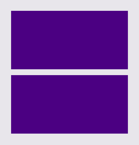
}In the images provided, we can see two boxes along with their corresponding reflections. In the first image, the box’s reflection is located exactly on the right-hand side, adjacent to the original box, while in the second image, the box also has a reflection on the right-hand side but is positioned 150 pixels away from the original box.


You may also like 🎬
CSS Reflection With Fade-Out Effect
It is essential to know that we can use the -webkit-box-reflect CSS property to create a reflection effect that accurately mirrors the original element’s appearance and style. We can further improve this effect and make it seem more authentic by using the linear-gradient CSS property, which gives us the impression of a gradual fade-out. This technique is pretty cool! 😎
We will start with our HTML code snippet, creating again two boxes with identical characteristics. We set 200 pixels width and 100 pixels height. Next, we give both boxes an indigo background-color.
<div class="box box--top"></div>
<div class="box box--bottom"></div>Next, we proceed with our -webkit-box-reflect where we create the reflections of each box, ensuring that they have the same direction (below). However, the second reflection has a linear-gradient that creates a fade-out effect from top to bottom.
.box {
  width: 200px;
  height: 100px;
  background-color: indigo;
  &--simple-reflection {
    -webkit-box-reflect: below 10px;
  }
  &--fade-out-reflection {
    -webkit-box-reflect: below 10px
    linear-gradient(
      rgba(0,0,0,0.0),
      rgba(0,0,0,0.2),
      rgba(0,0,0,0.4),
      rgba(0,0,0,0.6),
      rgba(0,0,0,0.8)
    );
  }
}When adjusting the reflection vertically, we need to use above and below instead of top and bottom.
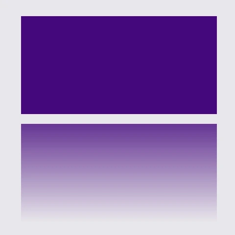
Below, you can observe two boxes along with their related reflections. In the first image, the box’s reflection is located 10 pixels above the original box. In the second image, the reflection stands again 10 pixels above the origin box, but this time has the fade-out effect. It looks nice, doesn’t it?


If you are interested in diving deeper, there is an amazing post about CSS text reflection that you might enjoy reading!
🌼 Hope you found my post interesting and helpful. Thanks for being here! 🌼


