
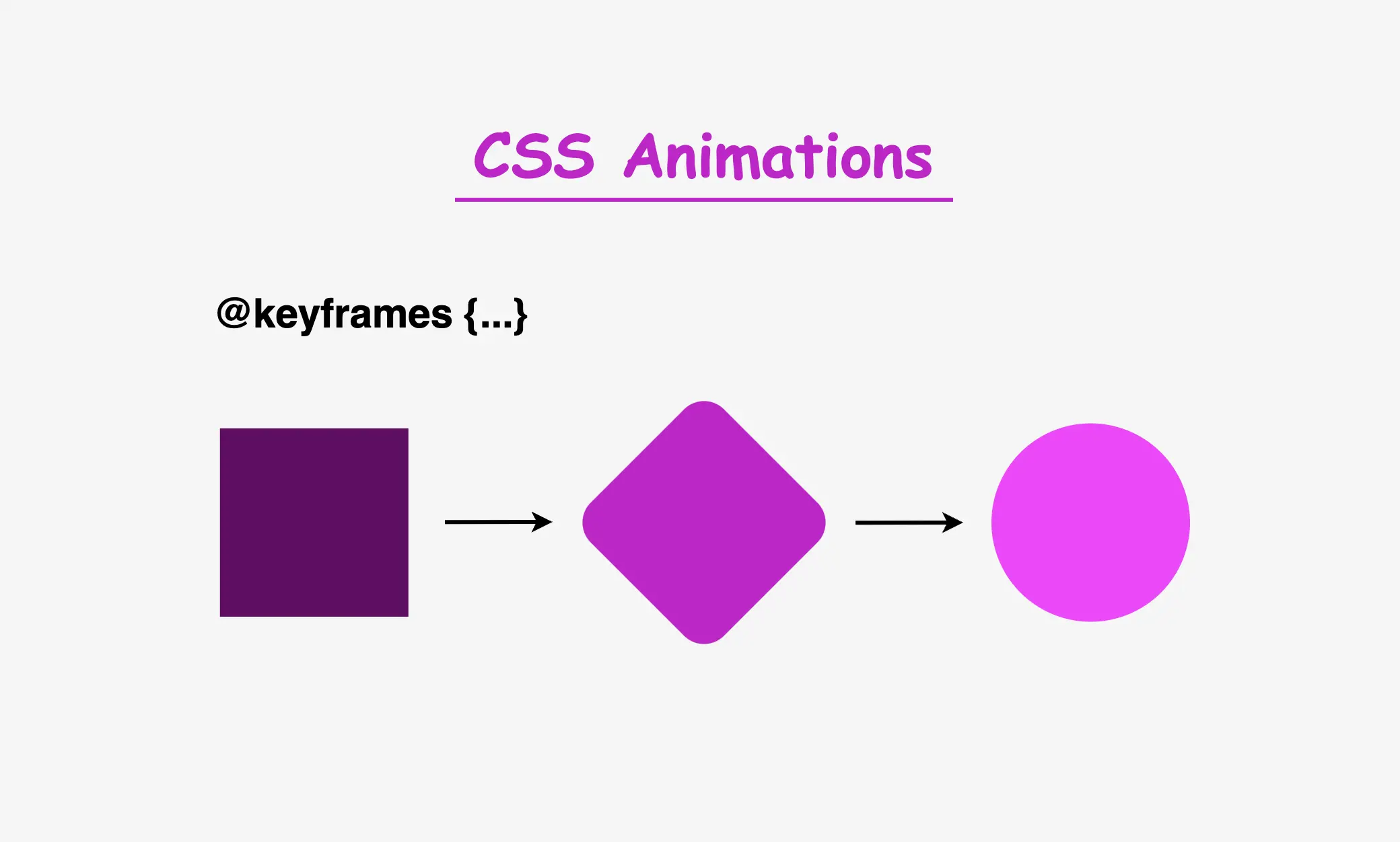
Hi there! 😃 In today’s post, we will analyze the amazing CSS @keyframes rule, an incredibly powerful tool for creating complex and visually stunning animations on web pages.
Understanding keyframes in CSS
In simple terms, keyframes define the animation’s behavior through a series of @keyframes which describes how the animation should change over time.
Each keyframe represents a specific point in time, and CSS smoothly transitions between these keyframes to create fluid motion.
With CSS keyframes, you can create various animations, from simple color changes to complex effects like movements and transformations. By combining keyframes with other CSS properties, we can control timing and duration and create dynamic and visually engaging websites.
I will provide you with an example that will make this at-rule crystal clear. 🧐 Let’s grab a ☕ and move forward. 🚀 We’ve got this!
Example of keyframes in CSS: The theory behind it
The details of the animation will depend on the specific effect we want to achieve. Let’s say we want to create an animation where a square ⬛ transforms into a circle ⚫ and then back into a square ⬛ again. Additionally, the color 🌈 of the shape changes during the animation, and there are some movements and transitions involved. It might seem massive and confusing, 😰 but we can deal with it step by step together! 🛠
For our animation to be smooth and realistic, we need to define the @keyframes. The first keyframe serves as the starting point (0%), followed by intermediate points and the final keyframe (100%) that marks the end of the animation and returns to the starting point.
😃The following code snippet provides a quick example of a keyframes structure in action.
@keyframes name-of-keyframe {
  0% {
    ... /* this is the starting point */
  }
  50% {
    ... /* this is one intermediate point */
  }
  100% {
    ... /* this is the ending point */
  }
}To create these keyframes, you’ll need to use CSS animation properties, such as animation-name, animation-duration, animation-iteration-count and animation-delay. The animation-name property connects the animation to its keyframes, while the other properties control how long it should last, how it should behave over time, and whether it has a delay before starting..
Once you’ve defined your keyframes and animation properties, CSS will automatically insert transitions between the keyframes to create smooth changes. This means you don’t need to worry about manual calculations. CSS takes care of it for you. Cool huh!? 😎 ✨
Example of keyframes in CSS: Practical implementation
As we already mentioned, we will work with a box. We need to start with the HTML code and create a <div> element that has the class name .box.
<div class="box"></div>Then, in our CSS code, we define the basic properties. It should be a square with a width and height of 200 pixels, and we’ll keep the background-color simple by using black for now.
.box {
  width: 200px;
  height: 200px;
  background-color: black;
}This is what is rendered on the screen for now. A simple black box.
Applying animation effects to the elements
To add animation effects to our <div> element, we need to define the animation properties of our class .box. We set the animation-name, which is the animation’s name, then the animation-duration, which is the time the animation takes to complete, and finally, the animation-iteration-count which declares how many times the animation should repeat.
.box {
  ...
  animation-name: my-animation;
  animation-duration: 10s;
  animation-iteration-count: infinite;
}

/* ----- MY ANIMATION ----- */
@keyframes my-animation {}Then, we create our animation using the @keyframes rule, where we can specify the values of the CSS properties at different points during the animation. The most crucial step is to link the animation to our element. We do this by using the animation-name property and assigning it to the same name we defined earlier. In our case my-animation.
Transforming colors and shapes with animation
We will start our transformations by working with colors and shapes using the background-color and border-radius properties.
/* ----- MY ANIMATION ----- */
@keyframes my-animation {
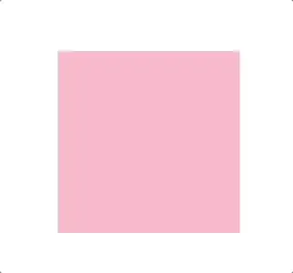
0% {
background-color: pink;
}
25% {
background-color: purple;
border-radius: 50%;
}
50% {
background-color: black;
border-radius: 50%;
}
75% {
background-color: purple;
border-radius: 50%;
}
100% {
background-color: pink;
}
}As we can see, it begins with a pink square at starting point: 0%. Then, it transitions to purple (25%) where it starts becoming cyclic. After that, it turns to black (50%) and remains a full circle. Then (75%) shifts to purple again, where it starts transitioning back to a square. Finally (ending point: 100%) turns to a pink square.
Animating Element Position
The next step is adjusting the position of our box. To do this, we need to adjust the positioning of the HTML element associated with our .box class and set it to position: relative, allowing it to move within its container.
Now, let’s animate its movement:
- The animation starts at the top-left corner
0%. - At
25%, it moves diagonally by changing both thetopandleftvalues. - At
50%, it continues moving horizontally to the left. - At
75%, it moves diagonally back by adjustingtopandleftagain. - Finally, at
100%, it returns to its original position at the top-left corner.
.box {
  ...
  position: relative;
}

/* ----- MY ANIMATION ----- */
@keyframes my-animation {
  0% {
    ...
    left: 0px;
    top: 0px;
  }
  25% {
    ...
    left: 200px;
    top: 100px;
  }
  50% {
    ...
    left: 300px;
  }
  75% {
    ...
    left: 200px;
    top: 100px;
  }
  100% {
    ...
    left: 0px;
    top: 0px;
  }
}
Animating Element Rotation
We can also make our box a little bit playful! 🤹♀️ We will add some extra moves with the amazing transform CSS property.
We will apply a rotation only between 25% and 75%.
- The animation starts with no rotation at
0%. - At
25%, the element remains unrotated withtransform: rotateY(0deg). - At
50%, it completes a full rotation withtransform: rotateY(360deg) - At
75%, it returns to its original position withtransform: rotateY(0deg). - Finally, at
100%, the cycle resets, ready to repeat.
/* ----- MY ANIMATION ----- */
@keyframes my-animation {
  0% {
    ...
  }
  25% {
    ...
    transform: rotateY(0deg);
  }
  50% {
    ...
    transform: rotateY(360deg);
  }
  75% {
    ...
    transform: rotateY(0deg);
  }
  100% {
    ...
  }
}
Now, let’s try to make it even more impressive by enriching the starting and ending phases.
- At
0%, we addtransform: rotateX(360deg). - At
25%, it resets withtransform: rotateX(0deg), creating a rotation along the X-axis from 0% to 25%. - At
50%and75%, we maintain a non-rotating phase withtransform: rotateX(0deg). - Finally, at
100%, we addtransform: rotateX(360deg), creating another rotation from75%to100%.
/* ----- MY ANIMATION ----- */
@keyframes my-animation {
  0% {
    ...
    transform: rotateX(360deg);
  }
  25% {
    ...
    transform: rotateX(0deg);
  }
  50% {
    ...
    transform: rotateX(0deg);
  }
  75% {
    ...
    transform: rotateX(0deg);
  }
  100% {
    ...
    transform: rotateX(360deg);
  }
}
Inserting content into the animated element
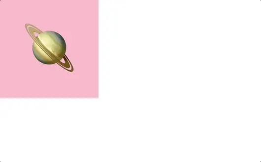
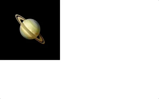
We can also add any content we want (text, image, emoticon, etc.) inside our HTML element. For our example, I use an emoticon and set its font-size to 100px.
<div class="box">
  <div class="emoticon">🪐</div>
</div>.box .emoticon {
font-size: 100px;
}
Delaying the animation start
We can add a delay to our animation by setting the animation-delay CSS property. This delay momentarily pauses the animation before it begins, creating a smoother and more controlled start.
For instance, if we set the delay to 2s, the animation will start after 2 seconds. However, please note that this delay occurs only once when we first see the animation. To observe the effect again, we may need to refresh the page.
.box {
...
animation-delay: 2s;
}You can see the animation with the delay effect below. It starts with its initial black background-color and after the 2s it starts the transitions we created with the @keyframes. 😉
Using the @keyframes shorthand for animations
By using shorthand, you can save space and time while improving your code’s readability. Instead of writing multiple properties separately, you can define them all using just the animation shorthand.
.box {
animation-name: my-animation;
animation-duration: 10s;
animation-iteration-count: infinite;
animation-delay: 2s;
/* Here’s the shorthand version */
animation: my-animation 10s 2s infinite;
}You may also like 🎬


Complete CSS animation code (copy & paste ready)
Below is the full code referenced in this blog post. Feel free to copy and use it in your own projects.
If you have any questions or encounter any issues, don’t hesitate to ask for help. You can easily copy the desired code snippet by clicking on the copy icon, located in the top-right corner of each snippet.
We’d love to hear your thoughts! If you have feedback or questions, drop a comment below.
<div class="box">
<div class="emoticon">🪐</div>
</div>* {
margin: 0;
padding: 0;
box-sizing: border-box;
}
html,
body {
height: 100vh;
}
.box {
width: 200px;
height: 200px;
background-color: black;
position: relative;
display: flex;
align-items: center;
justify-content: center;
animation: my-animation 10s 2s infinite;
}
.box .emoticon {
  font-size: 100px;
}
/* ----- MY ANIMATION ----- */
@keyframes my-animation {
0% {
left: 0px;
top: 0px;
background-color: pink;
transform: rotateX(360deg);
}
25% {
left: 200px;
top: 100px;
background-color: purple;
border-radius: 50%;
transform: rotateY(0deg) rotateX(0deg);
}
50% {
left: 300px;
background-color: black;
border-radius: 50%;
transform: rotateY(360deg) rotateX(0deg);
visibility: visible;
}
75% {
left: 200px;
top: 100px;
background-color: purple;
border-radius: 50%;
transform: rotateY(0deg) rotateX(0deg);
}
100% {
left: 0px;
top: 0px;
background-color: pink;
transform: rotateX(360deg);
}
}🌼 Hope you found my post interesting and helpful. Thanks for being here! 🌼
