
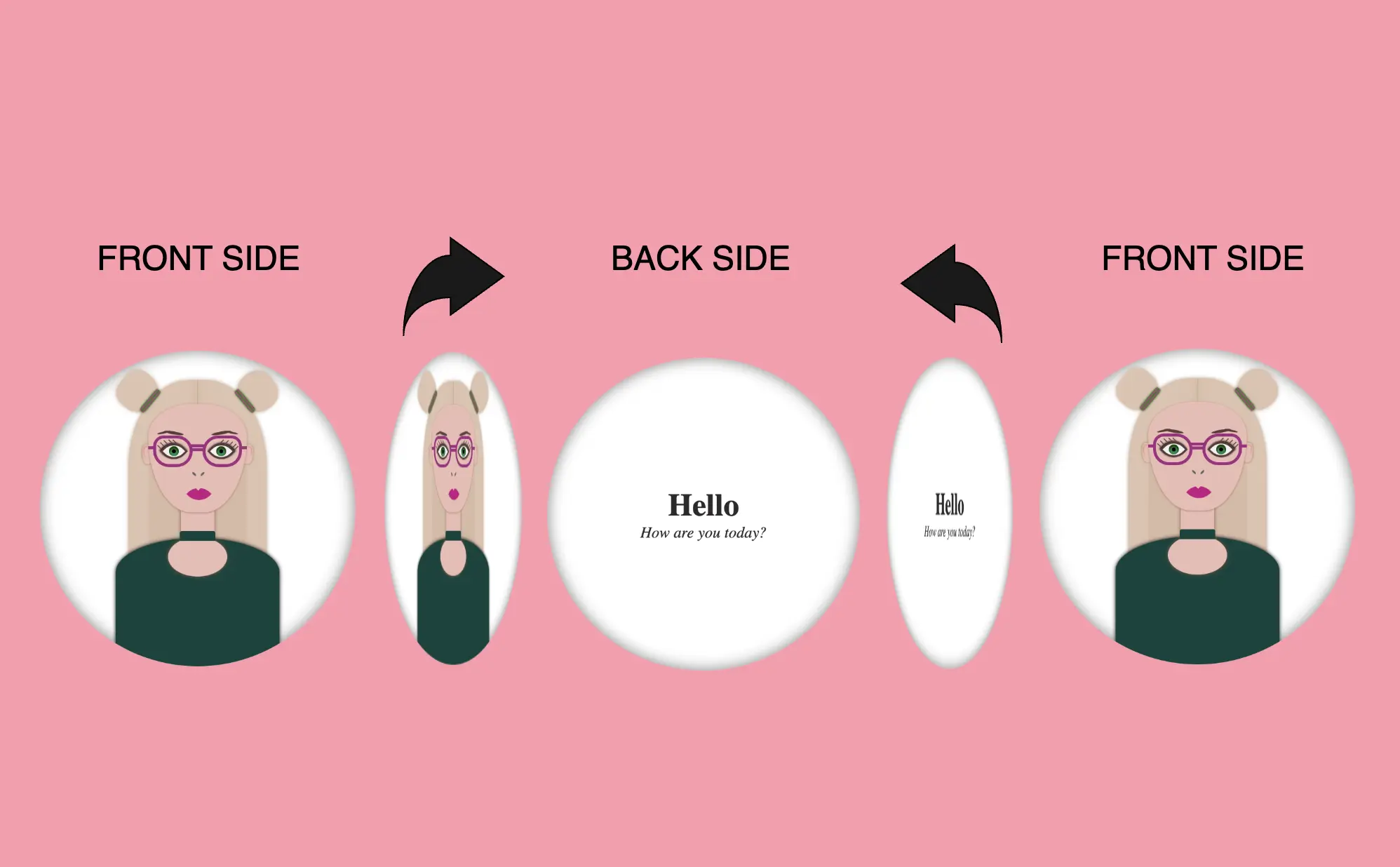
Hello! In this post, I will show you how to create a visually appealing CSS 2d card with flipping animation that activates when you hover over it. To enhance the design, I have added an avatar and integrated the animation with it. If you are interested in how I created the avatar, you can check out the complete avatar code at the end of this post. You are free to use it in your animation or customize it to your liking. Enjoy! 😉
For now, let’s move forward and create this incredible animation!
CSS Flipping card animation on hover
The following HTML and SCSS (Sass) code makes a card flip around. Using the X-axis and Y-axis which are two lines that intersect, helps us determine the position of a point in a two-dimensional area.
Let’s analyze our code one step at a time:
HTML structure
We will begin with the HTML structure. We create a parent container called .flip-wrapper. This container acts as the parent element for our animation. Inside it, we have a child element with the .flip-card class, this is where our animation happens. Next, we divide the child element into two parts: the front side and the back side. On the front side, we’ll add the .avatar-container and place the avatar inside while on the back side, we’ll add the .text-container class and add some text.
<div class="flip-wrapper">
  <div class="flip-card">
    <div class="avatar-container"></div>
    <div class="text-container">
      <h1>Hello</h1>
      <div><i>How are you today?</i></div>
    </div>
  </div>
</div>CSS Basic structure
In our CSS code snippet, first of all, we set the background of our whole page to pink. 💕 🎀 🌸
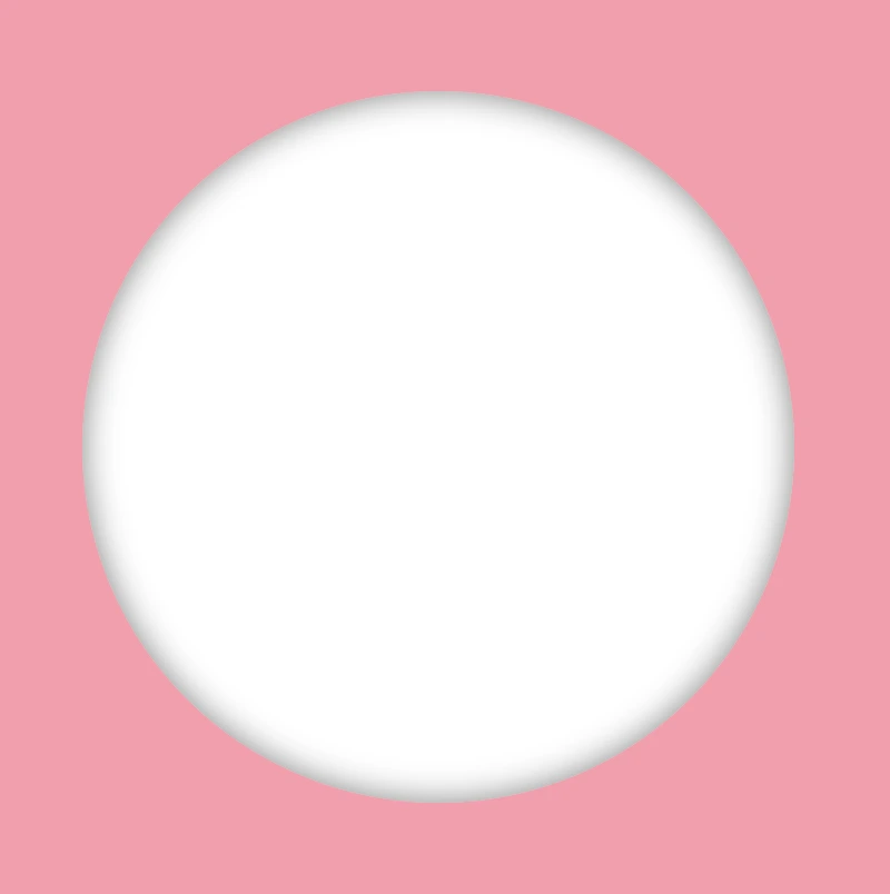
Moving on to the .flip-wrapper container, we specify its dimensions, giving it a fixed width and height of 300 pixels. To make a circular appearance, we apply a border-radius of 50%. If you desire, you can maintain the square ⬜ shape. I chose this rounded ⚪ design because it makes it easier for us to observe the effect we’re aiming for. 😉
Next, we focus on the .flip-card element. We set the position: relative property and then its witdh and height to 100% to ensure it covers the entire available space. We also add a white background-color and a subtle gray shadow effect. To maintain the circular theme, we apply a border-radius of 50% to this container too.
Finally, we set the position: absolute property in both .avatar-container and .text-container classes. In that way we will be ready to place the content we want on both, the front and the back, sides of our card.
body {
  background: pink;
}

.flip-wrapper {
  width: 300px;
  height: 300px;
  border-radius: 50%;
  .flip-card {
    position: relative;
    width: 100%;
    height: 100%;
    background-color: white;
    box-shadow: inset 0 0 15px grey;
    border-radius: 50%;
  }
}

.avatar-container,
.text-container {
  position: absolute;
}This is what’s rendered on our screen at the moment.
Adding the hover effect
In order for our effect to function as intended we have to work with both the parent and the child element. We begin with the parent element, where we apply the :hover effect and change the cursor to a pointer (you can pick any cursor style you prefer).
.flip-wrapper {
  ...
  &:hover {
    cursor: pointer;
  }
}
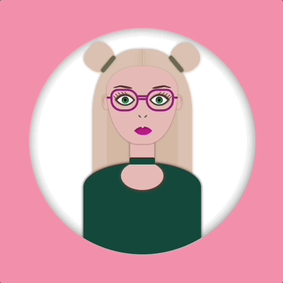
Preparing the front side of my flipping card
I added an avatar on the front side of my flipping card. You can add whatever you want (some text, maybe, or an emoticon ✏️) or you can leave it empty, though it is not really useful for observing the flipping.
.avatar-container {
  ...
}In the following image, we can see how the front side of our flipping card would be. Nice! Isn’t it? 😃

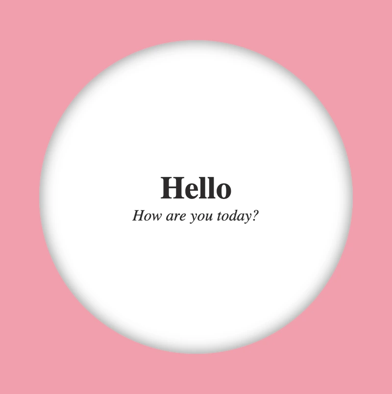
Preparing the back side of my flipping card
Here we prepare our text’s style. We keep the default black color and we centered our text based on the display: flex method.
.text-container {
  display: flex;
  flex-direction: column;
  align-items: center;
  justify-content: center;
}Below we can see how the back side of our flipping card would be. Cool huh! 😃
Now we are ready to connect these two parts and finally create our amazing animation.
You may also like 🎬


Adding the flipping animation at the 2D card
We are free to create flipping animations on both axis X and Y. Below, I prepared two examples. The first one is for axis-Y while the second one is for axis-X. Let’s break it down and see them analytically. 🧐
Flipping animation on axis-Y
In order to achieve our goal we have to combine the following CSS properties.
transform: rotateY(180deg)We begin by setting the transform property, which is responsible for the flipping, inside the hover effect. It is also necessary to add it to the class that represents the back side of our card, in our case the.text-containerclass, otherwise, our text won’t be rendered on the screen when we hover over the card.transition: transform 6s&transform-style: preserve-3dWe continue by combining these two properties inside the.flip-cardclass. The first one shows us the exact, time in seconds (s), our effect will take place while the second one makes the children of an element appear as if they are positioned in a 3D space. So this property gives us the impression that the descendants (children) of our element are located within a three-dimensional space.backface-visibility: hiddenWe finalize our work with the backface-visibility property that defines whether or not the back side of an element should be visible when facing the user. The back face of an element is a mirror image of the front face being displayed.
.flip-wrapper {
  ...
  &:hover {
    cursor: pointer;
    .flip-card {
      transform: rotateY(180deg);
    }
  }
  .flip-card {
    ...
    transition: transform 6s;
    transform-style: preserve-3d;
  }
}

.avatar-container,
.text-container {
  ...
  backface-visibility: hidden;
}

.text-container {
  transform: rotateY(180deg);
}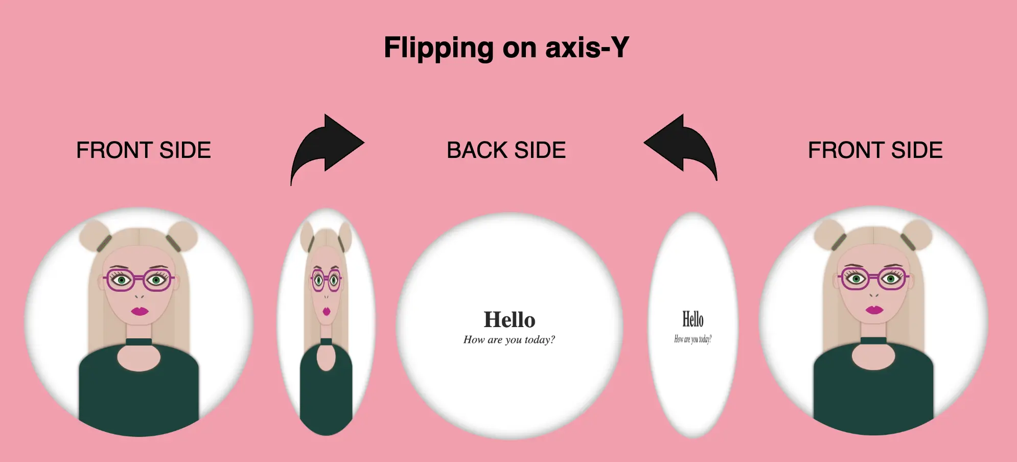
Voila!! Here is our amazing flipping 2d card animation for the Y-axis!! 🥳

Flipping animation on axis-X
We do as previously but in this case, we set the transform: rotateX as we want our animation to move along the X-axis.
.flip-wrapper {
  ...
  &:hover {
    cursor: pointer;
    .flip-card {
      transform: rotateX(180deg);
    }
  }
  .flip-card {
    ...
    transition: transform 6s;
    transform-style: preserve-3d;
  }
}

.avatar-container,
.text-container {
  ...
  backface-visibility: hidden;
}

.text-container {
  transform: rotateX(180deg);
}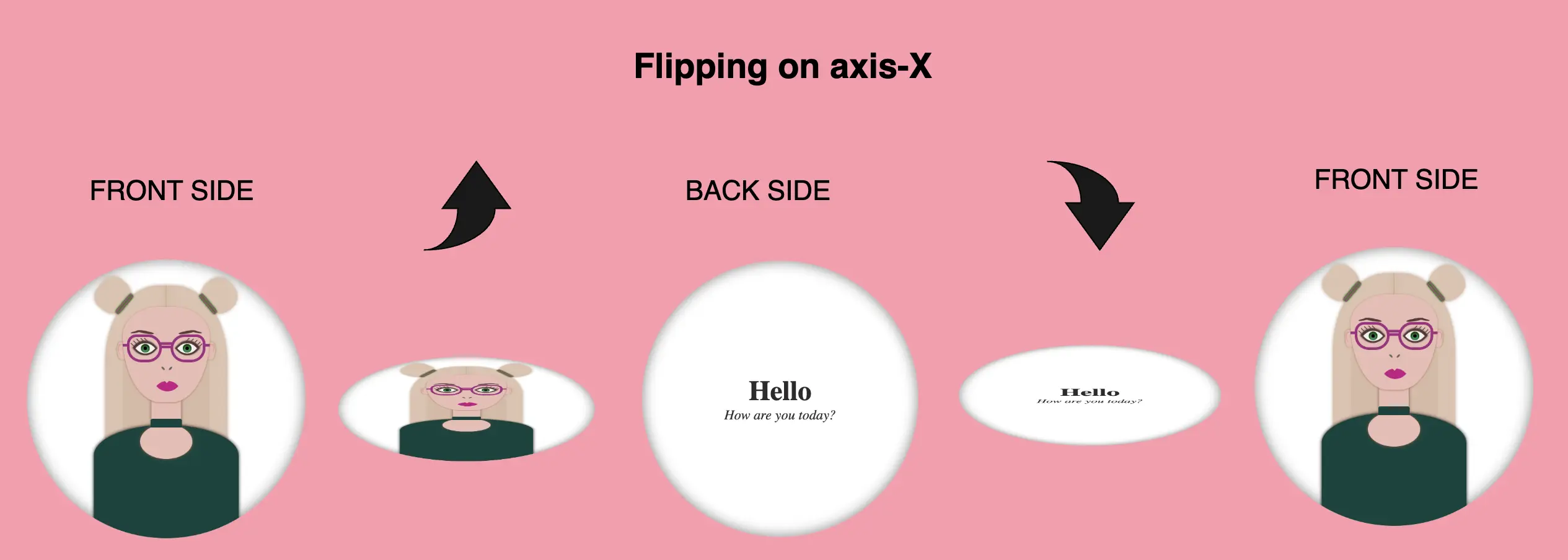
Boom! 🎉 This is our wonderful flipping 2d card animation for the X-axis!!
Complete avatar code
Below, I include my HTML and CSS avatar code.
<div class="avatar-container">
  <div class="hair-back"></div>
  <div class="hair hair--left"></div>
  <div class="hair hair--right"></div>
  <div class="hair-clip hair-clip--left"></div>
  <div class="hair-clip hair-clip--right"></div>
  <div class="ear ear--left"></div>
  <div class="ear ear--right"></div>
  <div class="face">
    <div class="eyebrow1 eyebrow1--left"></div>
    <div class="eyebrow1 eyebrow1--right"></div>
    <div class="eyebrow2 eyebrow2--left"></div>
    <div class="eyebrow2 eyebrow2--right"></div>
    <div class="eye-glasses eye-glasses-left"></div>
    <div class="eye-glasses eye-glasses-right"></div>
    <div class="eye eye--left">
      <div class="eyelash eyelash--left"></div>
      <div class="eyelash eyelash--left1"></div>
      <div class="eyelash eyelash--left2"></div>
      <div class="eyelash eyelash--left3"></div>
      <div class="eyelash eyelash--left4"></div>
    </div> <!-- end of left eye -->
    <div class="eye eye--right">
      <div class="eyelash eyelash--right"></div>
      <div class="eyelash eyelash--right1"></div>
      <div class="eyelash eyelash--right2"></div>
      <div class="eyelash eyelash--right3"></div>
      <div class="eyelash eyelash--right4"></div>
    </div> <!-- end of right eye -->
    <div class="nose"></div>
    <div class="lips"></div>
  </div> <!-- end of face -->
  <div class="neck"></div>
  <div class="t-shirt"></div>
  <div class="neckless"></div>
</div> <!-- end of avatar-container -->$body-color: #ff9aab;
$container-color: white;
$skin-color: #eabcb4;
$primary-color: #2d2a2a;
$secondary-color: #f1f1f1;
$eye-color: #17884e;
$eyeline-color: #5b3a3a;
$eyelash-color: #6d4646;
$iris-color: #000;
$hair-color: #dfc2ae;
$hair-clip-color1: green;
$hair-clip-color2: #b3498d;
$hair-clip-color: linear-gradient($hair-clip-color1, $hair-clip-color2, $hair-clip-color1, $hair-clip-color2, $hair-clip-color1);
$eye-glasses-color: #a32a80;
$eyebrow-color: #5b3a3a;
$nose-color: #646363;
$lips-color: #cd0b87;
$t-shirt-color: #0b443c;
$neckless-color: #0b443c;
* {
margin: 0;
padding: 0;
box-sizing: border-box;
}
html,
body {
height: 100vh;
}
body {
width: 100%;
display: flex;
align-items: center;
justify-content: center;
background: $body-color;
}
.avatar-container {
position: relative;
width: 320px;
height: 320px;
border-radius: 50%;
background-color: $container-color;
box-shadow: inset 0 0 15px grey;
overflow: hidden;
.hair-back {
position: absolute;
width: 140px;
height: 200px;
border-radius: 44% 44% 20px 20px;
top: 30px;
left: 50%;
transform: translate(-50%);
background-color: $hair-color;
filter: drop-shadow(0 0 2px #bc9b83);
z-index: 2;
&:before {
content: "";
position: absolute;
width: 0.5px;
height: 28px;
background-color: #bc9b83;
filter: drop-shadow(0 0 4px #69660f);
top: 0px;
left: 50%;
transform: translate(-50%);
}
&:after {
content: "";
position: absolute;
width: 100px;
height: 110px;
border-radius: 20%;
background-color: #d8baa4;
top: 70px;
left: 50%;
transform: translate(-50%);
}
}
.hair {
position: absolute;
width: 40px;
height: 40px;
background-color: $hair-color;
filter: drop-shadow(0 0 2px #bc9b83);
z-index: 1;
&--left {
border-radius: 50% 50% 70% 70%;
top: 22px;
left: 80px;
transform: rotate(-50deg);
}
&--right {
border-radius: 50% 50% 60% 60%;
top: 22px;
right: 80px;
transform: rotate(50deg);
}
}
.hair-clip {
position: absolute;
width: 28px;
height: 6px;
background: $hair-clip-color;
box-shadow: 0 0 2px #037203;
border-radius: 20%;
z-index: 10;
&--left {
transform: rotate(-50deg);
top: 48px;
left: 98px;
}
&--right {
transform: rotate(50deg);
top: 48px;
right: 98px;
}
}
.ear {
position: absolute;
width: 10px;
height: 20px;
background-color: $skin-color;
filter: drop-shadow(0 0 1px #7e7a1f);
border-radius: 40%;
top: 95px;
z-index: 3;
&--left {
left: 104px;
transform: rotate(-5deg);
&:before {
content: "";
position: absolute;
width: 6px;
height: 12px;
background-color: $skin-color;
border-radius: 40% 40% 50% 50%;
box-shadow: -1px -1px 1px darken($skin-color, 10%);
top: 3px;
left: 2px;
}
}
&--right {
right: 104px;
transform: rotate(5deg);
&:before {
content: "";
position: absolute;
width: 6px;
height: 10px;
background-color: $skin-color;
border-radius: 40% 40% 50% 50%;
box-shadow: 1px -1px 1px darken($skin-color, 10%);
top: 3px;
right: 2px;
}
}
} // end of ear
.face {
position: absolute;
width: 100px;
height: 110px;
border-radius: 100% / 70% 70% 160% 160%;
background-color: $skin-color;
top: 54px;
left: 50%;
transform: translate(-50%);
box-shadow: 0 0.5px 2px #b37865;
z-index: 10;
.eye-glasses {
position: absolute;
width: 40px;
height: 32px;
border: 3px solid $eye-glasses-color;
top: 32px;
z-index: 10;
&.eye-glasses-left {
border-radius: 12px 18px 18px 18px;
left: 5px;
&:before {
content: "";
position: absolute;
width: 14px;
height: 3px;
background-color: $eye-glasses-color;
top: 10px;
left: 35px;
}
&:after {
content: "";
position: absolute;
width: 6px;
height: 3px;
background-color: $eye-glasses-color;
top: 8px;
left: -8px;
}
}
&.eye-glasses-right {
border-radius: 18px 12px 18px 18px;
right: 5px;
&:before {
content: "";
position: absolute;
width: 15px;
height: 3px;
background-color: $eye-glasses-color;
top: 6px;
left: -15px;
}
&:after {
content: "";
position: absolute;
width: 6px;
height: 3px;
background-color: $eye-glasses-color;
top: 8px;
right: -8px;
}
}
} // end of eye-glasses
.eye {
position: absolute;
width: 20px;
height: 20px;
top: 38px;
background-color: $secondary-color;
border: 2px solid $eyeline-color;
border-radius: 75% 0%;
transform: rotate(45deg);
&:before {
content: "";
position: absolute;
width: 10px;
height: 10px;
top: 50%;
left: 50%;
transform: translate(-50%, -50%);
background-color: $eye-color;
border-radius: 50%;
box-shadow: inset 1px 1px 1px 1px #17460d;
}
&--left {
left: 16px;
box-shadow: -1px 0 2px darken($eyeline-color, 50%);
}
&--right {
right: 16px;
box-shadow: 0 -1px 2px darken($eyeline-color, 50%);
}
&:after {
content: "";
position: absolute;
width: 4px;
height: 4px;
top: 50%;
left: 50%;
transform: translate(-50%, -50%);
background-color: $iris-color;
border-radius: 50%;
}
.eyelash {
position: absolute;
Width: 1px;
height: 5px;
background-color: $eyelash-color;
&--left,
&--left1,
&--left2,
&--left3,
&--left4 {
transform: rotate(90deg);
}
&--left {
top: -2px;
left: 1px
}
&--left1 {
top: 1px;
left: -2px
}
&--left2 {
top: 5px;
left: -5px
}
&--left3 {
top: 9px;
left: -6px
}
&--left4 {
top: 13px;
left: -6px
}
&--right {
top: -2px;
right: 14px;
}
&--right1 {
top: -5px;
right: 10px;
}
&--right2 {
top: -7px;
right: 6px;
}
&--right3 {
top: -8px;
right: 2px;
}
&--right4 {
top: -8px;
right: -1px;
}
} // end of eye-lash
} // end of eye
.eyebrow1 {
position: absolute;
width: 20px;
height: 3px;
background-color: $eyebrow-color;
border-radius: 50%;
top: 28px;
&--left {
transform: rotate(10deg);
left: 16px;
}
&--right {
transform: rotate(-10deg);
right: 16px;
}
} // end of eyebrow1 //
.eyebrow2 {
position: absolute;
content: "";
width: 14px;
height: 2px;
background-color: $eyebrow-color;
border-radius: 50%;
top: 28px;
&--left {
transform: rotate(-12deg);
left: 9px;
}
&--right {
transform: rotate(12deg);
right: 9px;
}
} // end of eyebrow2 //
.nose {
position: absolute;
width: 5px;
height: 2px;
background-color: $nose-color;
border-radius: 50%;
transform: rotate(45deg);
top: 70px;
left: 44px;
&:before {
content: "";
position: absolute;
width: 5px;
height: 2px;
background-color: $nose-color;
border-radius: 50%;
transform: rotate(90deg);
top: -6px;
left: 6px;
}
} // end of nose
.lips {
position: absolute;
width: 18px;
height: 18px;
border-radius: 90% 0;
background-color: darken($lips-color, 1%);
top: 90px;
left: 50%;
transform: rotate(45deg) translate(-60%);
&:before {
content: "";
position: absolute;
width: 0;
height: 0;
border-left: 3px solid transparent;
border-right: 3px solid transparent;
border-top: 3px solid $skin-color;
border-radius: 60%;
transform: rotate(-45deg);
top: 24%;
left: 12%;
}
} // end of lips
} // end of face
.neck {
position: absolute;
width: 34px;
height: 50px;
background-color: $skin-color;
filter: drop-shadow(0 0 2px #865748);
top: 149px;
left: 50%;
transform: translate(-50%);
z-index: 9;
&:before {
content: "";
position: absolute;
width: 60px;
height: 40px;
background-color: $skin-color;
border-radius: 50%;
top: 40px;
left: 50%;
transform: translate(-50%);
}
} // end of neck
.t-shirt {
position: absolute;
width: 166px;
height: 140px;
background-color: $t-shirt-color;
border-radius: 100% / 50% 50% 20% 20%;
top: 190px;
left: 50%;
transform: translate(-50%);
filter: drop-shadow(0 0 2px);
z-index: 4;
} // end of t-shirt
.neckless {
content: "";
position: absolute;
width: 36px;
height: 10px;
background-color: $neckless-color;
border-radius: 2px 2px 0 0;
z-index: 10;
top: 183px;
left: 50%;
transform: translate(-50%);
} // end of neckless
} // end of avatar-container🌼 Hope you found my post interesting and helpful. Thanks for being here! 🌼
