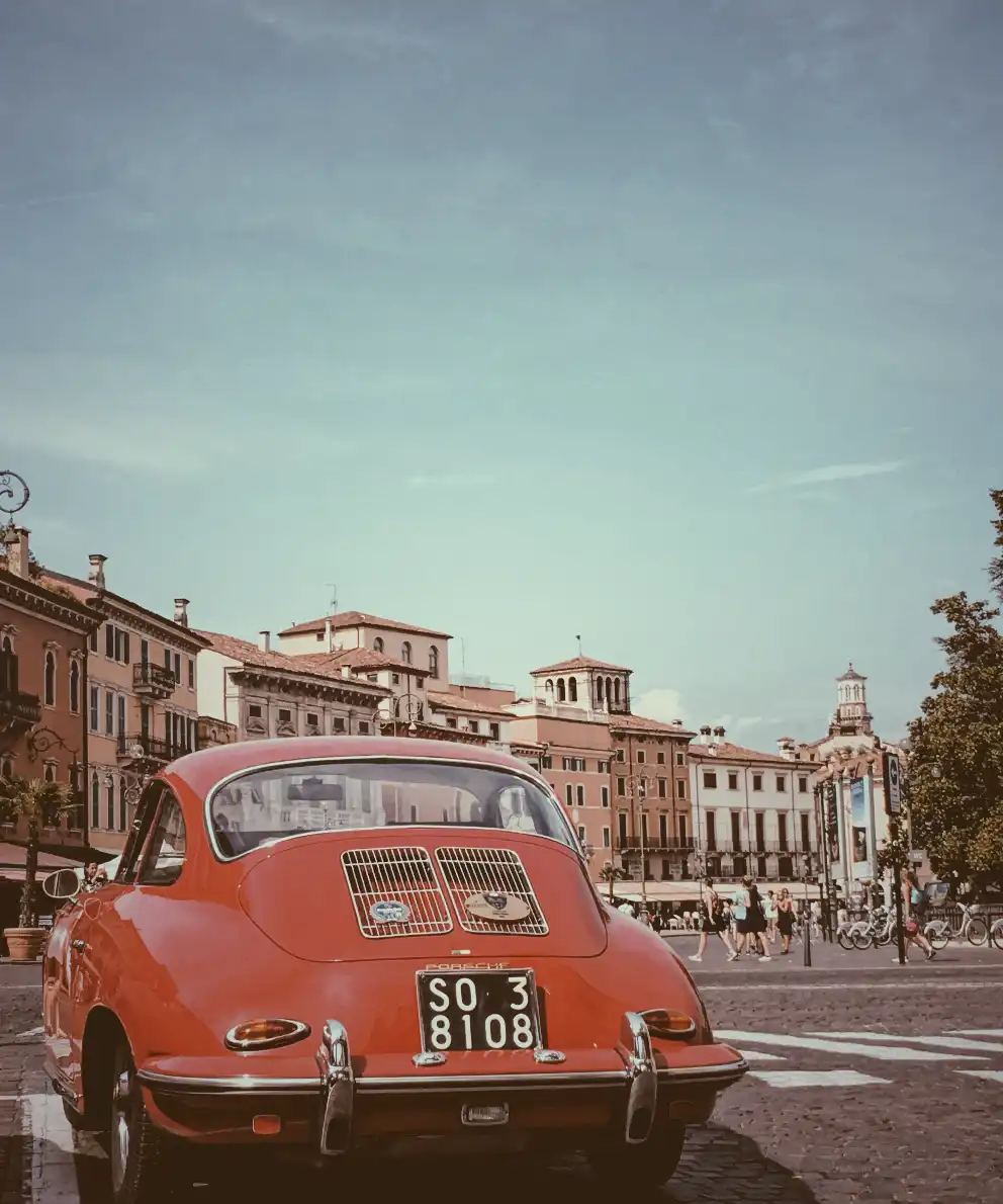
In the world of web design, adding a touch of nostalgia or a vintage vibe to images can significantly enhance a website’s aesthetic. One timeless technique to achieve this effect is the CSS sepia filter.
Originating from sepia ink, which has been used for centuries, this filter gives photos a warm, brownish tone reminiscent of old photographs, lending a sense of history and charm to the visuals.
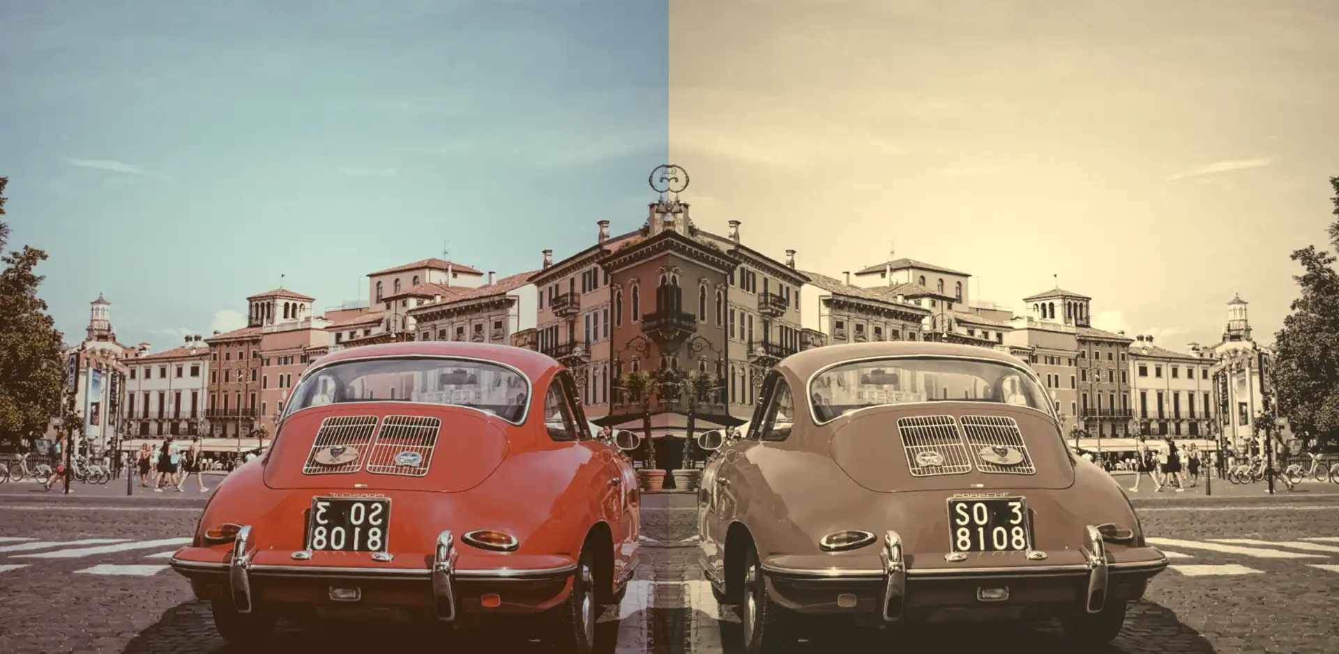
An image with 0% sepia maintains its original, true colors, while at 100% sepia, the image is entirely transformed into a warm, brownish tone as an aged photograph. As you increase the percentage, you intensify the sepia effect.
Join me 😃 into the magic of the filter: sepia(%) CSS property and explore how it can be seamlessly integrated into your web design toolbox.
History of the sepia ink
🧐 Did you know that sepia ink is a brownish-black ink made from the ink sac of the common cuttlefish, Sepia? 🐙 They belong to the class Cephalopoda, which also includes squid, octopuses, and nautiluses.
Historically, it has been used for writing and drawing, and it was particularly popular in the past for writing manuscripts and creating artwork.
The ink took its name from the sepia cuttlefish, which was the source of the ink. The ink was widely used in antiquity and during the Renaissance*, and it has a characteristic warm, brownish hue which is why the CSS filter that replicates this effect is referred to as the “sepia” filter.
(* The Renaissance was a period in European history that spanned roughly from the 14th century to the 17th century. It was characterized by a significant cultural, artistic, and intellectual rebirth after the Middle Ages. The term “Renaissance” is derived from the French word meaning “rebirth”).
Use the CSS sepia filter to an image
Below I craft an example as an easy way to explain this amazing CSS property to you! 😃 So, let’s proceed.
We will start with our HTML and CSS code snippets.
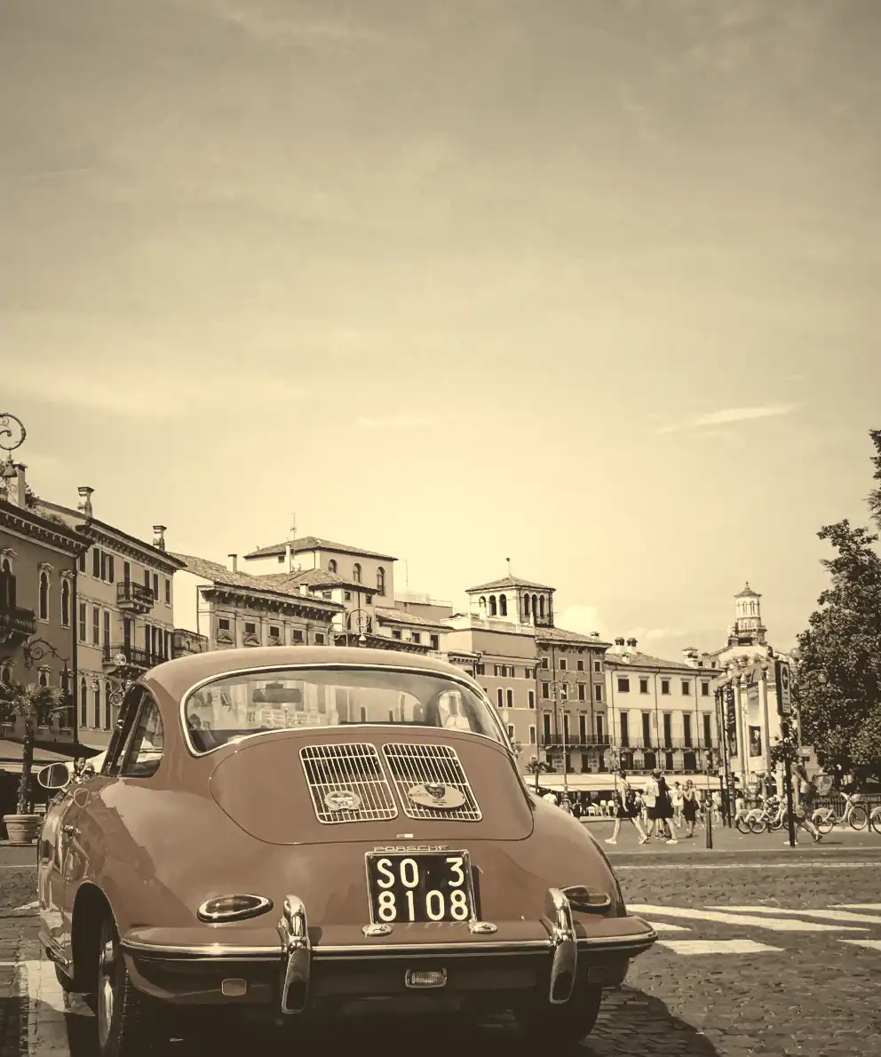
The HTML snippet contains two <img> elements. The first one has the .original-image class, indicating a standard image. The second one has also the .original-image and additionally the .with-sepia, implying it’s a styled image using the sepia filter, giving it a warm, brownish tone.
<img class="original-image"/>
<img class="original-image with-sepia"/>The .original-image class is shared by both image elements, setting a background image, ensuring it doesn’t repeat and covering the specified width and height (400px by 500px).
The .with-sepia class applied only to the second image, introduces a sepia filter of 80%, giving a warm, brownish tone.
.original-image {
  background-image: url(https://images.unsplash.com/photo-1501829385782-9841539fa6bf?ixlib=rb-4.0.3&ixid=M3wxMjA3fDB8MHxwaG90by1wYWdlfHx8fGVufDB8fHx8fA%3D%3D&auto=format&fit=crop&w=3024&q=80);
  background-repeat: no-repeat;
  background-size: cover;
  width: 400px;
  height: 500px;
}

.with-sepia {
  filter: sepia(80%);
}By placing the two images side by side, we can effortlessly 🧐 perceive the contrast between them. It’s absolutely fascinating, isn’t it? 😃


Enrich filter CSS sepia property with grayscale value
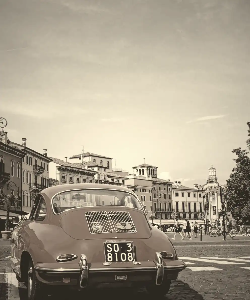
In addition, we can add the filter: grayscale(%) CSS property. Together, these filters can create a unique and visually captivating presentation, capturing the essence of both the past and the present in a single frame.
.with-sepia {
  filter: sepia(80%) grayscale(50%);
}Wow! 🌟 This is absolutely stunning! 😃

🌼 Hope you found my post interesting and helpful. Thanks for being here! 🌼


