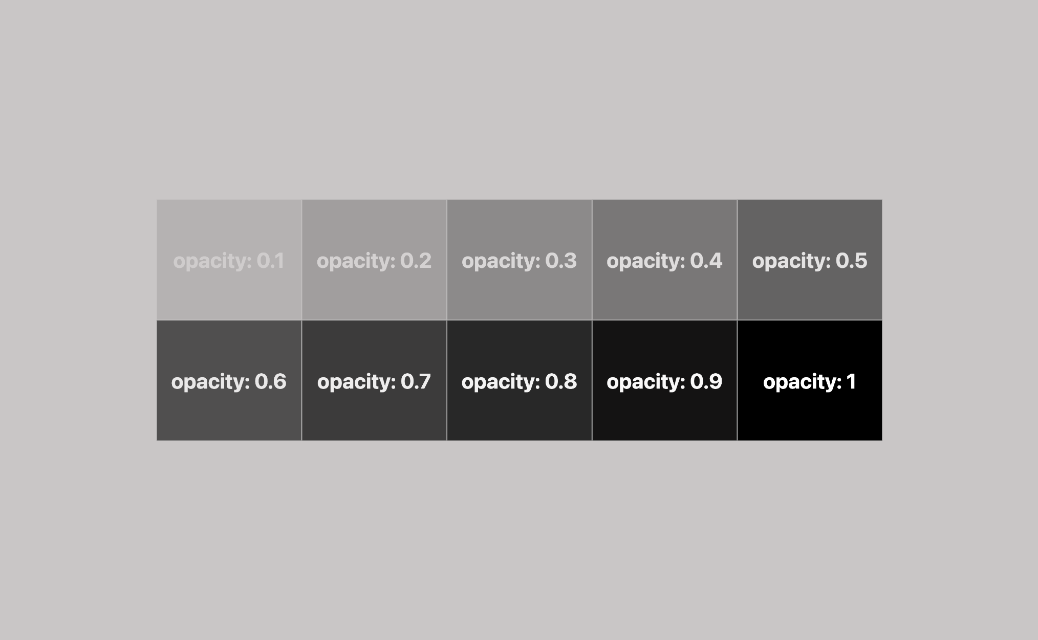
The CSS opacity filter is a property that allows you to adjust the element’s transparency on a website. Opacity values range from 0.0 to 1 (default), where opacity: 0.0 indicates complete transparency and opacity: 1 indicates complete intransparency (opaqueness). 👻💻
How to change opacity on hover?
You can create visually appealing effects by overlapping the elements’ colors. Moreover, you can make it more dynamic 💥 by animating it with CSS transitions. For instance, you can create an effect when an element is clicked or hovered over.
Let’s say, for example, we have a red box like this

and would like to change its opacity on hover. How would we do that? We would add the following code:
.box:hover {
   opacity: 0.5;
}As a result, when hovering over our element, it would change its opacity like this
See the Pen
Opacity box no transition by George (@GeorgeLin)
on CodePen.
Some may think this is not ideal; changing the opacity is cool, but it feels like we can do better. A straightforward way to improve the opacity change is just to add a transition effect and make it look much cooler:
.box {
  transition: opacity 0.5;
}
.box:hover {
   opacity: 0.5;
   transition: opacity 0.5;
}We apply the same transition to both the .box class and its hover state to ensure a consistent effect when hovering on or off the element. This approach produces the following result:
See the Pen
Opacity box with transition by George (@GeorgeLin)
on CodePen.
Pretty cool, right?
You may also like 🎬
Exploring CSS Opacity and Its Impact on Background Colors in HTML
Depending on the opacity value, the child’s hues are influenced by the parent’s colors. Hues become more vibrant as the opacity/transparency increases. If the child element has a low opacity value, its colors will be more similar to the parent’s background-color. Conversely, if the child element has a high opacity value, its colors will be less similar to the parent’s color.
In the following examples I prepared, we can see how this CSS property works. 🧐 So, let’s take a closer look.
Each example has a pair of HTML elements, one with .parent class and one with the .child class. Child elements have the same colors (color: black and background-color: white) while parent elements have different background-color each time (gray and orange).
CSS Opacity: Effects on HTML Elements with Gray Backgrounds
As we can see, the resulting color of our child element will be a mix of white, influenced by the grey ⬜ background color.
.parent {
  background-color: grey;
}

.child {
  color: black;
  background-color: white;
  opacity: 0.1; // depending on the value //
}
CSS Opacity: Effects on HTML Elements with Orange Backgrounds
As observed, the child’s resulting color will be a blend of white, affected by the orange 🟧 background color.
.parent {
  background-color: orange;
}

.child {
  color: black;
  background-color: white;
  opacity: 0.1; // depending on the value //
}
CSS opacity provides a powerful way to control transparency, affecting how the background colors of parent elements interact with child elements. Understanding these interactions can help create visually appealing designs where colors harmoniously blend across different layers. 🌈 ✨
You may also like 🎬
🌼 Hope you found my post interesting and helpful. Thanks for being here! 🌼


