Our life consists of large and small boxes! By saying that, I mean all those things we have to deal with daily, and we usually put them into categories as we do in programming with boxes by using the amazing CSS box model property. Are these boxes a mystery puzzle 🕵️♀ or could they end up being really helpful when we truly understand how they work? Let’s continue and get a clearer understanding of it! 😀
What is a CSS box model?
By saying CSS box 🎁 model we mean the space which contains an HTML element. A CSS box consists of:
1) Content: This is the space that the HTML element occupies. By content, we mean text, images, lists, avatars, videos, icons, shapes …
2) Border: It’s the line we surround something. We could define it as a frame that encloses HTML elements. Border doesn’t include content, it’s an independent property. Border property can take only one value (border) or many values (some we use more are border-width, border-style, border-color, border-radius, border-image but there are many others too). You can also set different values for each side of the border with border-top, border-bottom, border-left, border-right CSS properties.
3) Paddings: It’s the distance between content and border. We can set the same value for all four sides (padding) or we can set different values for each side (padding-top, padding-bottom, padding-left & padding-right).
4) Margins: It’s the external distance between HTML elements. By setting margin in one value it works the same for all four sides of the element, otherwise, you can set dissimilar values with margin-top, margin-bottom, margin-left & margin-right CSS properties.
We can COMBINE all these properties in a CSS box but we can also use them separately.
Below, we have an image that shows a CSS box model diagram.
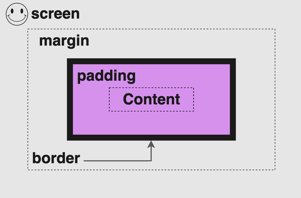
🔖 Always remember margin & padding are both transparent. The padding uses the same background as the one used by the main content, while the margin inherits its background from the parent element to which it belongs.
CSS Box model example
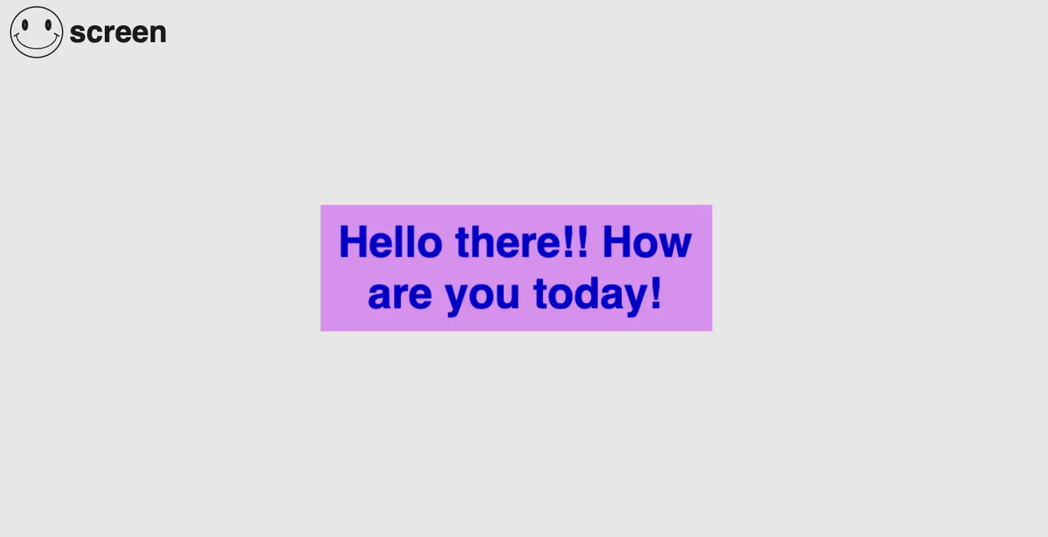
We can now take a break ☕ and continue… Let’s analyze a little bit more our CSS box model with an example. First, we have to write down our HTML & CSS code without padding, border & margin. The image, that follows our code snippet, shows what was rendered through our code.
<body>
  <div class="title">
    Hello there! How are you today?
  </div>
</body>html,
body {
height: 100%;
}
body {
/* we use display property to center our HTML element to the body */
display: flex;
align-items: center;
justify-content: center;
background-color: grey;
}
.title {
text-align: center; /* to center our text */
color: blue;
background-color: purple;
font-size: 40px;
width: 300px;
height: 100px;
}For the time being, we are able to observe the content displayed on the screen.
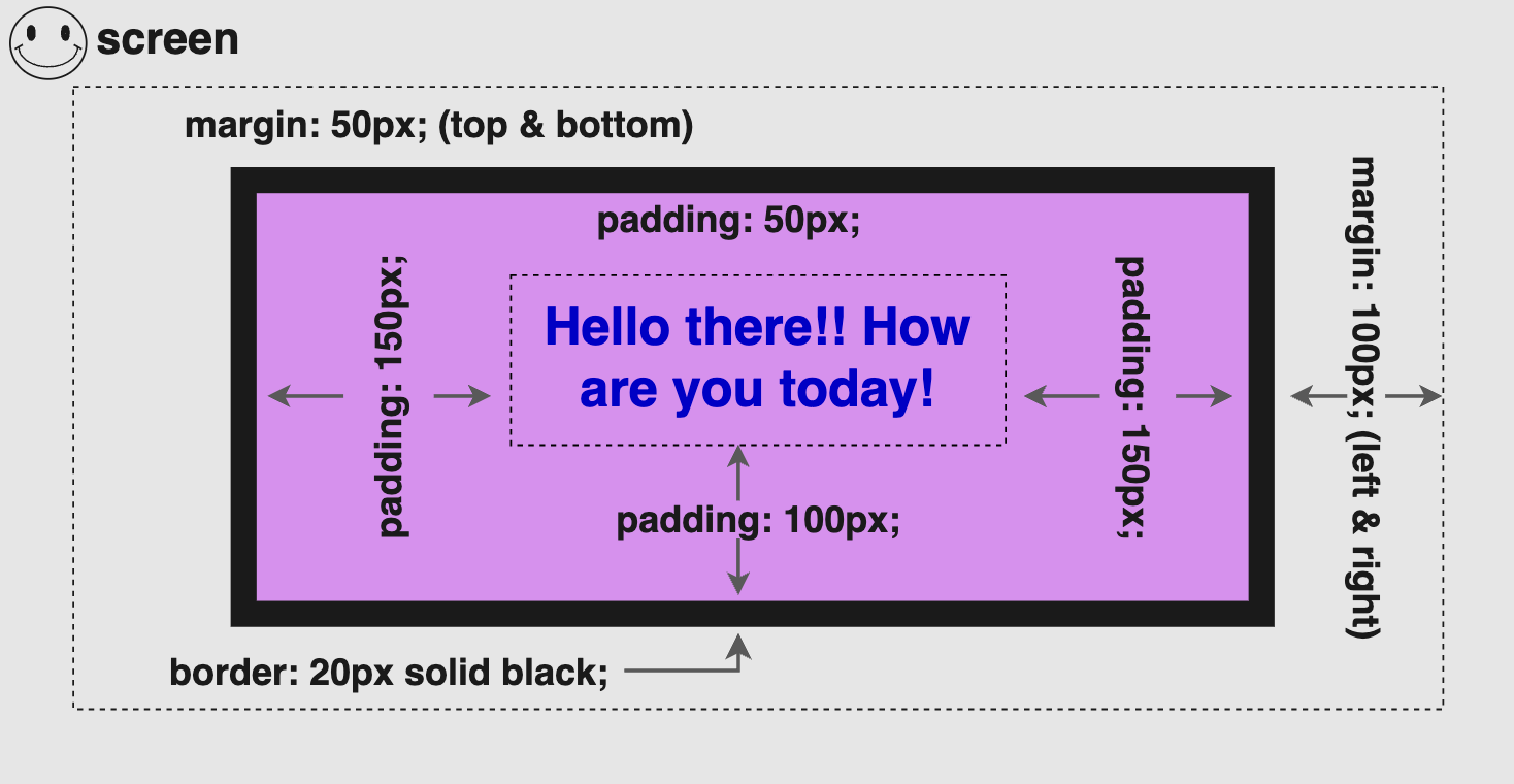
Below, we can see the same example after adding padding, border & margin.
.title {
  ...
  /* if you have different values, instead of padding-left padding-top,
  padding-right, padding-bottom you can write all padding values together
  like above. */
  padding: 50px 150px 100px 150px; /* top, right, bottom, left */
  /* instead of border-width, border-style & border-color you can write just
  border and set all these values together like above */
  border: 20px solid black;
  /* if margin-top & margin-bottom have the same value, margin-left &
  margin-right the same too you can write all margin values together
  like above */
  margin: 50px 100px; /* (top & bottom 50px) then (left & right 100px) */
}
You may also like 🎬
💡Explaining CSS Box Model Calculations
It would be helpful to understand the calculation process for determining “Total Width” & “Total Height” and make the concepts clearer. At this point, it would be really helpful to know that the CSS box model has, by default, box-sizing: content-box which means that borders and paddings take extra place around the object we want to add them.
Margins are NOT included, as they are outside the CSS box model.
width: ➡ 300px (content’s width) + 40px (20px border-left + 20px border-right) + 300px (150px padding-left & 150px padding-right) = 640px;
height: ➡ 100px (content’s height) + 40px (20px border-top + 20px border-bottom) + 250px (50px padding-top + 100px padding-bottom) = 390px;
🕵️♀️ There is a method to include borders and paddings within the box’s dimensions. If you’re interested in learning more about the box-sizing CSS property to achieve this, I recommend checking out our guide for detailed insights on this topic. You will find detailed instructions and explanations.
⛔ Avoid These Mistakes
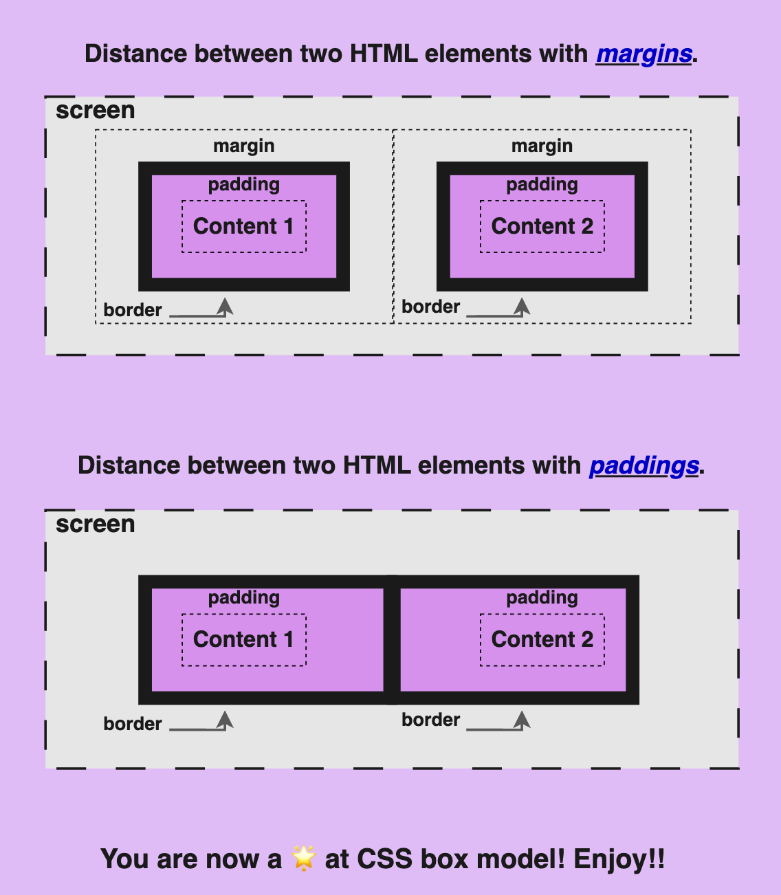
When we want to SEPARATE HTML ELEMENTS we must use margin instead of padding. Most times, we work without borders, so we can’t see the elements’ boundaries. Because of that, we think that we can use both paddings or margins to create space between elements, BUT we should NOT.
I’ve included an example with two images below, to show you the wrong usage of separating elements using padding instead of margin. As you see, when we use padding, even though we create space, we do it the wrong way.
We should not separate HTML elements using their INNER SPACE (padding).
🌼 Hope you found my post interesting and helpful. Thanks for being here! 🌼


